kage
kage
context.dev
Design analysis
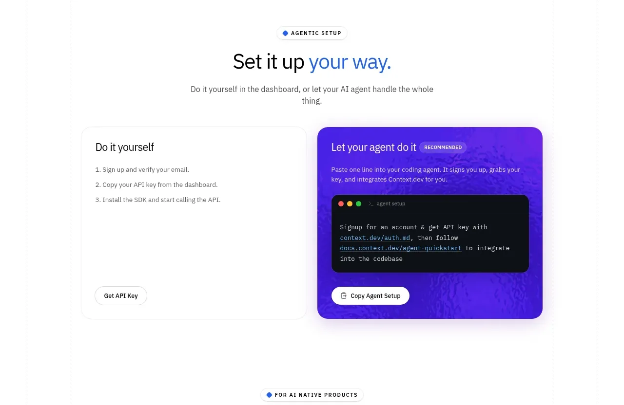
An eyebrow and centered heading introduce two side-by-side setup choices, visually contrasting a self-serve card with an agent-assisted code card.
Prompt preview
## Reference images

Study these alongside the description below: hierarchy, rhythm, spacing, colour. Build for the product you are asked about, using this design language.

- Component: https://kage-design-assets.t3.tigrisfiles.io/components/scrape-anything-by-context-dev/b0e64468-3924-45db-a4d8-d7cbe8044a77-1791871394-4.webp
- Full page it was cut from: https://kage-design-assets.t3.tigrisfiles.io/screenshots/scrape-anything-by-context-dev/b0e64468-3924-45db-a4d8-d7cbe8044a77-1791871314047-full.webp
- Component on Kage: https://kage.design/component/scrape-anything-by-context-tabs

## Before you start
Ask what the user's product, audience, and brand are, then translate the setup decision into their onboarding flow.

Build a setup-choice section with a small uppercase eyebrow, centered headline, and short explanatory line. Present two equal cards: a light self-serve path with numbered steps and a compact button, and a vivid accent-colored assisted path with a short explanation, dark code window, and copy/setup action. Use 20–24px card radii, a thin #E5E7EB border on the light card, a purple-blue gradient around #4B1FE8 on the assisted card, and generous internal padding. Make the choices keyboard accessible and clearly indicate the recommended path without excessive badges. Stack the cards on narrow screens.

Never: use logos, product names, copy, illustrations, or imagery from the reference.