kage
kage
reikacode.com
Design analysis
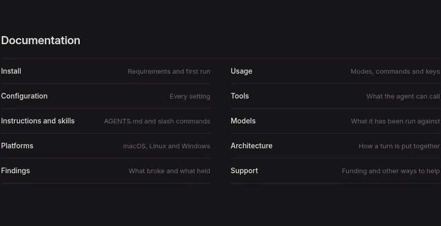
A documentation index turns many destinations into two aligned columns of compact rows, each separated by subtle horizontal rules and paired with a short descriptor.
Prompt preview
## Reference images

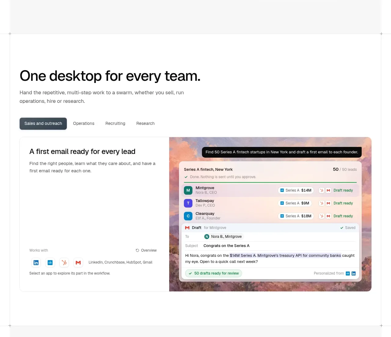
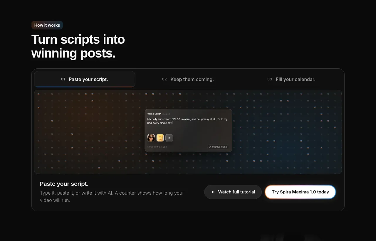
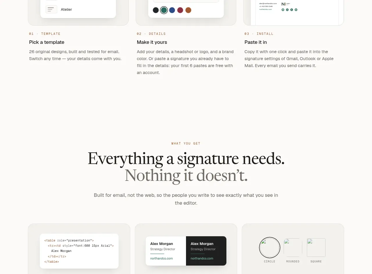
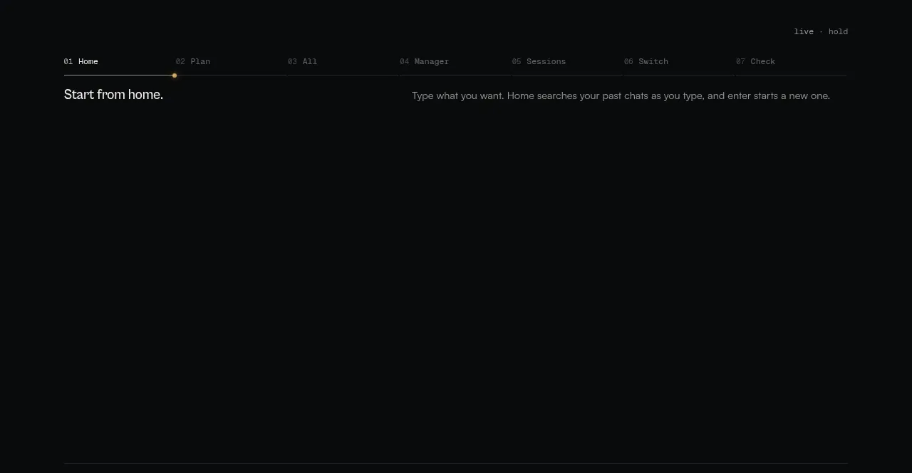
Study these alongside the description below: hierarchy, rhythm, spacing, colour. Build for the product you are asked about, using this design language.

- Component: https://kage-design-assets.t3.tigrisfiles.io/components/reika/dbc92e41-38c4-497a-81df-7bf52356b7a2-1791439501-5.webp
- Full page it was cut from: https://kage-design-assets.t3.tigrisfiles.io/screenshots/reika/dbc92e41-38c4-497a-81df-7bf52356b7a2-1791439420892-full.webp
- Component on Kage: https://kage.design/component/reika-tabs

## Before you start
Ask what the user's product is, who it serves, and what its brand personality and preferred visual identity are. Apply the principles below to that product rather than reproducing this reference.

Create a documentation directory with a clear section heading and a two-column list of navigable rows. Each row should have a primary link on the left and a short muted descriptor aligned on the right; divide rows with 1px rules around #29272c. Use a 12–14px sans-serif, bright text #e2dfe4 for destinations, muted #77737b for descriptions, and a subtle accent hover state such as #d38bc2. Keep column widths equal, row height around 40–46px, and maintain consistent vertical rhythm. On mobile, stack the columns while preserving row separators and keyboard-accessible focus states.

Never: use logos, product names, copy, illustrations, or imagery from the reference.