 kage
kage
esigna.app
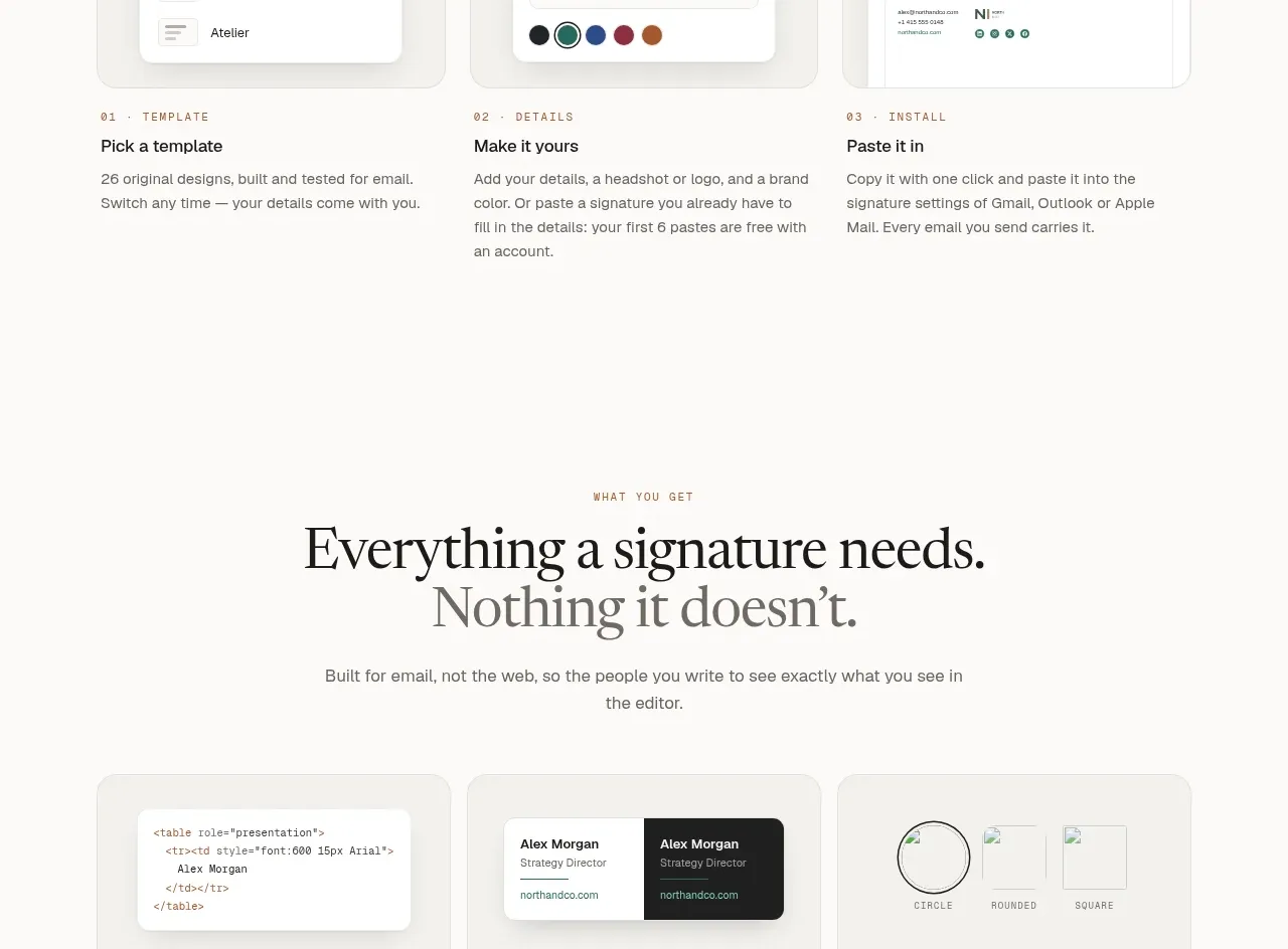
Design analysis
A tab-like platform selector lets visitors understand how the same output adapts across contexts, with one large preview below.
Prompt preview
## Reference images

Study these alongside the description below: hierarchy, rhythm, spacing, colour. Build for the product you are asked about, using this design language.

- Component: https://kage-design-assets.t3.tigrisfiles.io/components/esigna/76bcd194-d16d-4973-9e2e-b189e2506cae-1791007555-5.webp
- Full page it was cut from: https://kage-design-assets.t3.tigrisfiles.io/screenshots/esigna/76bcd194-d16d-4973-9e2e-b189e2506cae-1791007443637-full.webp
- Component on Kage: https://kage.design/component/esigna-tabs

## Before you start
Ask which environments, integrations, or modes the user's product supports and which preview best demonstrates that flexibility. Apply the pattern to those contexts.

Create a centered preview section with an eyebrow, large serif headline, supporting copy, and a compact pill tab bar. Tabs should have a white rounded container, small neutral labels, and a dark filled active tab with a clear focus state. Below, show one large responsive product preview inside a wide rounded light-gray stage (#d8d7d5), with a centered white interface card and soft shadow. Keep the active preview visually dominant and provide keyboard-accessible tabs with smooth crossfade or slide transitions. Use warm white background (#faf9f7), ink #171716, muted copy #77746e, and 24px stage radius.

Never: use logos, product names, copy, illustrations, or imagery from the reference.
More components
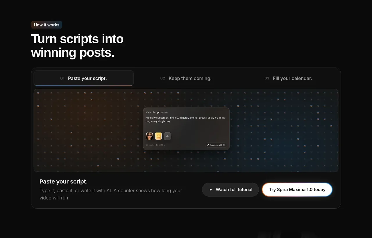
 Script-to-output workflow tabs
Spira Maxima · Tabs & steps
Script-to-output workflow tabs
Spira Maxima · Tabs & steps
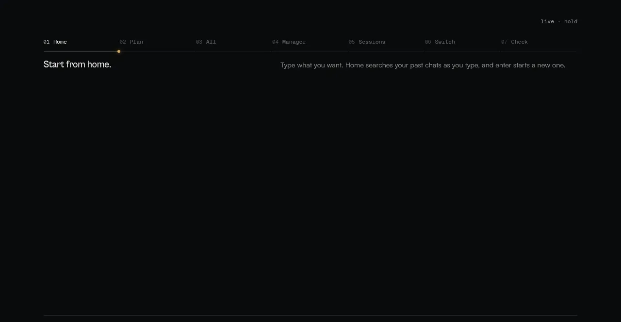
 Workflow stages explainer
CodeAF · Tabs & steps
Workflow stages explainer
CodeAF · Tabs & steps

 Use-case media tabs
Clarity · Tabs & steps
Use-case media tabs
Clarity · Tabs & steps
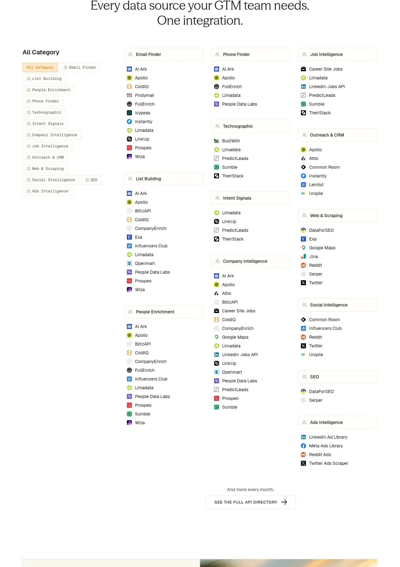
 Integration directory
ColdIQ x Slack · Tabs & steps
Integration directory
ColdIQ x Slack · Tabs & steps
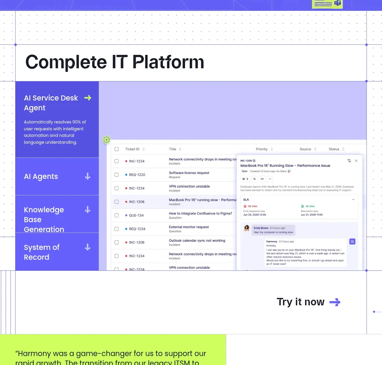
 Complete platform product tour
Harmony · Tabs & steps
Complete platform product tour
Harmony · Tabs & steps
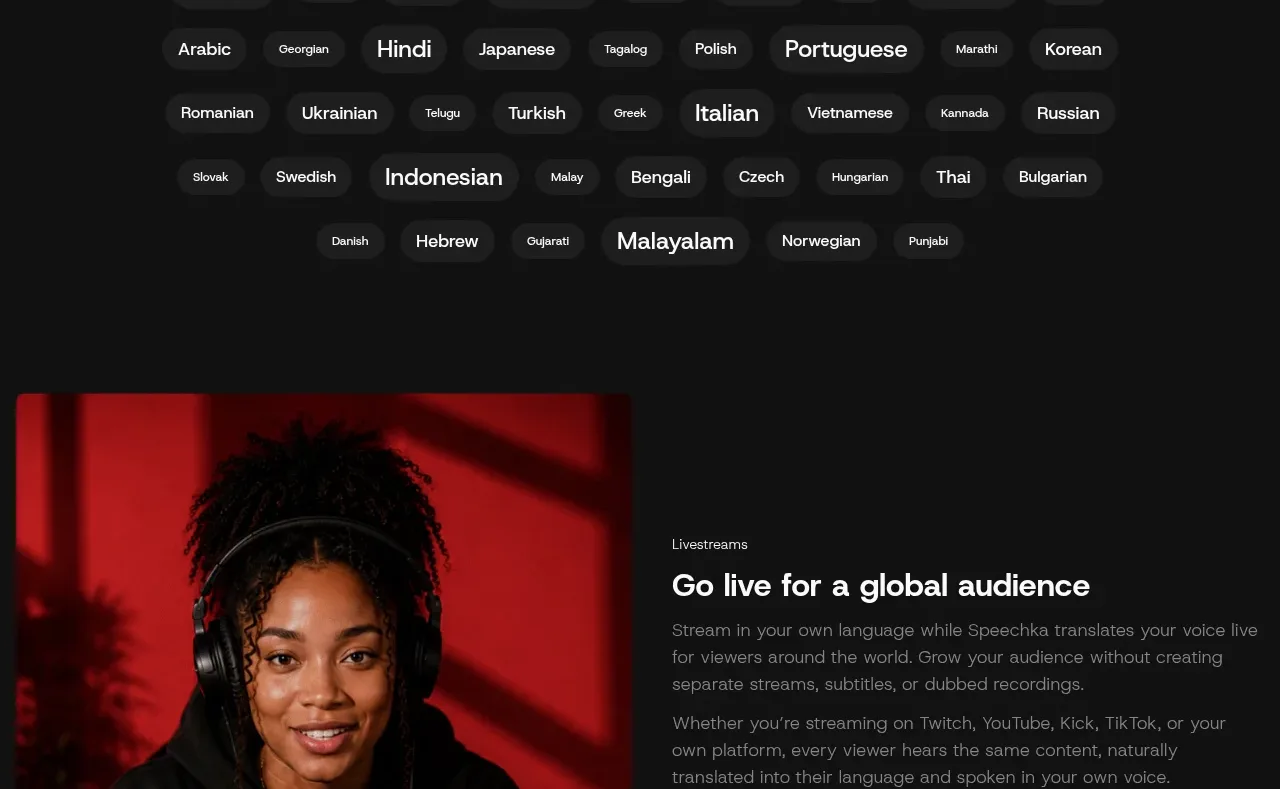
 Language selection cloud
Speechka · Tabs & steps
Language selection cloud
Speechka · Tabs & steps