kage
kage
openswarm.info
Design analysis
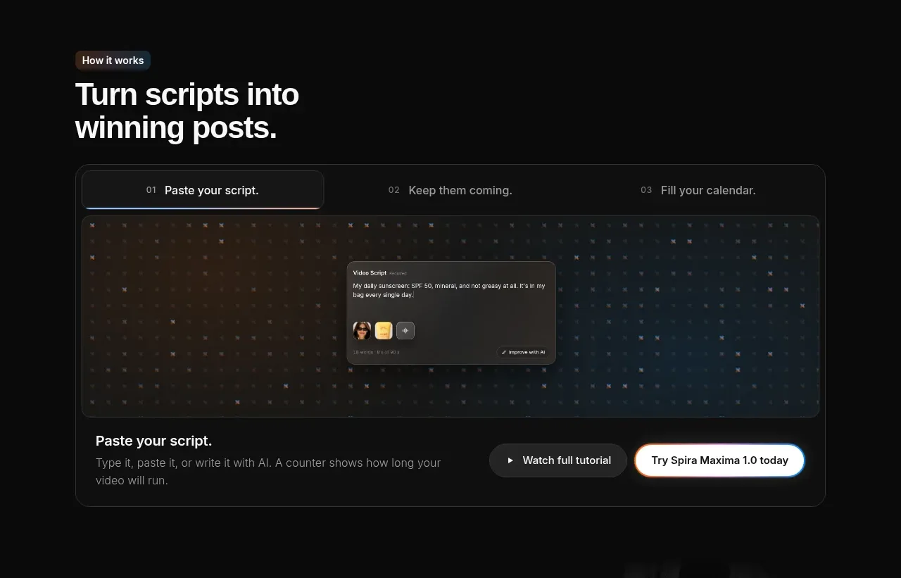
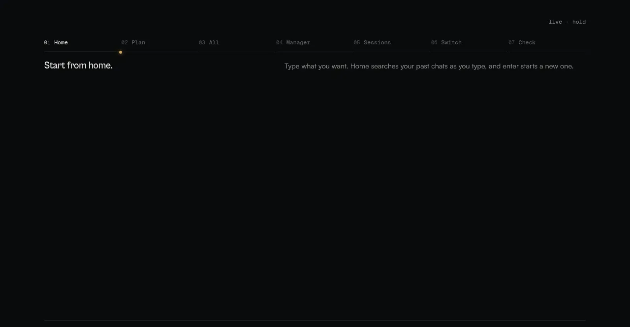
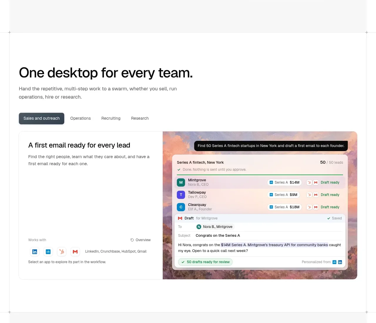
This section shifts from broad capabilities to a concrete workflow, with an introductory heading, category tabs, and a large split product demonstration.
Prompt preview
## Reference images

Study these alongside the description below: hierarchy, rhythm, spacing, colour. Build for the product you are asked about, using this design language.

- Component: https://kage-design-assets.t3.tigrisfiles.io/components/openswarm/378a218c-dbaf-492a-bc34-8c3bcee33f67-1791525666-3.webp
- Full page it was cut from: https://kage-design-assets.t3.tigrisfiles.io/screenshots/openswarm/378a218c-dbaf-492a-bc34-8c3bcee33f67-1791525640433-full.webp
- Component on Kage: https://kage.design/component/openswarm-tabs

## Before you start
Ask what teams use the user's product and what workflow categories should be switchable. Ask which single workflow best demonstrates value, then apply this interaction model to the brand.

Create a workflow showcase on white with a left-aligned section title around 38–48px, a concise muted paragraph, and a compact horizontal tab row beneath. Tabs should have 13–14px labels, generous 12–16px spacing, and a dark filled active state with white text against muted inactive labels. Under the tabs, create one large rounded demonstration panel with a split layout: explanatory copy and small metadata on the left, and a rich application preview on the right. Use a pale warm border `#e5e7e9`, 12–16px radius, and a very subtle shadow. The preview may use a textured gradient around `#d9b2a2` behind a clean interface mockup, while the content remains readable. Include a small prompt/status chip above the preview to show the workflow in action. Make tabs keyboard accessible, update the panel without page navigation, and stack the split layout on mobile.

Never use logos, product names, copy, illustrations, or imagery from the reference.