 kage
kage
aside.com
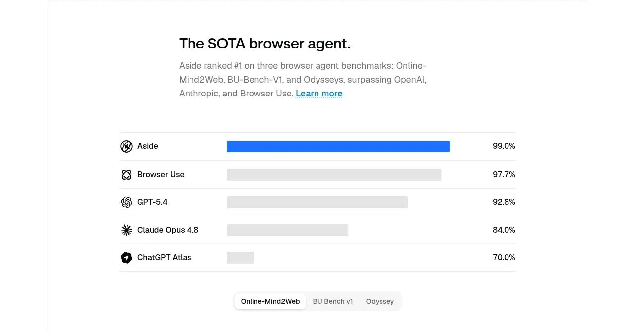
Design analysis
A compact benchmark section combines a heading and explanatory copy with horizontal comparison bars, clearly emphasizing the product's leading score.
Prompt preview
## Reference images

Study these alongside the description below: hierarchy, rhythm, spacing, colour. Build for the product you are asked about, using this design language.

- Component: https://kage-design-assets.t3.tigrisfiles.io/components/aside/f609b01b-1081-4ce1-af9f-cbdda1611f88-1789452075-4.webp
- Full page it was cut from: https://kage-design-assets.t3.tigrisfiles.io/screenshots/aside/f609b01b-1081-4ce1-af9f-cbdda1611f88-1789452037588-full.webp
- Component on Kage: https://kage.design/component/aside-chart

## Before you start
Ask what measurable proof point matters for the user's product and what data is credible to show. Apply the principles below to that product.

Build a lightweight comparison chart on white. Use a left-aligned heading and short explanation above a centered, narrow chart. Each row should contain a small label, a horizontal track, a filled bar, and a right-aligned percentage or metric. Highlight the product's row in vivid blue #2879E8 and keep comparison bars in #E5E5E5. Use thin #EEEEEE row separators, 13–15px labels, and clear tab-like controls below if multiple datasets exist. Avoid axes and visual clutter; the hierarchy should make the leading result immediately legible. Include accessible text alternatives and responsive bars that preserve labels on narrow screens.

Never: copy logos, product names, copy, illustrations, or imagery from the reference.
More components
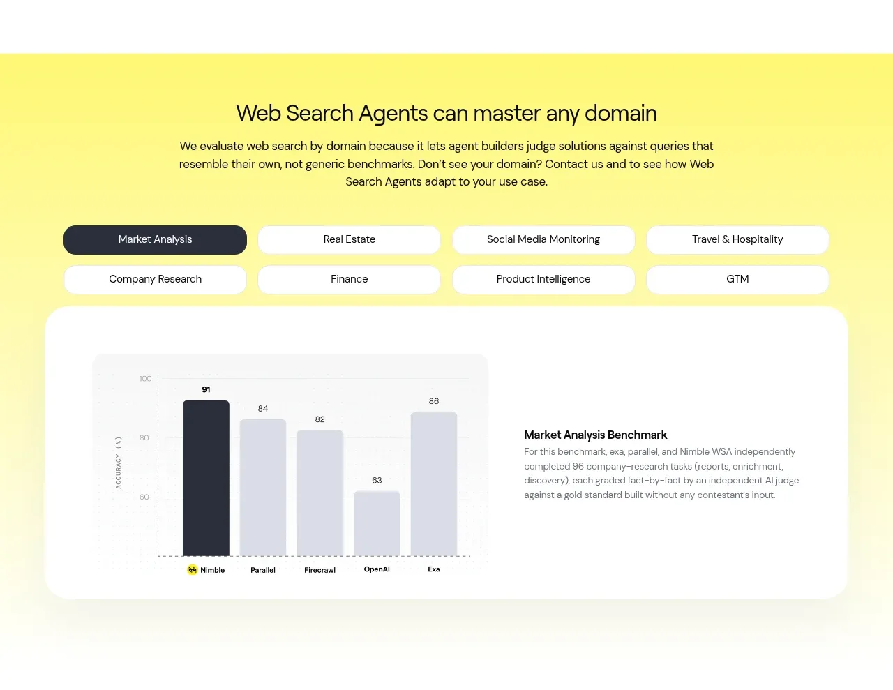
 Domain benchmark and tabs
Web Search Agents by Nimble · Chart
Domain benchmark and tabs
Web Search Agents by Nimble · Chart
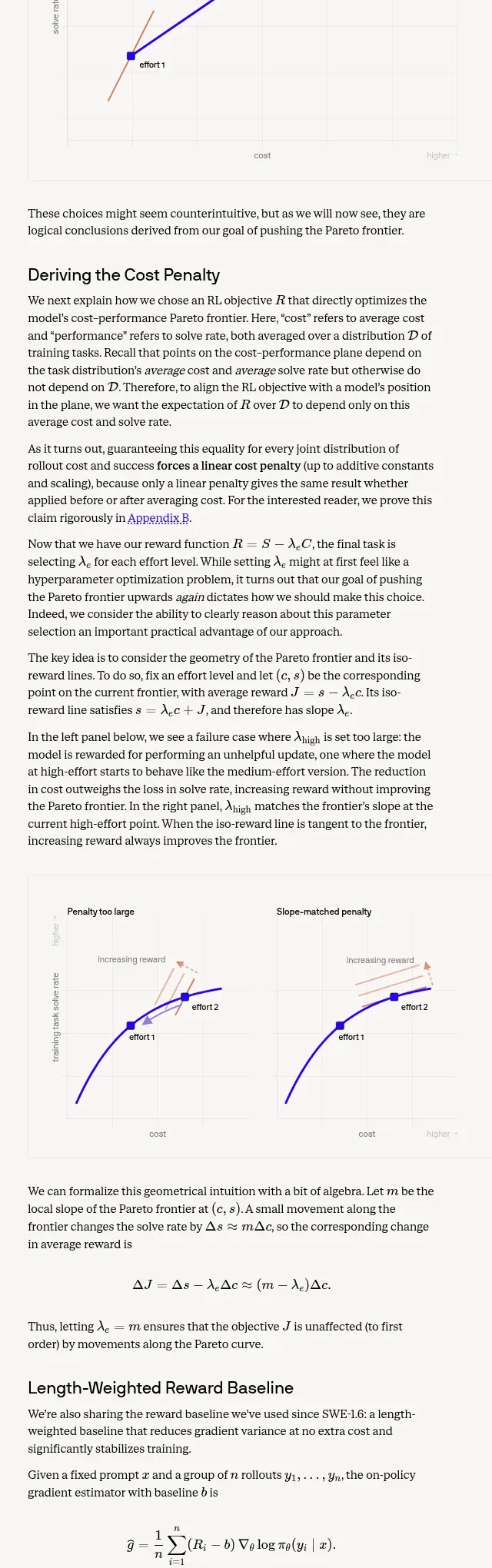
 Length-weighted reward and RL stability
Cognition's SWE-2 · Chart
Length-weighted reward and RL stability
Cognition's SWE-2 · Chart
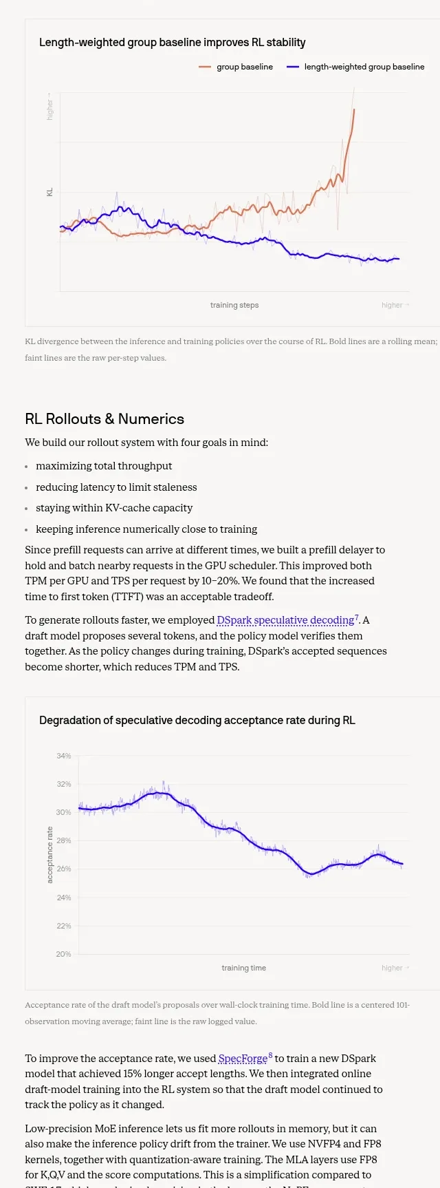 Trustworthiness evaluation charts
Cognition's SWE-2 · Chart
Trustworthiness evaluation charts
Cognition's SWE-2 · Chart
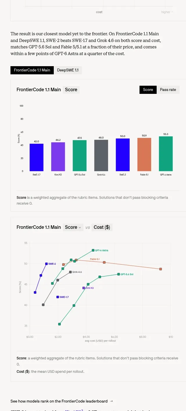 Benchmark score and cost charts
Cognition's SWE-2 · Chart
Benchmark score and cost charts
Cognition's SWE-2 · Chart

 Financial dashboard charts
tryobra.com · Chart
Financial dashboard charts
tryobra.com · Chart

 Old way vs live-product workflow comparison chart
Modeinspect · Chart
Old way vs live-product workflow comparison chart
Modeinspect · Chart