kage
kage
saidtrace.com
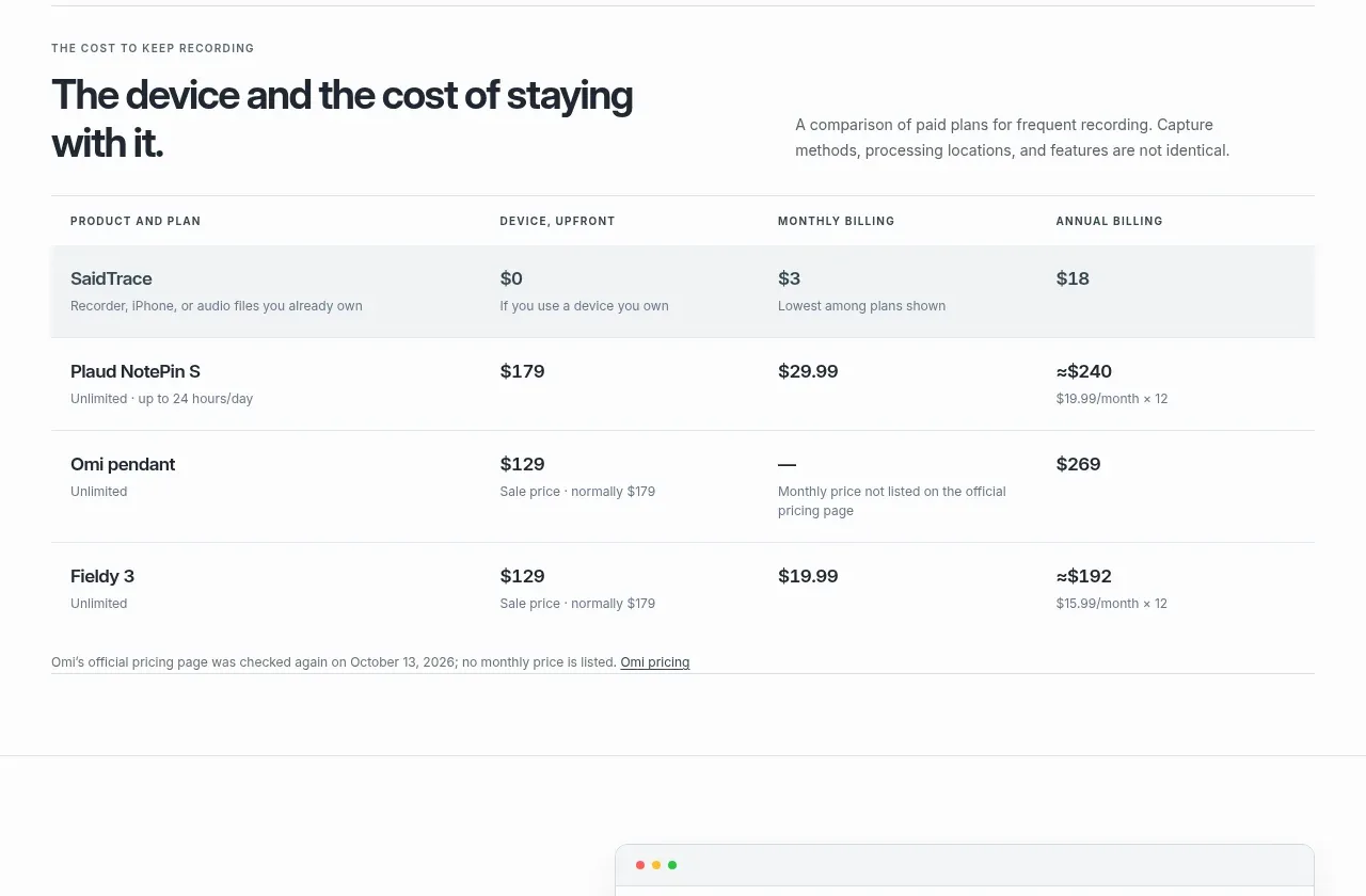
Design analysis
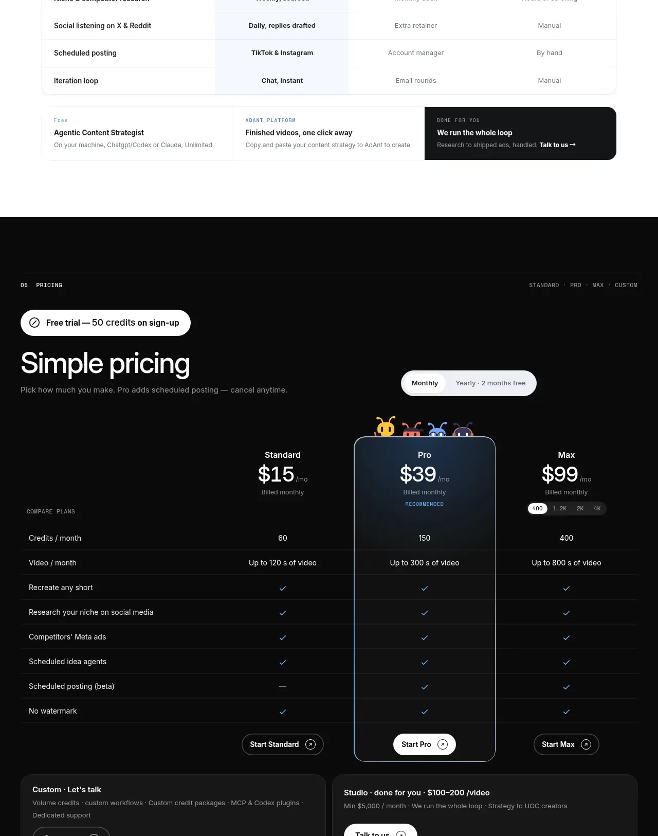
A factual comparison table clarifies total cost across products and billing periods, with a quiet header and lightly shaded first row for the user's own offering.
Prompt preview
## Reference images

Study these alongside the description below: hierarchy, rhythm, spacing, colour. Build for the product you are asked about, using this design language.

- Component: https://kage-design-assets.t3.tigrisfiles.io/components/saidtrace/da2a1190-1b0d-4dc6-9c61-691af1a5c9a8-1792130576-5.webp
- Full page it was cut from: https://kage-design-assets.t3.tigrisfiles.io/screenshots/saidtrace/da2a1190-1b0d-4dc6-9c61-691af1a5c9a8-1792130502177-full.webp
- Component on Kage: https://kage.design/component/saidtrace-table

## Before you start
Ask what the user's product and brand are, then apply the principles below to that product rather than copying the reference.

Create an editorial comparison table introduced by a compact eyebrow, a two-line heading, and a short explanatory note. Use four columns on desktop: product and plan, upfront device cost, monthly billing, and annual billing. Keep the header in small uppercase text, give rows generous vertical padding, use thin horizontal rules, and lightly tint the primary product row with #f3f5f6. Use #20252b for values, #687178 for descriptions, and one subtle accent for links or the highlighted row. Avoid heavy borders and avoid card shadows. Ensure the table can scroll horizontally on mobile, keeps the first column readable, and includes a small source note below with an accessible external-link treatment.

Never use the reference's logo, product name, copy, illustrations, or imagery.