 kage
kage
autocaptioner.com
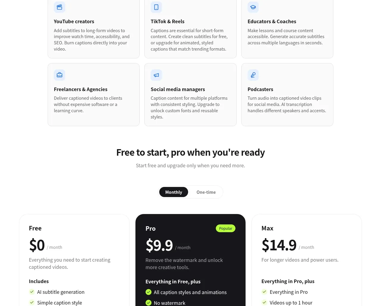
Design analysis
A pricing section presents three plans with a monthly/one-time toggle, strongly differentiated middle plan, feature checklists, and plan-specific CTAs.
Prompt preview
## Reference images

Study these alongside the description below: hierarchy, rhythm, spacing, colour. Build for the product you are asked about, using this design language.

- Component: https://kage-design-assets.t3.tigrisfiles.io/components/autocaptioner-com/ff4d8c71-c21f-4141-9075-b069f1384c25-1792109433-5.webp
- Full page it was cut from: https://kage-design-assets.t3.tigrisfiles.io/screenshots/autocaptioner-com/ff4d8c71-c21f-4141-9075-b069f1384c25-1792109412255-full.webp
- Component on Kage: https://kage.design/component/autocaptioner-pricing-table

## Before you start
Ask what the user's product, audience, and brand are, then apply the following principles to that product rather than copying this reference.

Create a pricing section with a centered heading, subtitle, and segmented billing toggle. Below it, place three equal-width pricing cards. Use white cards with thin #e5e7eb borders and 14–18px radii; visually emphasize the recommended middle tier with a near-black #18181b background, white text, a bright lime or brand accent badge, and a vivid accent CTA. Show plan name, large price, billing unit, short description, feature heading, checkmarked feature list, and a full-width bottom button. Keep pricing typography prominent but not oversized, use consistent card heights, and align the CTAs at the bottom. Make the billing toggle interactive and update prices/features without shifting layout; ensure the recommended plan is also accessible to screen readers.

Never use logos, product names, copy, illustrations, or imagery from the reference.
More components
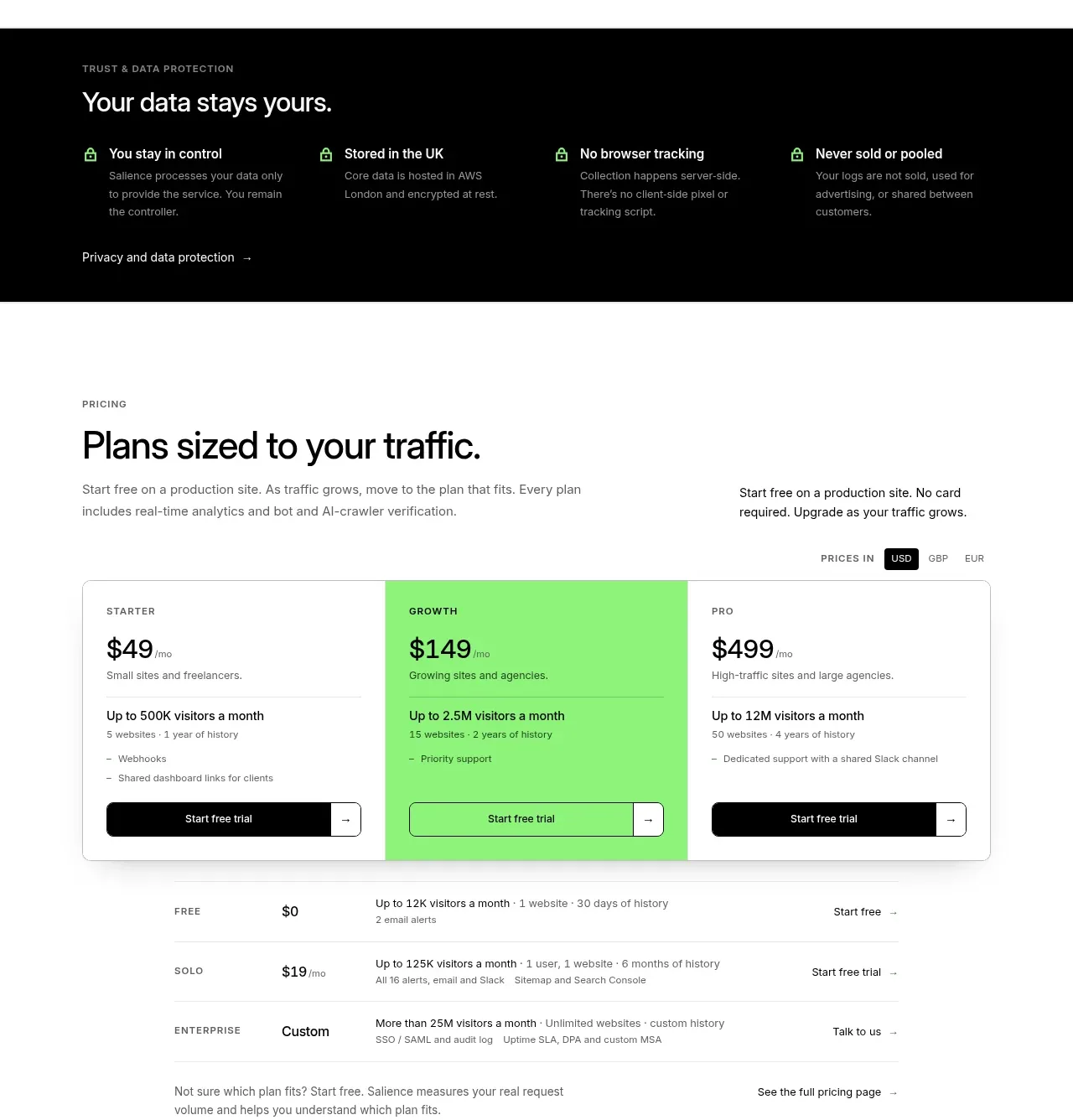
 Traffic-based pricing plans
Salience · Pricing table
Traffic-based pricing plans
Salience · Pricing table
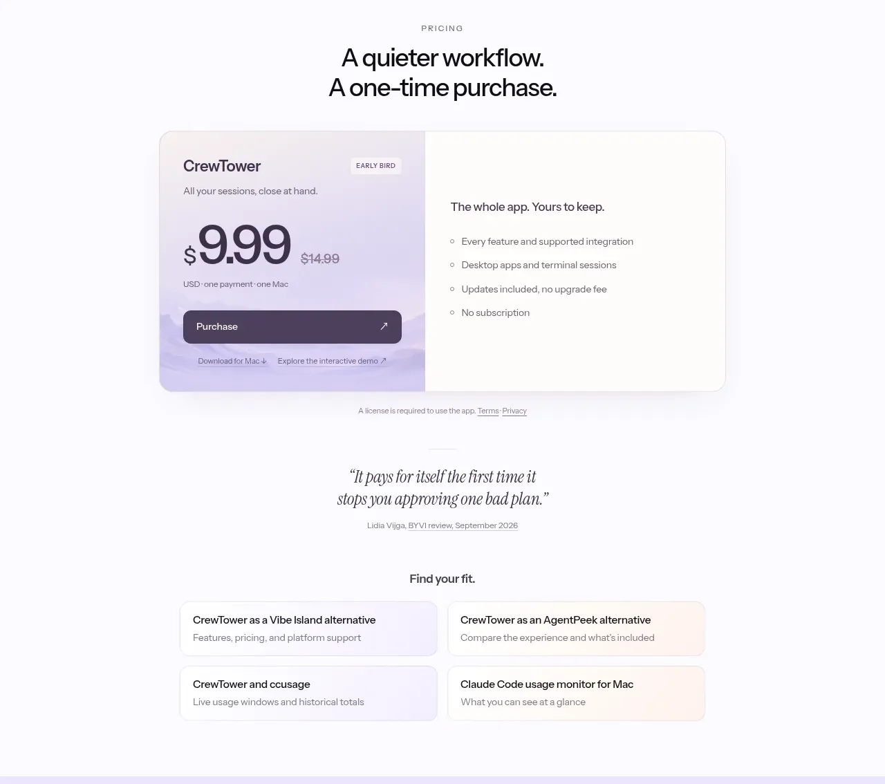
 One-time purchase pricing
CrewTower Mod for Claude Code · Pricing table
One-time purchase pricing
CrewTower Mod for Claude Code · Pricing table
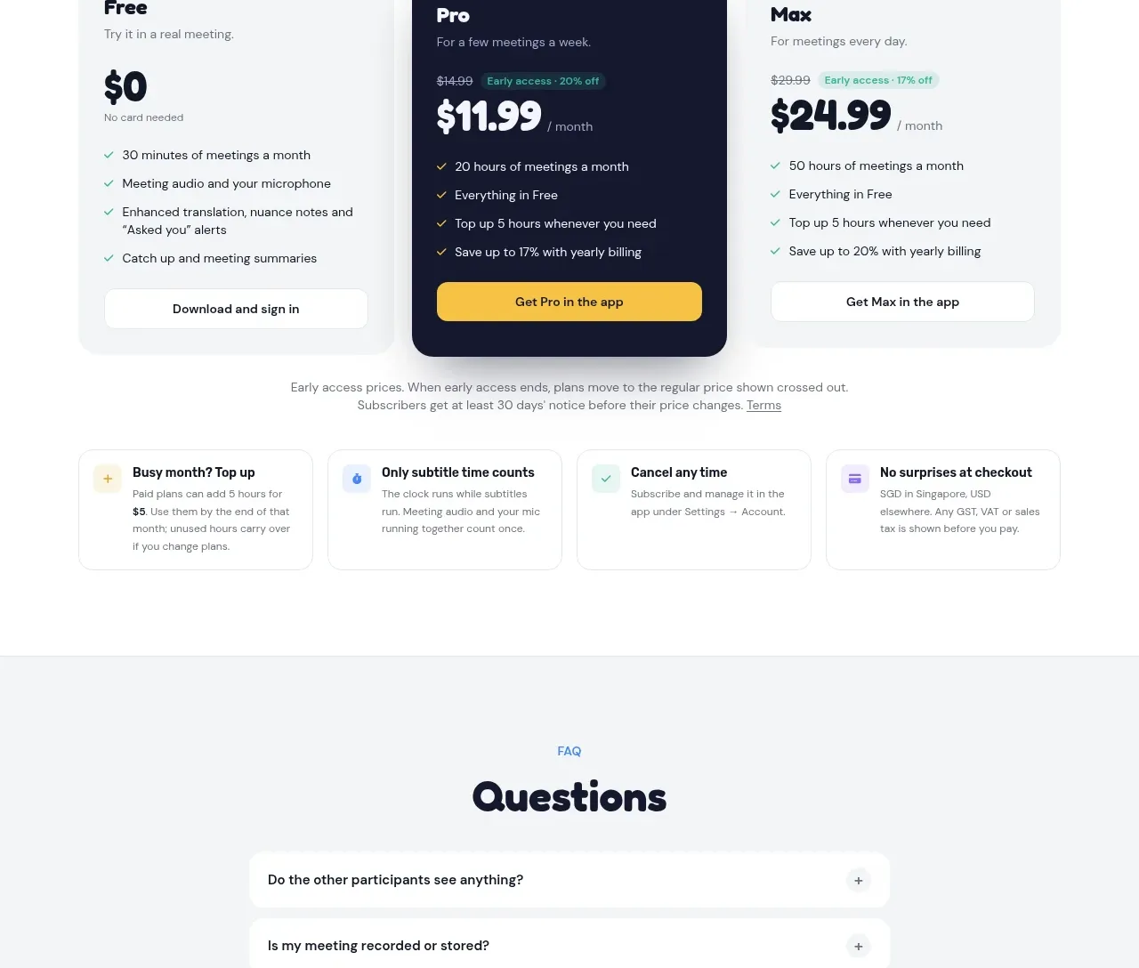
 Three-plan pricing
NANI??? · Pricing table
Three-plan pricing
NANI??? · Pricing table
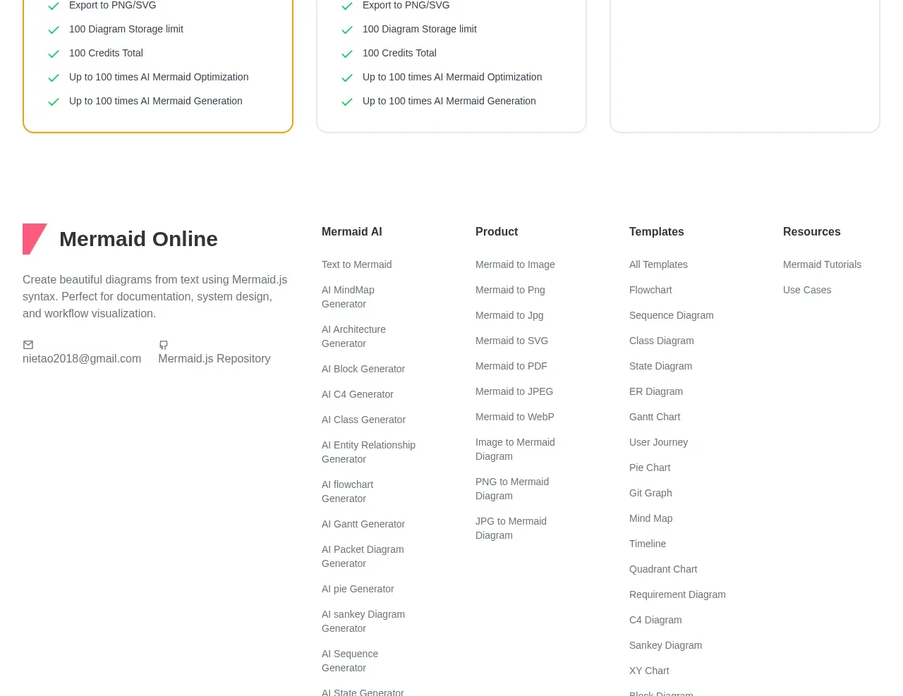
 Three-tier pricing plans
mermaidonline.live · Pricing table
Three-tier pricing plans
mermaidonline.live · Pricing table
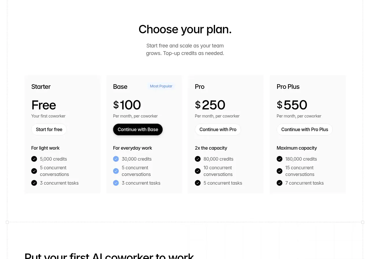
 Four-tier pricing table
Backdrop · Pricing table
Four-tier pricing table
Backdrop · Pricing table
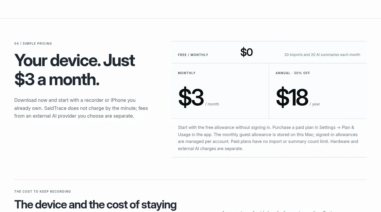
 Simple monthly pricing
SaidTrace · Pricing table
Simple monthly pricing
SaidTrace · Pricing table