 kage
kage
backdropagent.com
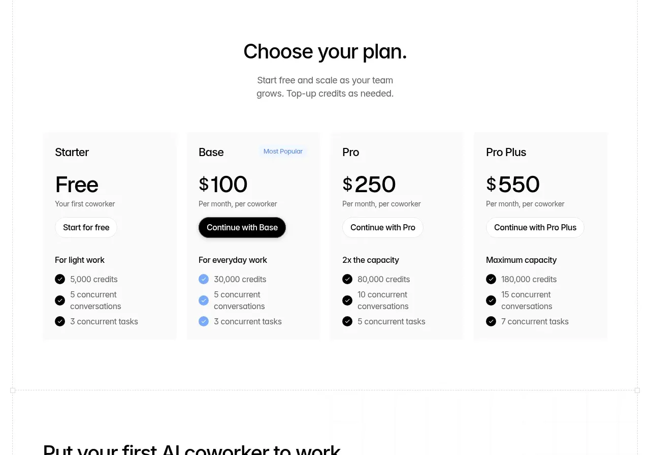
Design analysis
A centered pricing introduction leads to four evenly weighted cards, each with a plan name, price, CTA, capacity label, and concise included limits.
Prompt preview
## Reference images

Study these alongside the description below: hierarchy, rhythm, spacing, colour. Build for the product you are asked about, using this design language.

- Component: https://kage-design-assets.t3.tigrisfiles.io/components/backdrop/a4be162f-a1b8-4e5c-8da7-09cb7d37c0e3-1792130681-7.webp
- Full page it was cut from: https://kage-design-assets.t3.tigrisfiles.io/screenshots/backdrop/a4be162f-a1b8-4e5c-8da7-09cb7d37c0e3-1792130585649-full.webp
- Component on Kage: https://kage.design/component/backdrop-pricing-table

## Before you start
Ask what the user's pricing model, billing unit, audience, and conversion goal are. Then design a pricing section that expresses those facts clearly.

Create a centered pricing heading and short subtitle above a four-column responsive pricing grid. Each card needs a plan name, prominent price or billing label, one primary CTA, a capacity descriptor, and a short checklist of included limits. Give one plan a subtle “recommended” treatment using a small badge or accent border, while keeping all plans comparable. Use white or #fafafa cards, 1px #eeeeee borders, 8–12px radius, 24–32px padding, black primary buttons, outlined secondary buttons, and blue/green accent checks only where meaningful. Align prices and buttons consistently, make the whole grid collapse to a vertical stack on small screens, and include accessible billing language.

### Never
- Never copy the reference plan names, prices, limits, or button labels.
- Never obscure important pricing terms in hover-only content.
- Never use fake scarcity or misleading comparison.
More components
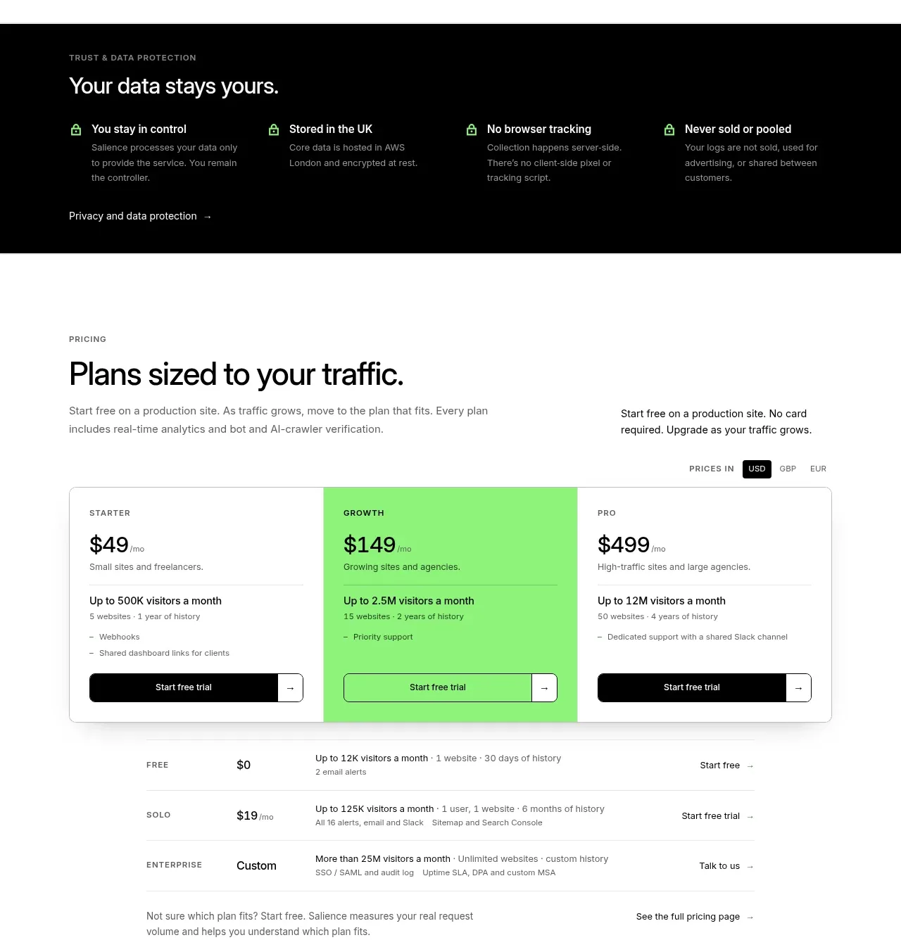
 Traffic-based pricing plans
Salience · Pricing table
Traffic-based pricing plans
Salience · Pricing table
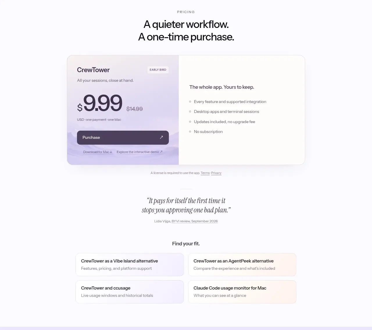
 One-time purchase pricing
CrewTower Mod for Claude Code · Pricing table
One-time purchase pricing
CrewTower Mod for Claude Code · Pricing table
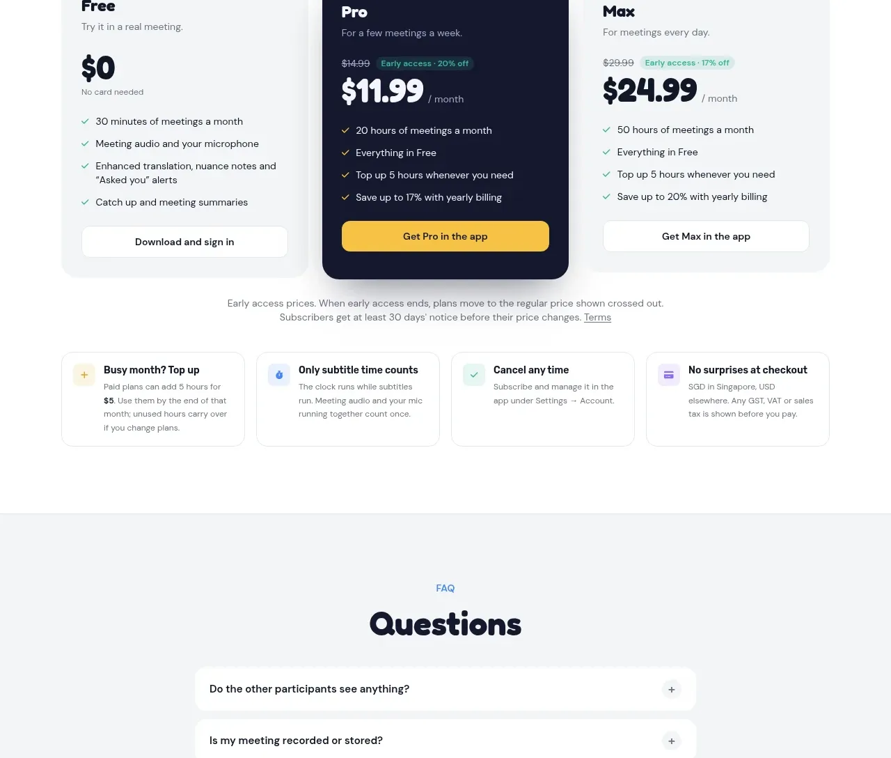
 Three-plan pricing
NANI??? · Pricing table
Three-plan pricing
NANI??? · Pricing table
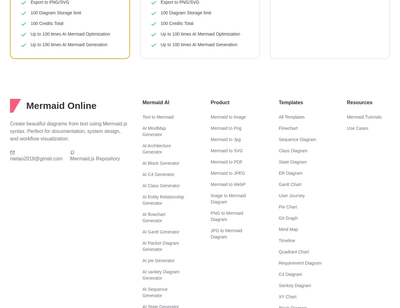
 Three-tier pricing plans
mermaidonline.live · Pricing table
Three-tier pricing plans
mermaidonline.live · Pricing table
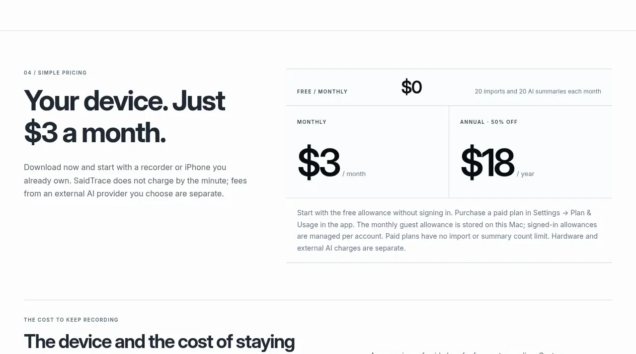
 Simple monthly pricing
SaidTrace · Pricing table
Simple monthly pricing
SaidTrace · Pricing table
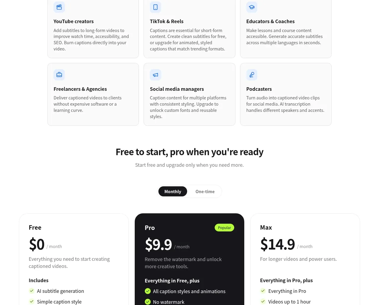
 Three-tier pricing
autocaptioner.com · Pricing table
Three-tier pricing
autocaptioner.com · Pricing table