 kage
kage
salience.com
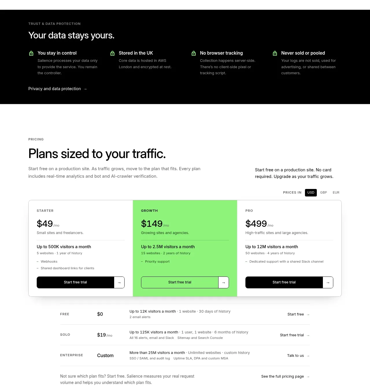
Design analysis
Pricing is introduced with a clear traffic-based framing, three prominent plans, additional rows for edge cases, and a visible unit toggle and trial action.
Prompt preview
## Reference images

Study these alongside the description below: hierarchy, rhythm, spacing, colour. Build for the product you are asked about, using this design language.

- Component: https://kage-design-assets.t3.tigrisfiles.io/components/salience/db9244f7-ec48-4516-9a93-11a957a9eab9-1792303422-9.webp
- Full page it was cut from: https://kage-design-assets.t3.tigrisfiles.io/screenshots/salience/db9244f7-ec48-4516-9a93-11a957a9eab9-1792303314589-full.webp
- Component on Kage: https://kage.design/component/salience-pricing-table

## Before you start
Ask about the user's billing metric, plan differences, target customers, trial policy, and currencies. Use that information to make an original pricing experience.

Create a pricing section with a small uppercase label, large heading, supporting copy, and a compact currency/unit toggle. Show three primary plan cards in one row: each has a plan label, large price, billing unit, audience descriptor, divider, included limits, and full-width CTA. Make the middle plan visually featured with a vivid green background (#8bea72); keep the others white with 1px grey borders (#dfe5df). Use 12px card radii, 24px padding, near-black text, 14px body copy, and strong button contrast. Below, add a simple comparison list for free, solo, and enterprise/custom cases with aligned price, limits, and CTA columns. Include a link to detailed pricing. Make the toggle, buttons, and cards keyboard accessible and ensure the table becomes stacked labelled cards on mobile.

Never use logos, product names, copy, illustrations, or imagery from the reference.
More components
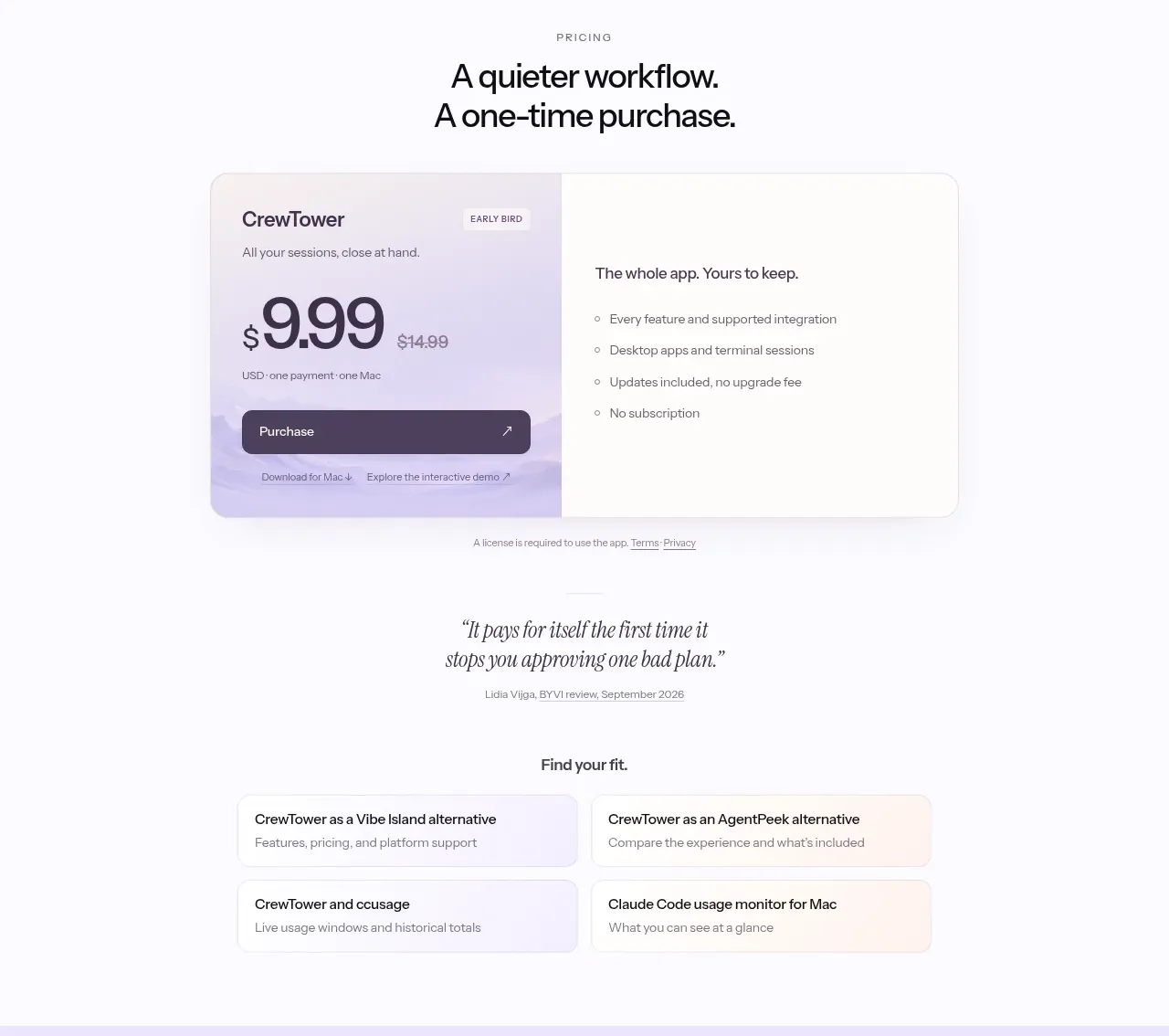
 One-time purchase pricing
CrewTower Mod for Claude Code · Pricing table
One-time purchase pricing
CrewTower Mod for Claude Code · Pricing table
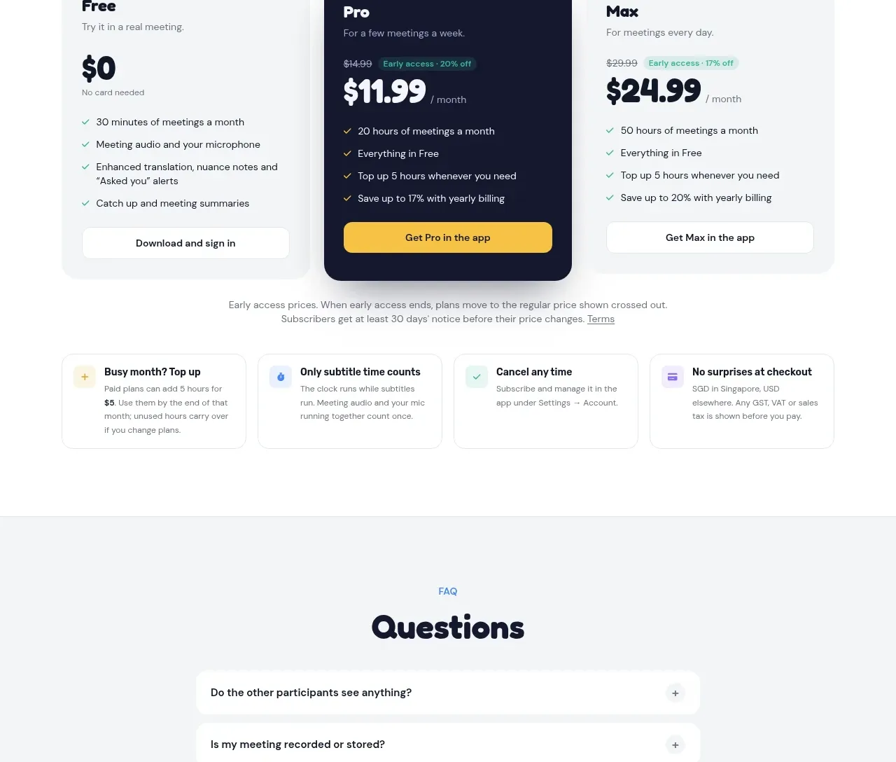
 Three-plan pricing
NANI??? · Pricing table
Three-plan pricing
NANI??? · Pricing table
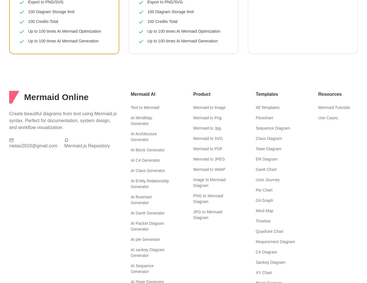
 Three-tier pricing plans
mermaidonline.live · Pricing table
Three-tier pricing plans
mermaidonline.live · Pricing table
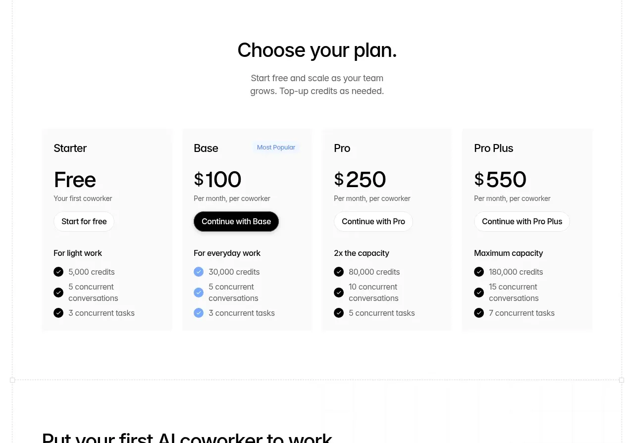
 Four-tier pricing table
Backdrop · Pricing table
Four-tier pricing table
Backdrop · Pricing table
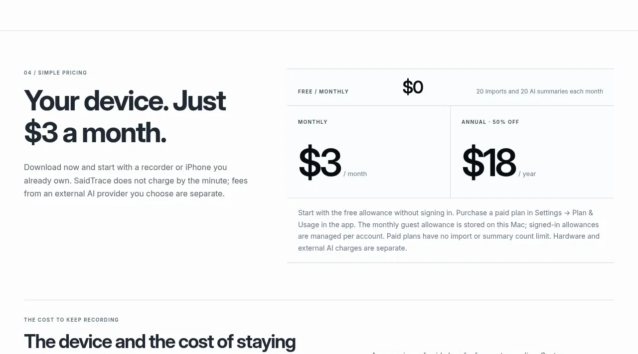
 Simple monthly pricing
SaidTrace · Pricing table
Simple monthly pricing
SaidTrace · Pricing table
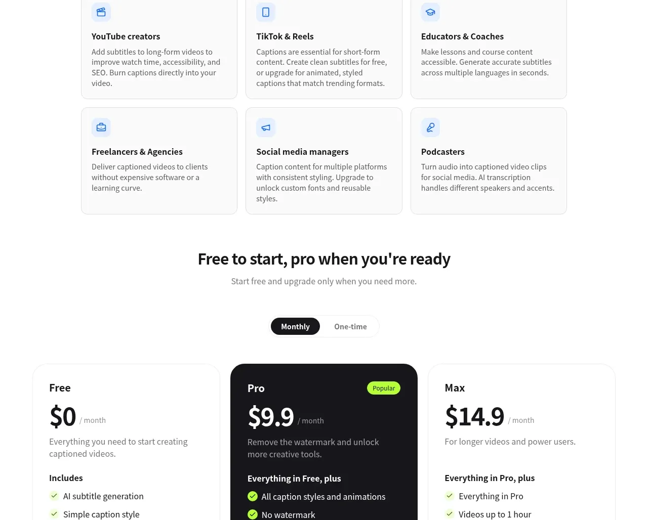
 Three-tier pricing
autocaptioner.com · Pricing table
Three-tier pricing
autocaptioner.com · Pricing table