 kage
kage
mermaidonline.live
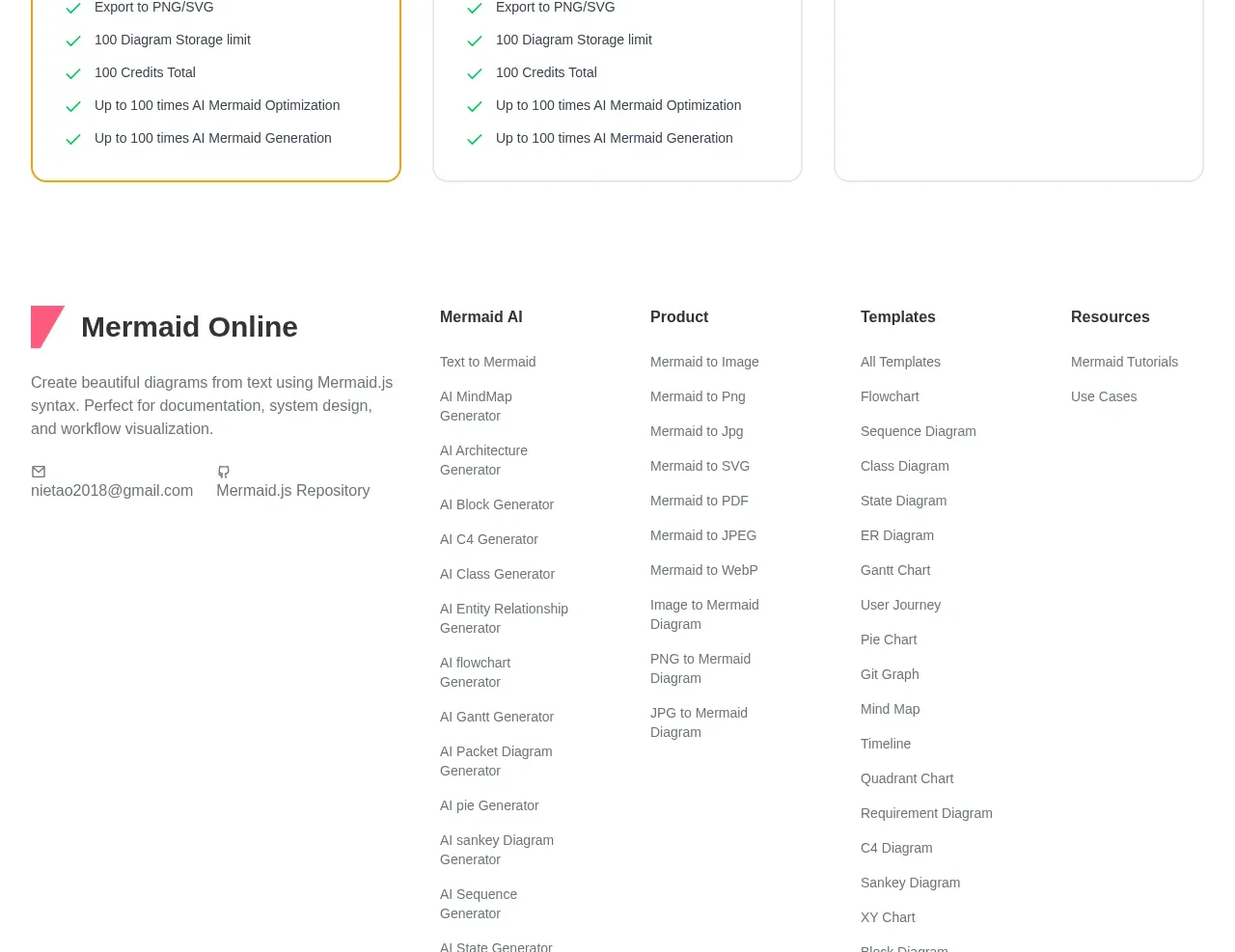
Design analysis
The pricing section starts with a centered heading and description, then compares monthly, one-time, and lifetime packages in equal cards. A highlighted first plan, strong prices, checkmarked benefits, and distinct buttons support quick evaluation.
Prompt preview
## Reference images

Study these alongside the description below: hierarchy, rhythm, spacing, colour. Build for the product you are asked about, using this design language.

- Component: https://kage-design-assets.t3.tigrisfiles.io/components/mermaidonline-live/7b9ecc63-d7b9-4b92-a5d2-b69508fba7f2-1792152745-10.webp
- Full page it was cut from: https://kage-design-assets.t3.tigrisfiles.io/screenshots/mermaidonline-live/7b9ecc63-d7b9-4b92-a5d2-b69508fba7f2-1792152710959-full.webp
- Component on Kage: https://kage.design/component/mermaidonline-live-pricing-table

## Before you start
Ask about the user's pricing model, billing options, entitlements, and preferred highlighted plan. Build a truthful, original pricing comparison for that product.

Create a three-column pricing table with a centered heading and explanatory subtitle above it. Each card needs a plan name, short descriptor, large price with billing context, primary action, and a scannable checkmarked feature list. Make cards equal height, align buttons and prices, and highlight one recommended plan with a stronger colored border or small badge. Use white cards, #e5e5e5 borders, 12px radius, subtle shadows, charcoal #303238, muted gray #747980, green #0aa66a for checks, and distinct primary button colors only where semantically useful. Use 22–28px internal padding and stack cards on mobile. Include accessible billing labels and a clear focus/hover state.

Never: use logos, product names, copy, illustrations, or imagery from the reference.
More components
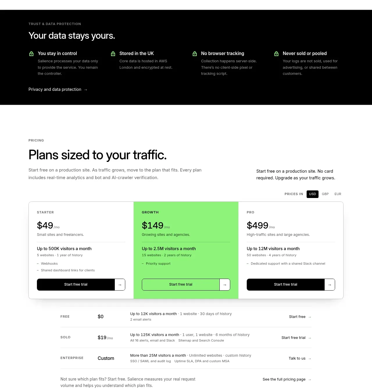
 Traffic-based pricing plans
Salience · Pricing table
Traffic-based pricing plans
Salience · Pricing table
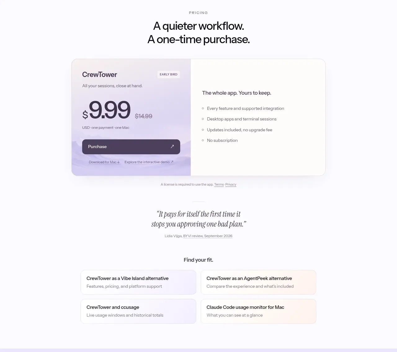
 One-time purchase pricing
CrewTower Mod for Claude Code · Pricing table
One-time purchase pricing
CrewTower Mod for Claude Code · Pricing table
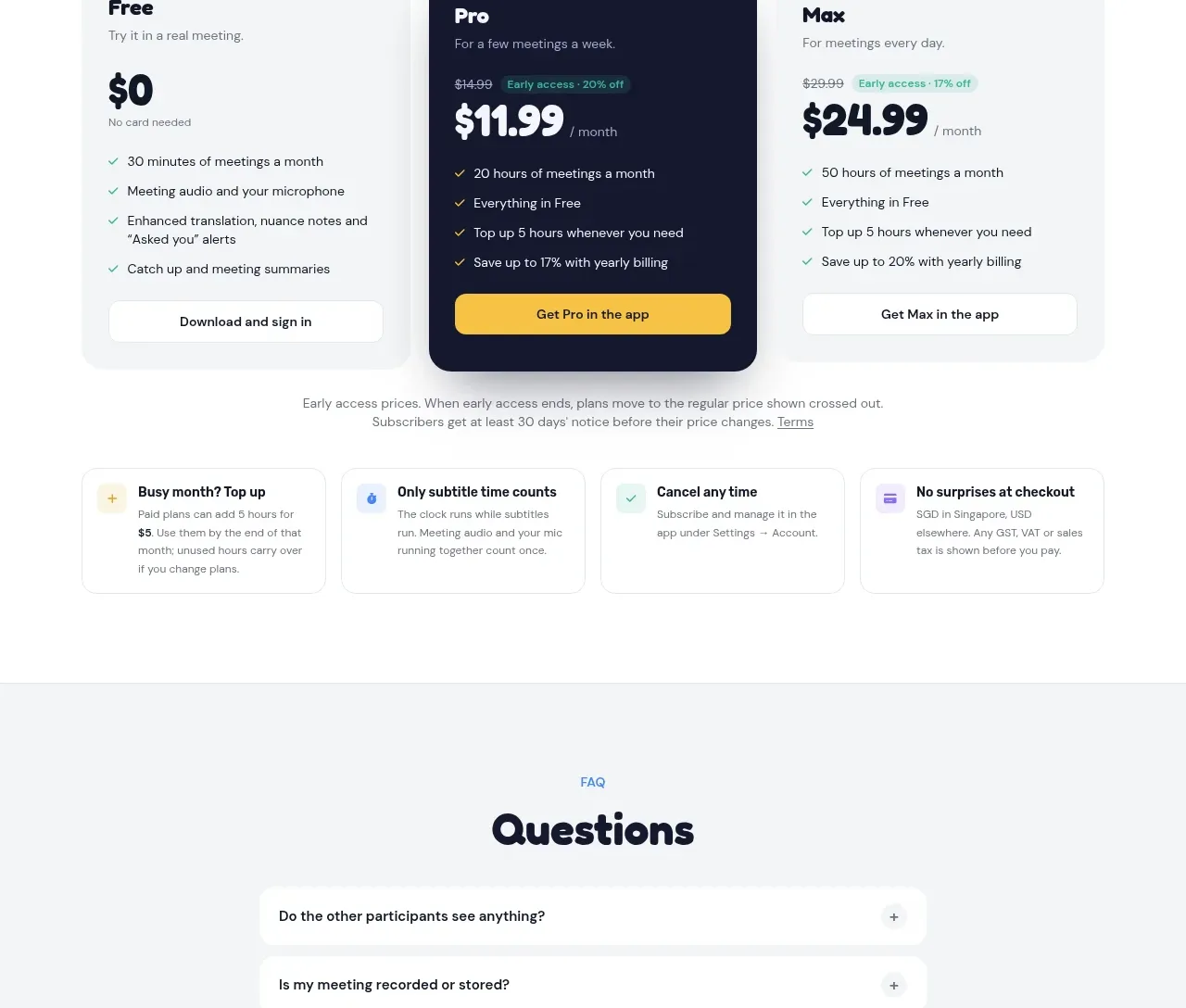
 Three-plan pricing
NANI??? · Pricing table
Three-plan pricing
NANI??? · Pricing table
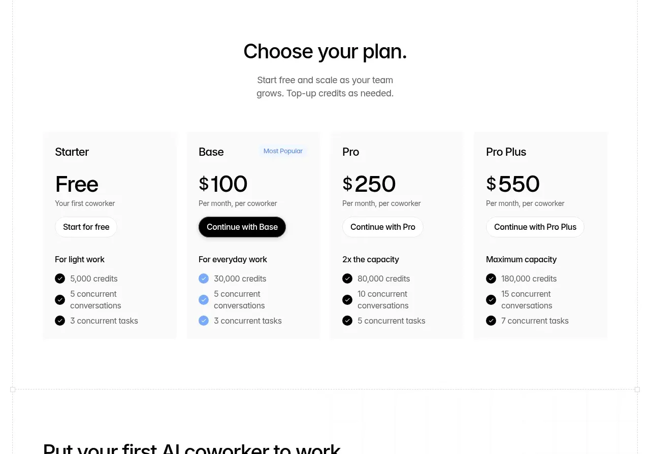
 Four-tier pricing table
Backdrop · Pricing table
Four-tier pricing table
Backdrop · Pricing table
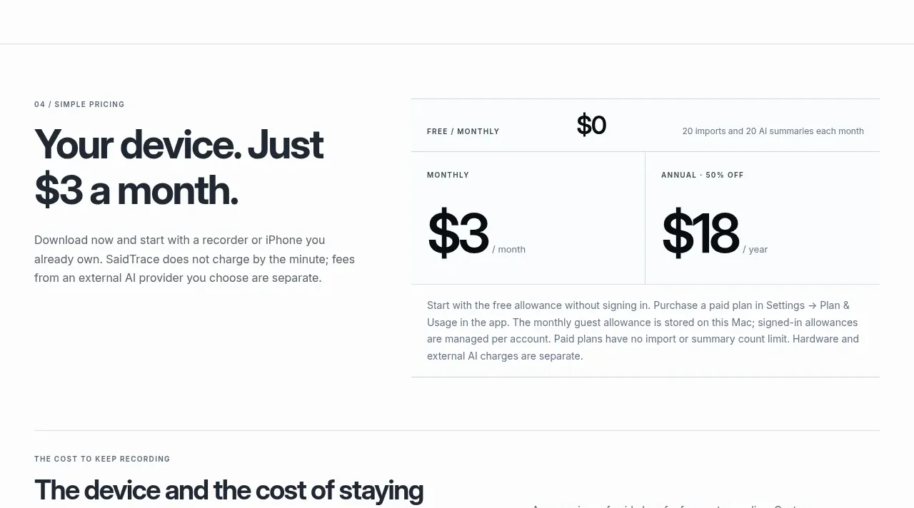
 Simple monthly pricing
SaidTrace · Pricing table
Simple monthly pricing
SaidTrace · Pricing table
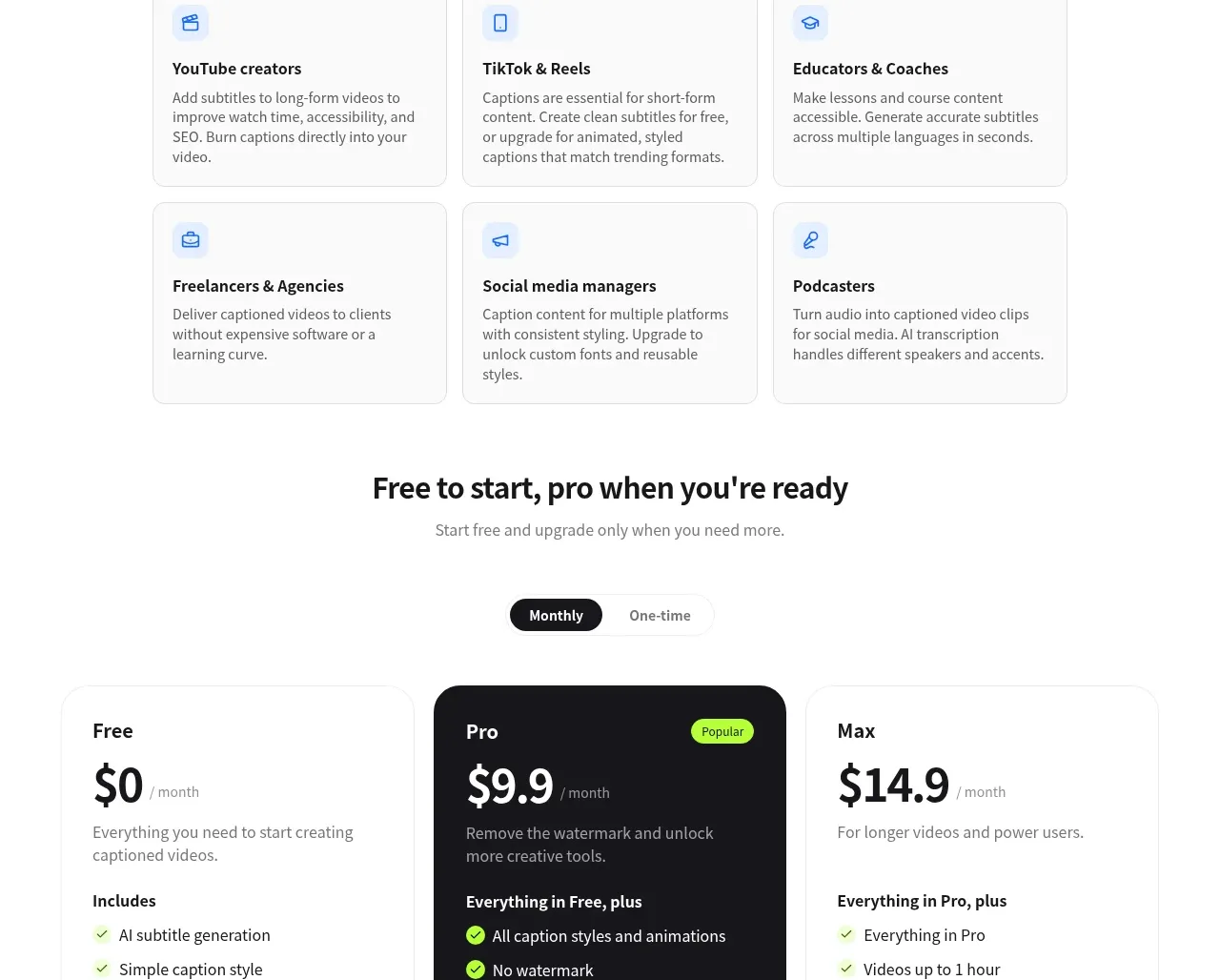
 Three-tier pricing
autocaptioner.com · Pricing table
Three-tier pricing
autocaptioner.com · Pricing table