 kage
kage
coretechlabs.co
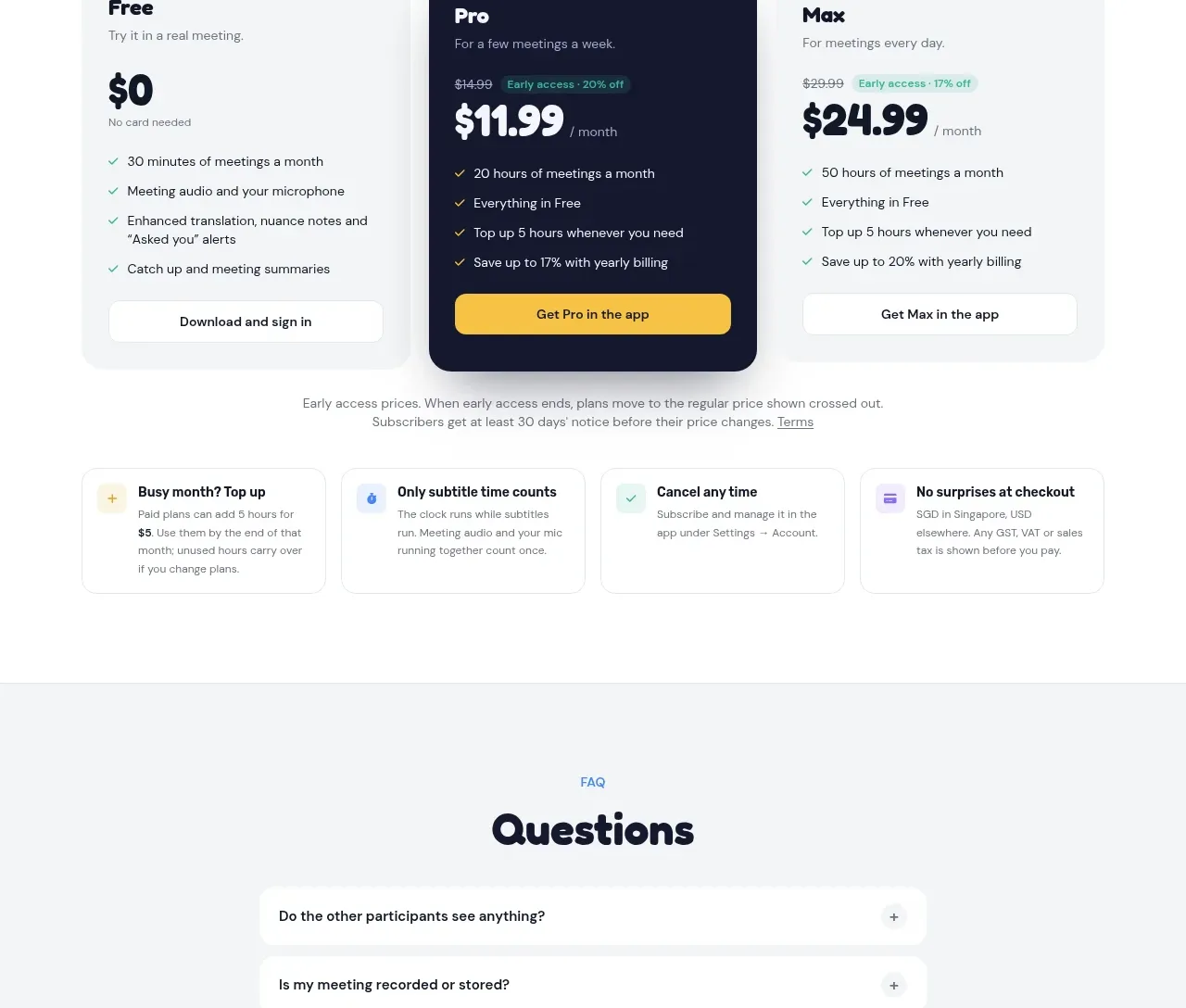
Design analysis
The pricing area makes plan comparison easy through a billing/currency toggle, three distinct cards, a highlighted recommended plan, and reassurance notes below.
Prompt preview
## Reference images

Study these alongside the description below: hierarchy, rhythm, spacing, colour. Build for the product you are asked about, using this design language.

- Component: https://kage-design-assets.t3.tigrisfiles.io/components/nani/f548445b-7dd2-48a7-847f-0684381711f2-1792217070-5.webp
- Full page it was cut from: https://kage-design-assets.t3.tigrisfiles.io/screenshots/nani/f548445b-7dd2-48a7-847f-0684381711f2-1792217012251-full.webp
- Component on Kage: https://kage.design/component/nani-pricing-table

## Before you start
Ask what the user's pricing model, limits, billing cadence, and preferred brand colors are. Then create an original pricing section using these principles.

Build a light pricing section with a centered eyebrow, a large display heading, supporting sentence, and compact segmented controls for billing cadence and currency. Below, place three equal pricing cards with clear plan names, descriptions, prices, billing suffixes, checkmarked benefits, and full-width actions. Make the middle plan visually dominant using a deep navy surface, a small floating recommendation badge, bright price/action accents, and light text; keep the other cards white or very pale gray. Add a short pricing disclaimer and a row of four compact reassurance cards beneath the main plans. Use #f7f8f9 backgrounds, #17192f text, muted gray copy, yellow #f5c33b for the featured action, green checks, 16–20px radii, subtle borders, and accessible focus states. The billing and currency controls should visibly update prices and remain keyboard accessible.

Never: reuse logos, product names, copy, illustrations, or imagery from the reference.
More components
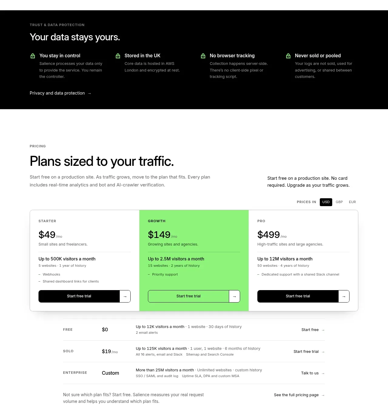
 Traffic-based pricing plans
Salience · Pricing table
Traffic-based pricing plans
Salience · Pricing table
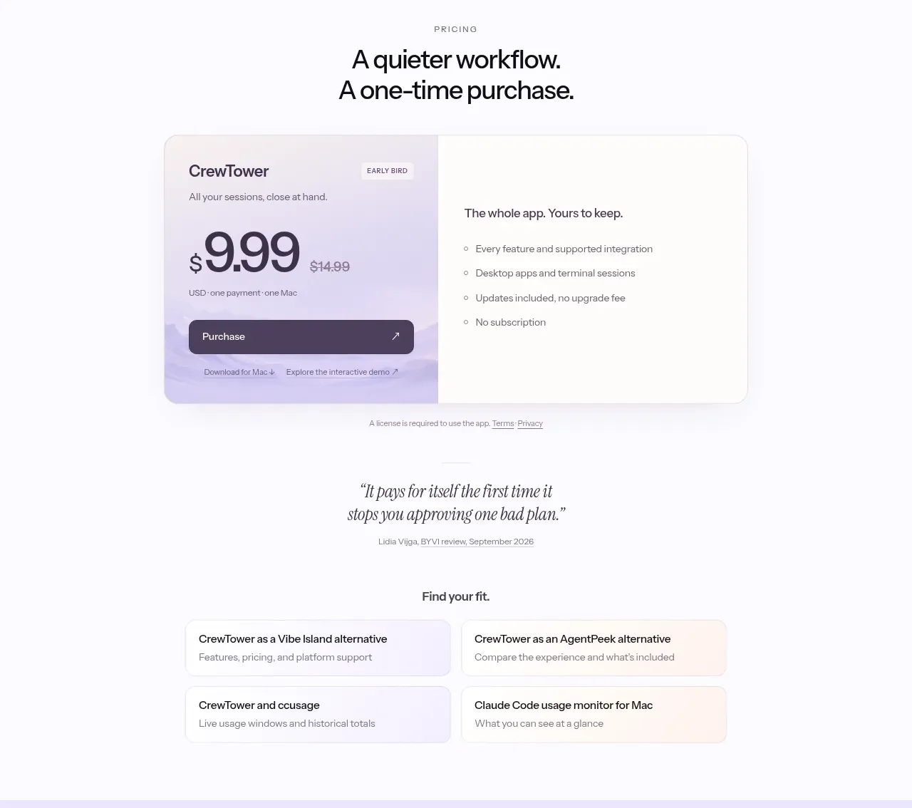
 One-time purchase pricing
CrewTower Mod for Claude Code · Pricing table
One-time purchase pricing
CrewTower Mod for Claude Code · Pricing table
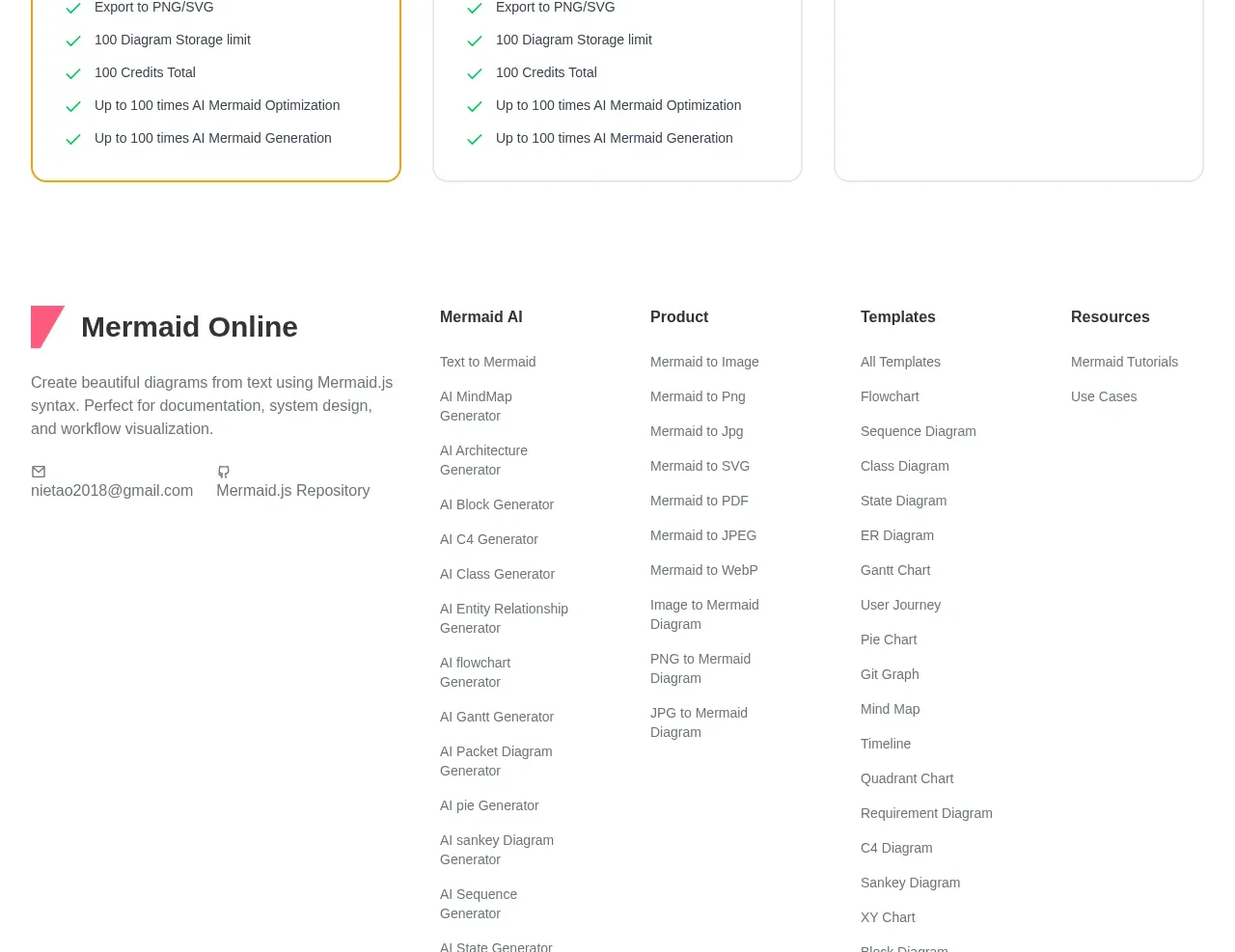
 Three-tier pricing plans
mermaidonline.live · Pricing table
Three-tier pricing plans
mermaidonline.live · Pricing table
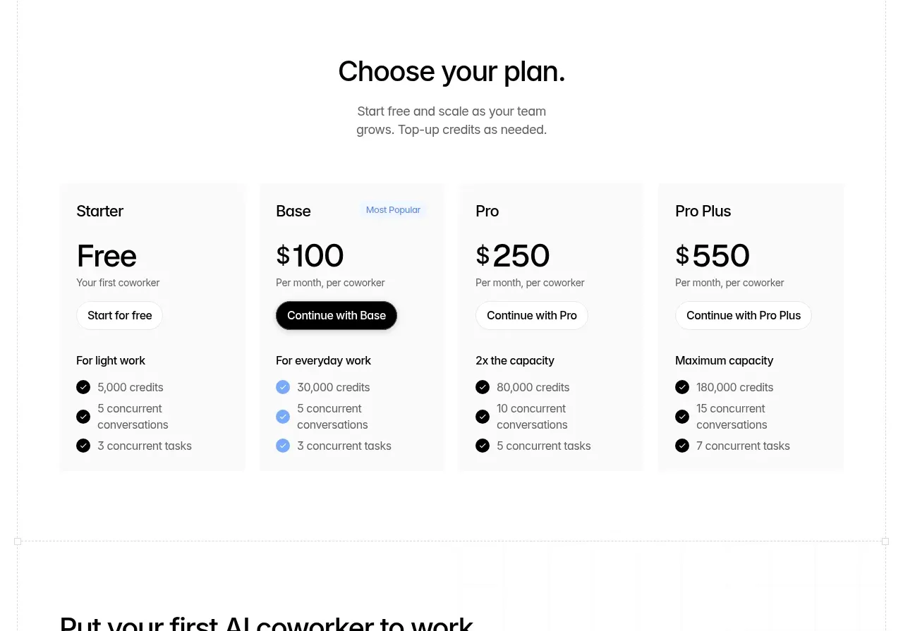
 Four-tier pricing table
Backdrop · Pricing table
Four-tier pricing table
Backdrop · Pricing table
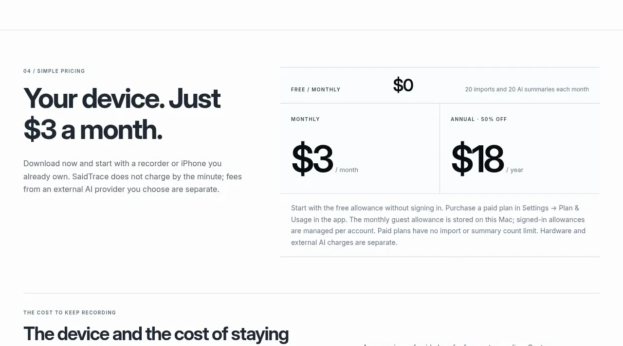
 Simple monthly pricing
SaidTrace · Pricing table
Simple monthly pricing
SaidTrace · Pricing table
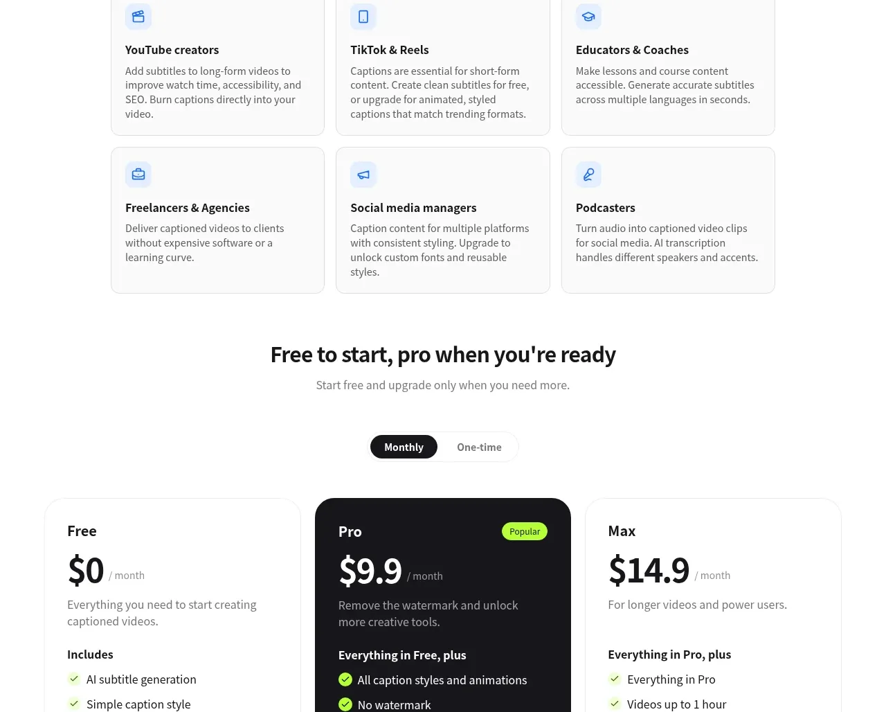
 Three-tier pricing
autocaptioner.com · Pricing table
Three-tier pricing
autocaptioner.com · Pricing table