 kage
kage
crewtower.app
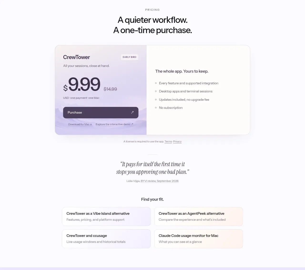
Design analysis
The pricing area makes the commercial model immediately clear with a single highlighted offer, a prominent price, a purchase button, included-benefit bullets, and reassurance about updates and licensing.
Prompt preview
## Reference images

Study these alongside the description below: hierarchy, rhythm, spacing, colour. Build for the product you are asked about, using this design language.

- Component: https://kage-design-assets.t3.tigrisfiles.io/components/crewtower-mod-for-claude-code/6a95b5f4-2bf6-41f9-aa93-70409ededf43-1792303420-4.webp
- Full page it was cut from: https://kage-design-assets.t3.tigrisfiles.io/screenshots/crewtower-mod-for-claude-code/6a95b5f4-2bf6-41f9-aa93-70409ededf43-1792303277739-full.webp
- Component on Kage: https://kage.design/component/crewtower-mod-for-claude-code-pricing-table

## Before you start
Ask what the user's pricing model, currency, offer structure, and most important purchase objection are. Build the pricing experience around those answers.

Create a centered pricing section on a warm off-white background. Use a small uppercase eyebrow and a two-line headline that communicates simplicity. Place one wide split card beneath it: a lightly tinted left panel with plan label, optional badge, large price, billing qualifier, and a dark full-width purchase button; and a white right panel with a short value statement and 3–5 checkmarked benefits. Use #f7f5f3, #eee9ff, #242033, and a restrained accent such as #8e83cb. Give the card a 16–20px radius, 1px #e5e1e8 border, soft shadow, and 32–40px internal padding. Add small legal/license links below. If there are alternatives, present them as quiet secondary cards rather than competing with the primary offer.

Never use logos, product names, copy, illustrations, or imagery from the reference.
More components
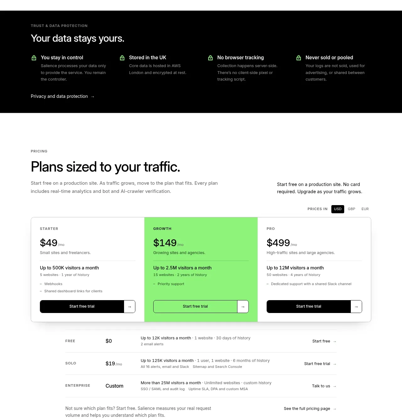
 Traffic-based pricing plans
Salience · Pricing table
Traffic-based pricing plans
Salience · Pricing table
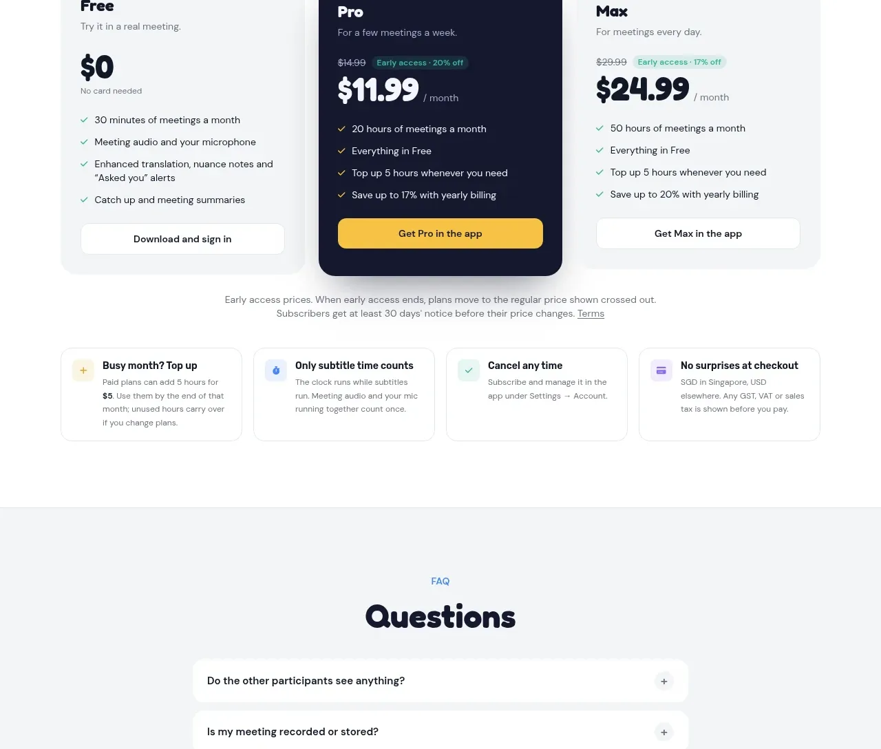
 Three-plan pricing
NANI??? · Pricing table
Three-plan pricing
NANI??? · Pricing table
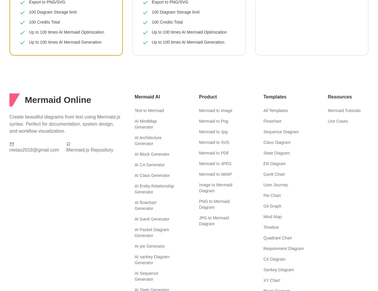
 Three-tier pricing plans
mermaidonline.live · Pricing table
Three-tier pricing plans
mermaidonline.live · Pricing table
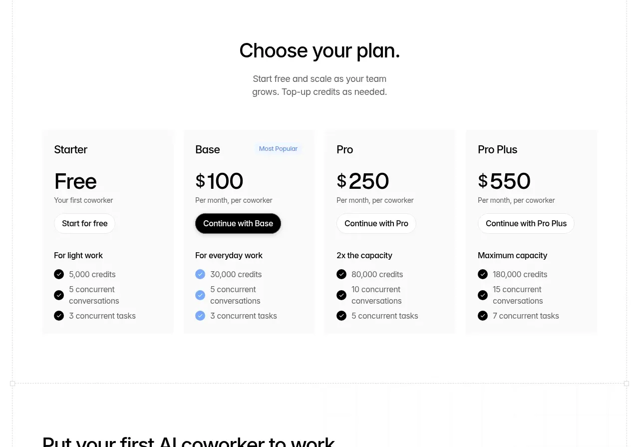
 Four-tier pricing table
Backdrop · Pricing table
Four-tier pricing table
Backdrop · Pricing table
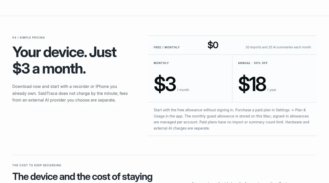
 Simple monthly pricing
SaidTrace · Pricing table
Simple monthly pricing
SaidTrace · Pricing table
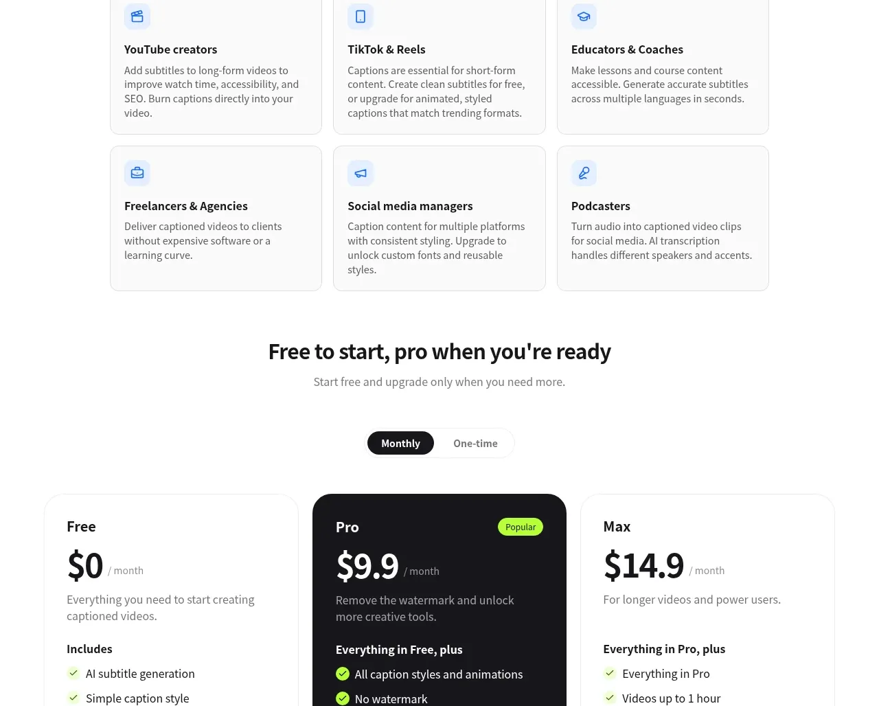
 Three-tier pricing
autocaptioner.com · Pricing table
Three-tier pricing
autocaptioner.com · Pricing table