 kage
kage
saidtrace.com
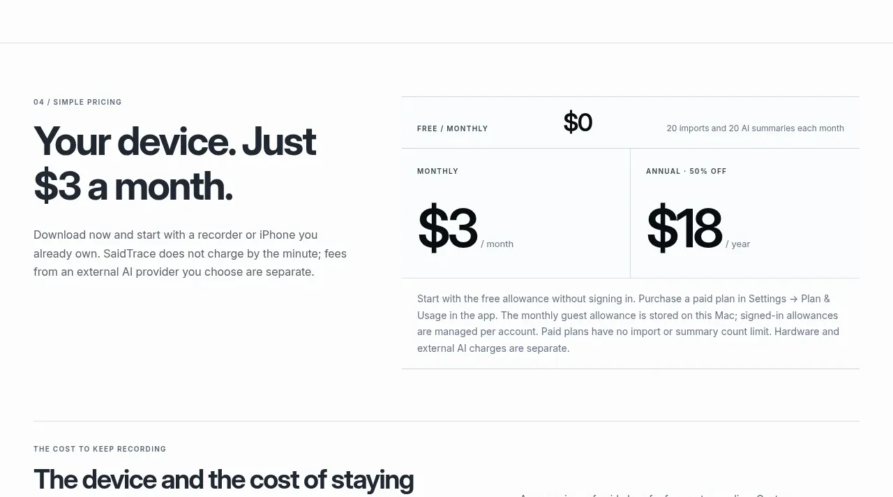
Design analysis
The pricing block leads with a plain-language price promise and places a compact free/monthly/annual structure beside it, avoiding a crowded multi-card layout.
Prompt preview
## Reference images

Study these alongside the description below: hierarchy, rhythm, spacing, colour. Build for the product you are asked about, using this design language.

- Component: https://kage-design-assets.t3.tigrisfiles.io/components/saidtrace/da2a1190-1b0d-4dc6-9c61-691af1a5c9a8-1792130575-4.webp
- Full page it was cut from: https://kage-design-assets.t3.tigrisfiles.io/screenshots/saidtrace/da2a1190-1b0d-4dc6-9c61-691af1a5c9a8-1792130502177-full.webp
- Component on Kage: https://kage.design/component/saidtrace-pricing-table

## Before you start
Ask what the user's product and brand are, then apply the principles below to that product rather than copying the reference.

Build a simple pricing section with a large left-side value statement and a right-side pricing module. Include a free allowance row, then monthly and annual options with large prices, billing units, and a small savings label. Prefer a clean table-like arrangement over several marketing cards. Use #fbfbfa, dark #171b20 numerals, muted #697178, and a single accent for the recommended choice. Separate rows and columns with #dfe3e5 rules, use 0–10px radii, 32–48px cell padding, and make the price numerals 42–58px with tight tracking. Add concise footnotes beneath the prices explaining limits and billing. Make the module horizontally scrollable or stack into rows on small screens, with an obvious selected state and accessible controls if a toggle is included.

Never use the reference's logo, product name, copy, illustrations, or imagery.
More components
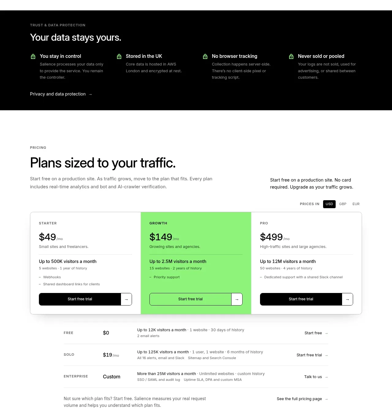
 Traffic-based pricing plans
Salience · Pricing table
Traffic-based pricing plans
Salience · Pricing table
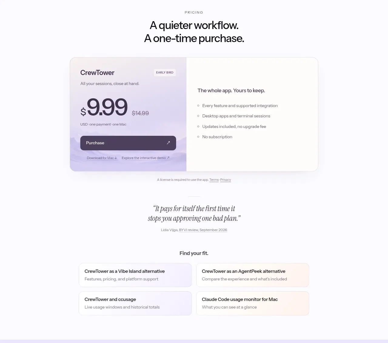
 One-time purchase pricing
CrewTower Mod for Claude Code · Pricing table
One-time purchase pricing
CrewTower Mod for Claude Code · Pricing table
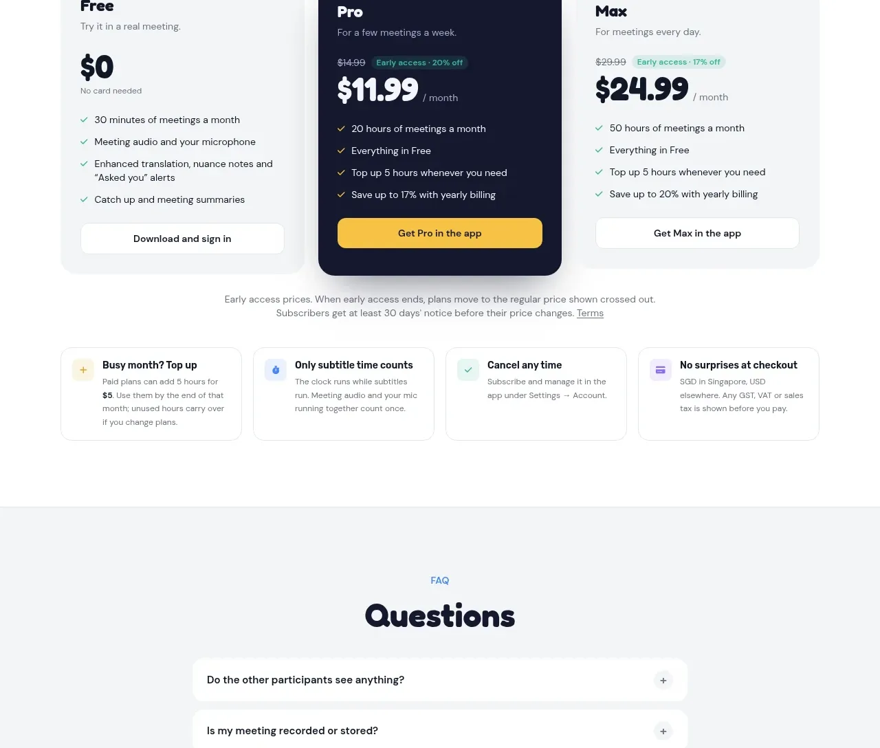
 Three-plan pricing
NANI??? · Pricing table
Three-plan pricing
NANI??? · Pricing table
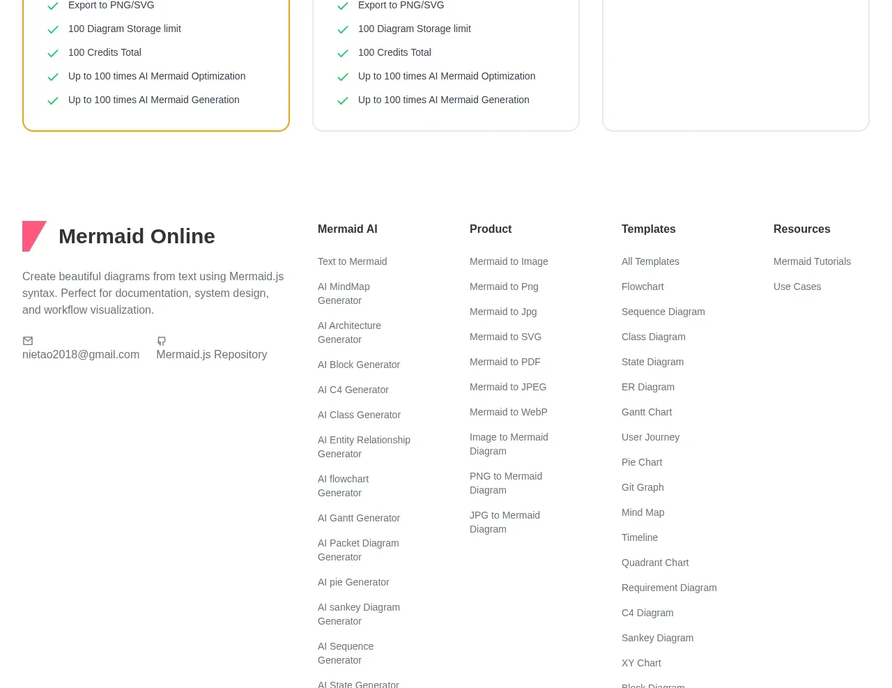
 Three-tier pricing plans
mermaidonline.live · Pricing table
Three-tier pricing plans
mermaidonline.live · Pricing table
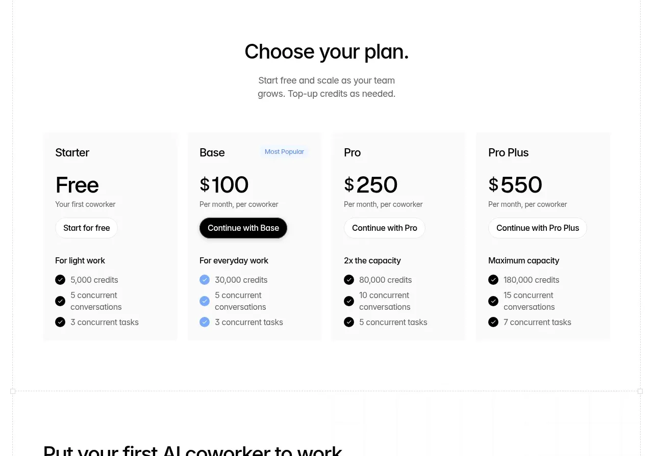
 Four-tier pricing table
Backdrop · Pricing table
Four-tier pricing table
Backdrop · Pricing table
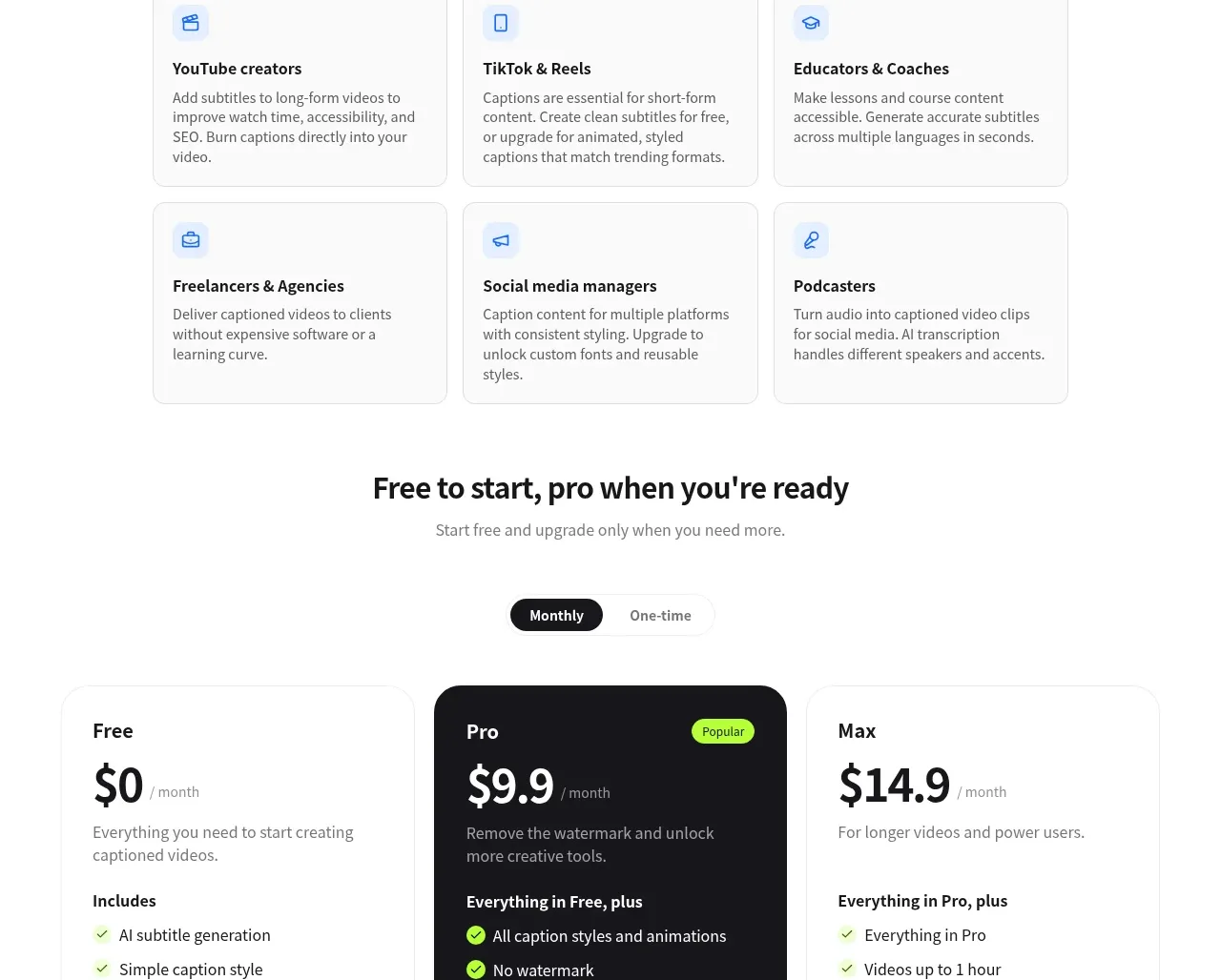
 Three-tier pricing
autocaptioner.com · Pricing table
Three-tier pricing
autocaptioner.com · Pricing table