 kage
kage
base44.com
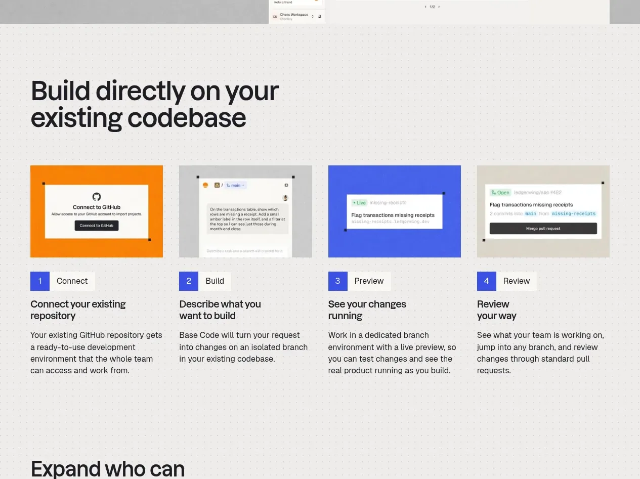
Design analysis
Four evenly weighted steps explain the product journey from connecting a repository through building, previewing, and reviewing, with numbered labels, visuals, and concise copy.
Prompt preview
## Reference images

Study these alongside the description below: hierarchy, rhythm, spacing, colour. Build for the product you are asked about, using this design language.

- Component: https://kage-design-assets.t3.tigrisfiles.io/components/base-code/bec5af88-964e-4f0a-90b9-76aa2444b6f5-1791871471-4.webp
- Full page it was cut from: https://kage-design-assets.t3.tigrisfiles.io/screenshots/base-code/bec5af88-964e-4f0a-90b9-76aa2444b6f5-1791871315791-full.webp
- Component on Kage: https://kage.design/component/base-code-feature-grid-3

## Before you start
Ask what the user's product journey is, what the key stages are, and how its brand should look. Translate that journey into an original process section.

Build a four-column process grid titled with a concise workflow promise. Each item should contain a consistent visual panel, a small coloured number badge, a short stage title, and a compact explanation. Align all image panels to one height and all text blocks to a shared baseline where possible. Use an off-white background with a faint grid or dot texture, cobalt or brand-colour number badges around `#3f55d9`, neutral image placeholders, thin spacing-driven separation, and modest corner radii. On smaller screens turn the grid into a horizontal scroll or a single-column sequence while preserving numbering and progress. Avoid excessive card chrome; the rhythm should come from alignment and repetition.

Never use logos, product names, copy, illustrations, or imagery from the reference.
More components
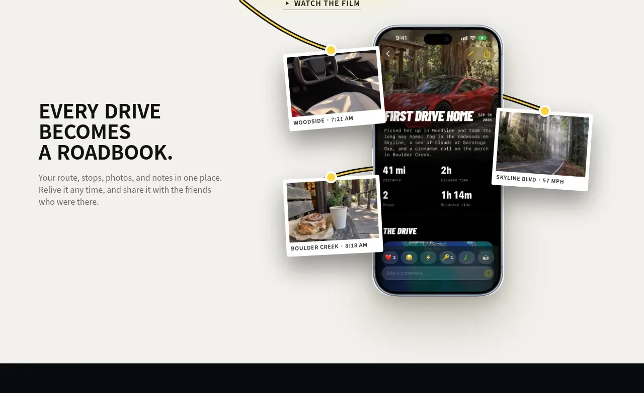
 Roadbook feature story
Milepost · Feature grid
Roadbook feature story
Milepost · Feature grid
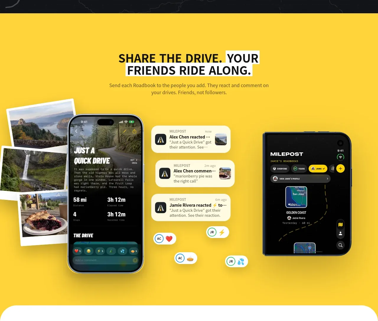 Shared drive feature
Milepost · Feature grid
Shared drive feature
Milepost · Feature grid
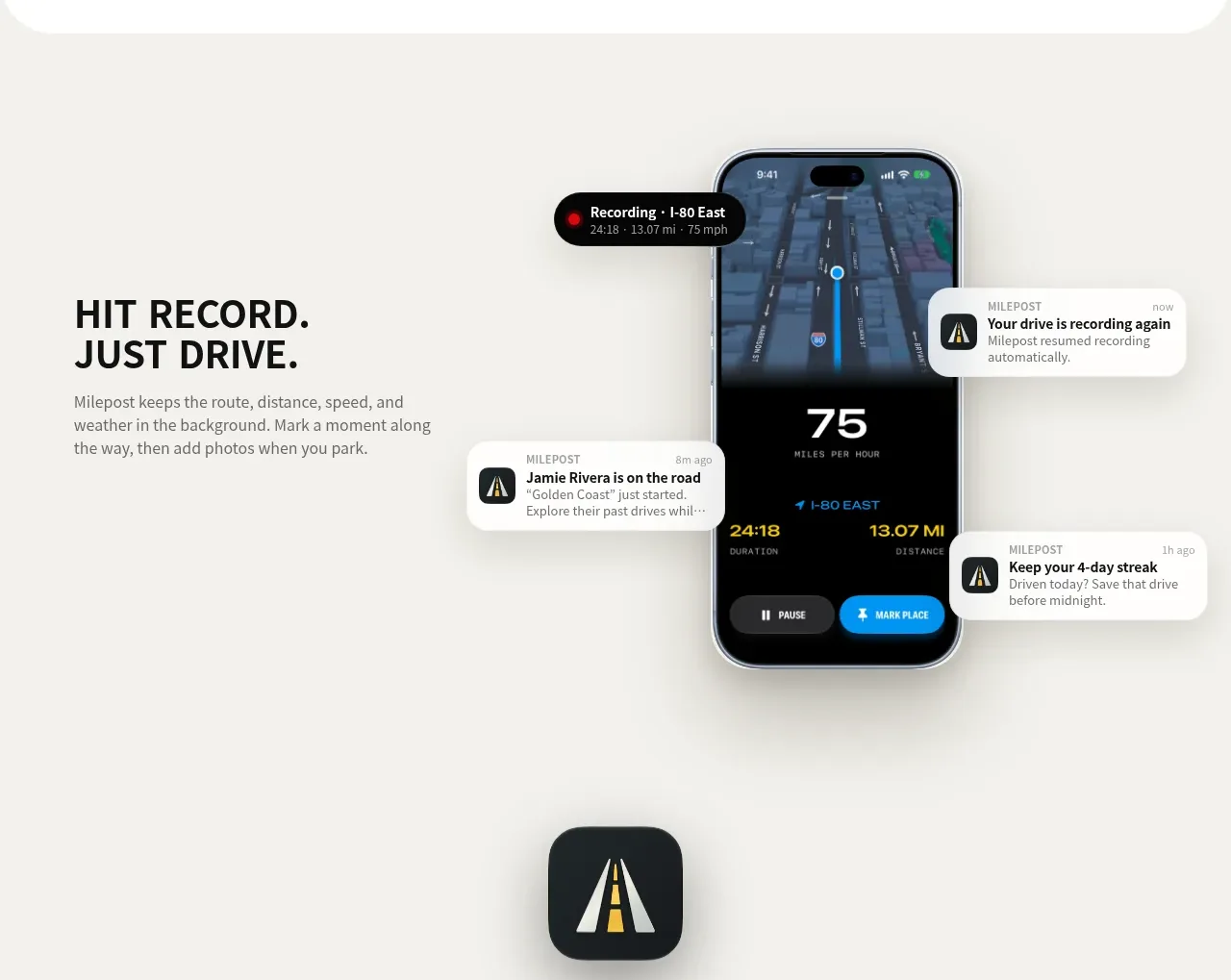 Automatic recording feature
Milepost · Feature grid
Automatic recording feature
Milepost · Feature grid
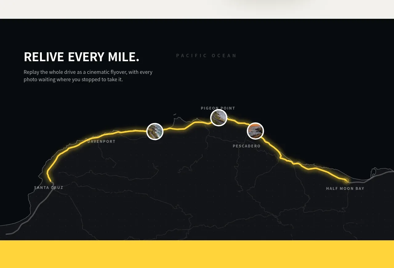 Route replay map feature
Milepost · Feature grid
Route replay map feature
Milepost · Feature grid
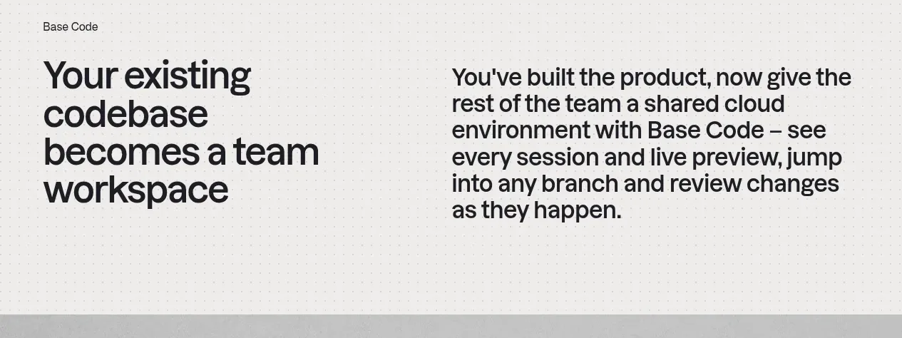
 From codebase to team workspace
Base Code · Feature grid
From codebase to team workspace
Base Code · Feature grid
 Cross-functional collaboration accordion
Base Code · Feature grid
Cross-functional collaboration accordion
Base Code · Feature grid