kage
kage
capacity.so
Design analysis
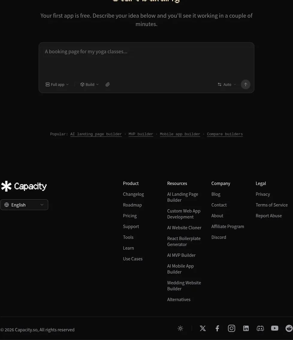
The footer closes with a compact brand/language area, multi-column resource navigation, and a separated legal/social bar.
Prompt preview
## Reference images

Study these alongside the description below: hierarchy, rhythm, spacing, colour. Build for the product you are asked about, using this design language.

- Component: https://kage-design-assets.t3.tigrisfiles.io/components/capacity-so/08f2bf80-ea5b-4604-8f5e-193c94acfc56-1791551997-10.webp
- Full page it was cut from: https://kage-design-assets.t3.tigrisfiles.io/screenshots/capacity-so/08f2bf80-ea5b-4604-8f5e-193c94acfc56-1791551914192-full.webp
- Component on Kage: https://kage.design/component/capacity-footer

## Before you start
Ask for the user's real navigation taxonomy, legal requirements, supported languages, and social channels. Then build a footer that reflects their product and brand.

Create a spacious dark footer inside a centered max-width container. Put the brand and language selector on the left, then organize useful links into three or four labeled columns such as product, resources, company, and legal. Finish with a thin divider and a bottom row containing copyright, theme or utility controls, and social links. Use 12–14px muted gray labels, 16px column headings, warm white brand text, subtle borders #ffffff12, and generous vertical spacing. Make the language selector, links, and social icons keyboard accessible; collapse columns into accordions on small screens.

**Never:** use logos, product names, copy, illustrations, or imagery from the reference.