 kage
kage
capacity.so
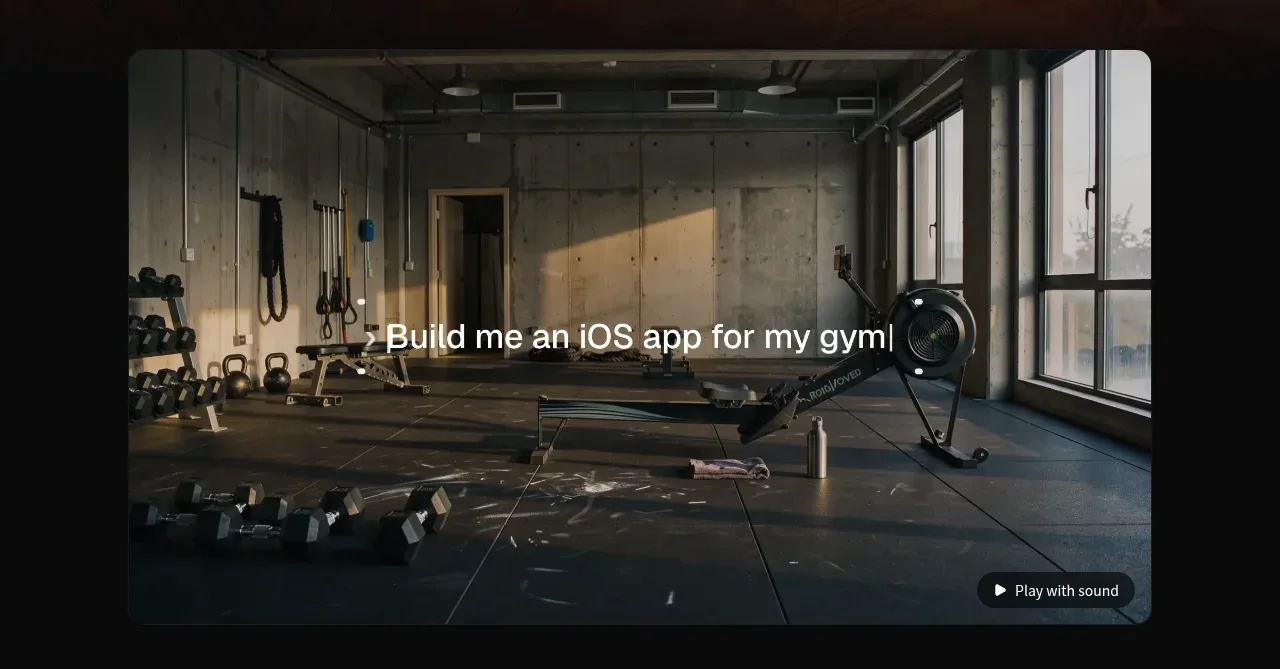
Design analysis
A large rounded media panel demonstrates the generated product in context, with a centered overlaid title and a small play-with-sound control.
Prompt preview
## Reference images

Study these alongside the description below: hierarchy, rhythm, spacing, colour. Build for the product you are asked about, using this design language.

- Component: https://kage-design-assets.t3.tigrisfiles.io/components/capacity-so/08f2bf80-ea5b-4604-8f5e-193c94acfc56-1791551994-2.webp
- Full page it was cut from: https://kage-design-assets.t3.tigrisfiles.io/screenshots/capacity-so/08f2bf80-ea5b-4604-8f5e-193c94acfc56-1791551914192-full.webp
- Component on Kage: https://kage.design/component/capacity-gallery

## Before you start
Ask what kind of product demonstration best communicates the user's value and what visual language their brand uses. Apply the principles below to create an original version.

Build a wide, centered demonstration media section with a 16:9-ish rounded video or image panel. Use an original product-relevant visual, darkened enough for readable overlay text. Center a concise outcome-oriented title over the media, and place a small unobtrusive play/audio control in the lower-right corner. Keep the panel max-width around 720px on this canvas, use 14–16px corner radius, overflow hidden, subtle shadow, and generous vertical separation from neighboring content. Support poster image, play/pause, mute, captions, and accessible labels.

**Never:** use logos, product names, copy, illustrations, or imagery from the reference.
More components
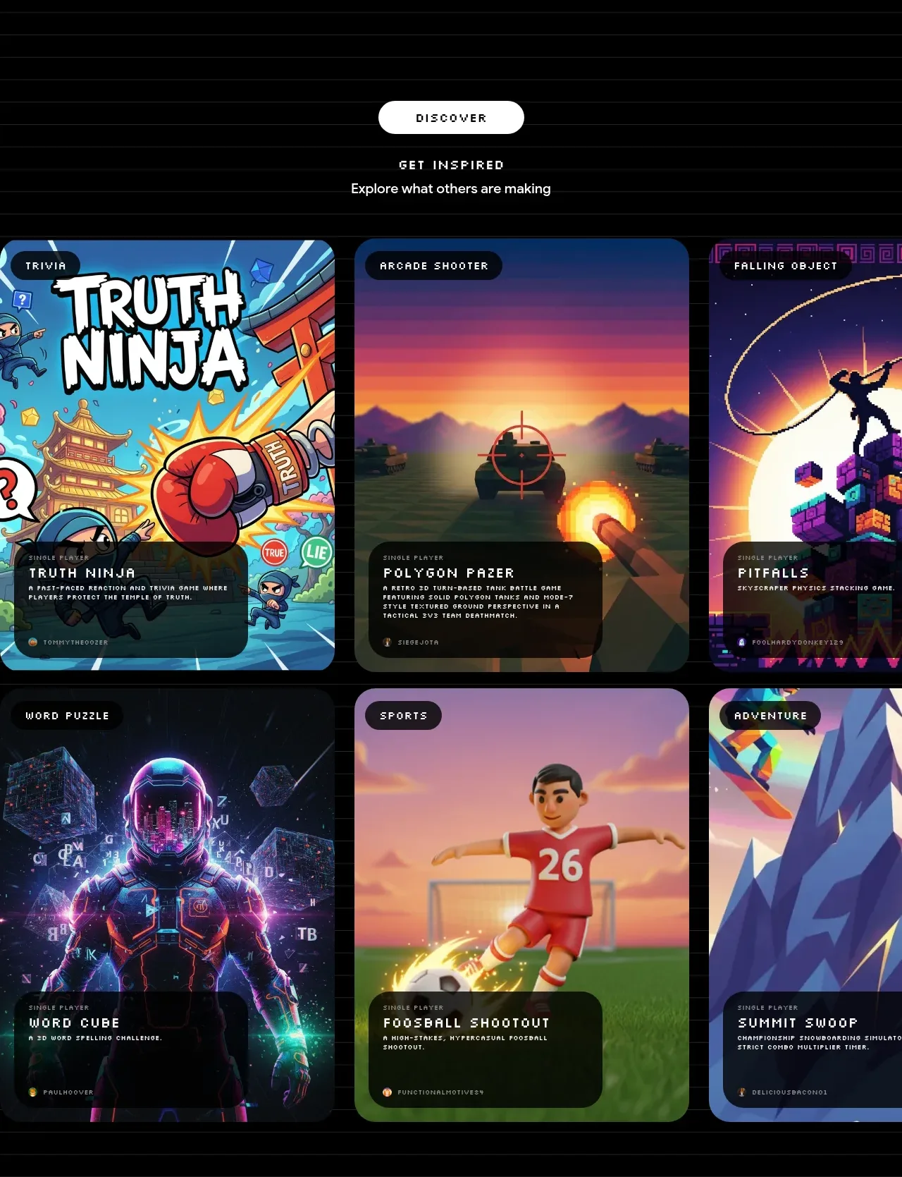
 Discover inspiration gallery
Playground by Google Labs · Gallery
Discover inspiration gallery
Playground by Google Labs · Gallery
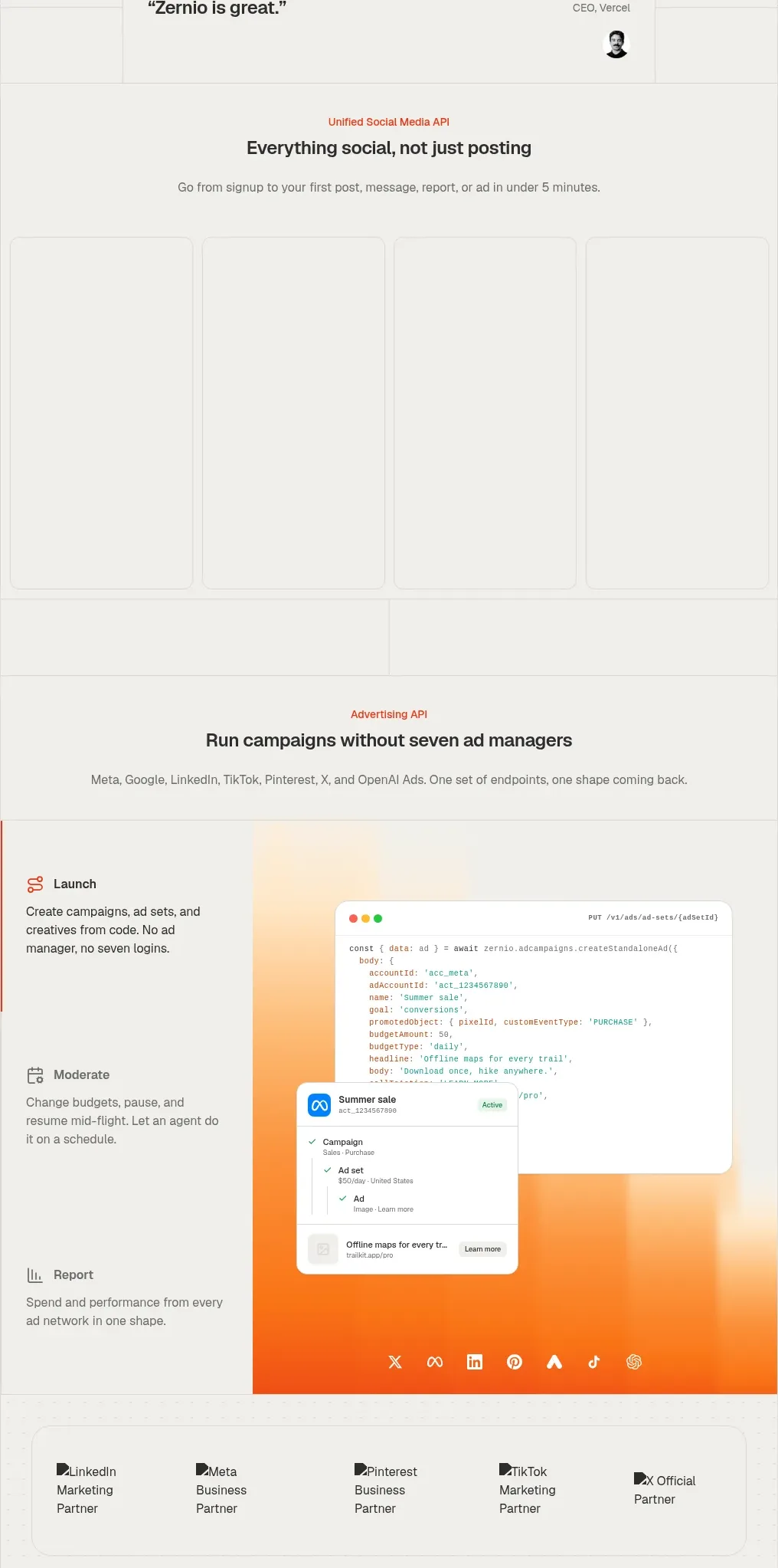
 Social media campaign API showcase
Zernio · Gallery
Social media campaign API showcase
Zernio · Gallery
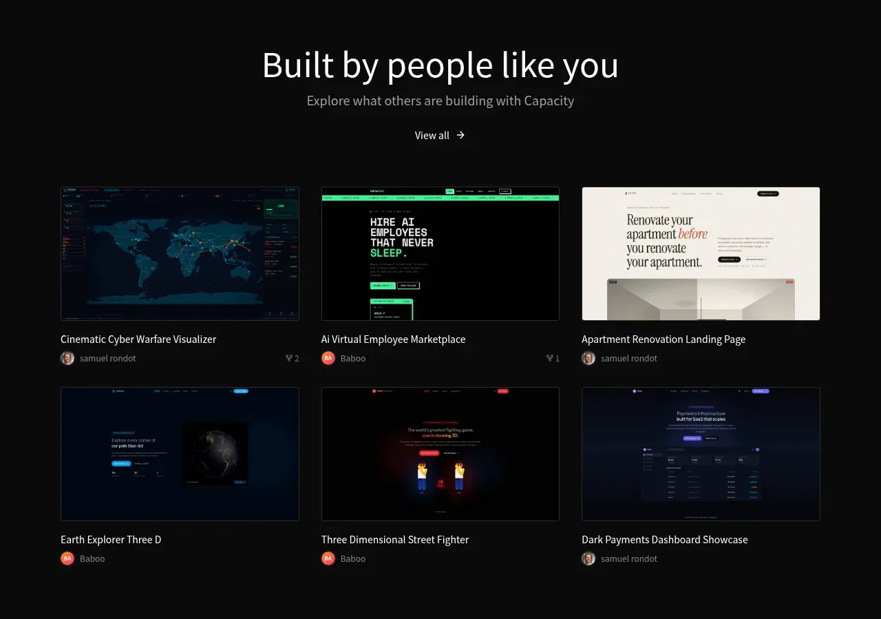
 Community project gallery
capacity.so · Gallery
Community project gallery
capacity.so · Gallery
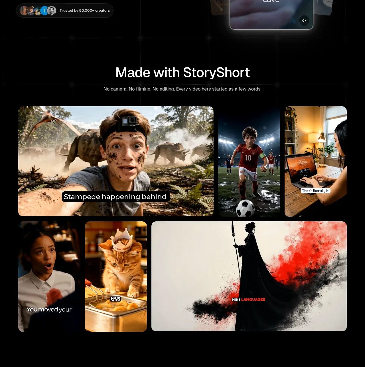
 Made-with showcase gallery
storyshort.ai · Gallery
Made-with showcase gallery
storyshort.ai · Gallery
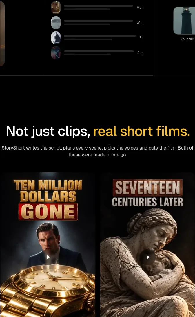 Short-film examples
storyshort.ai · Gallery
Short-film examples
storyshort.ai · Gallery
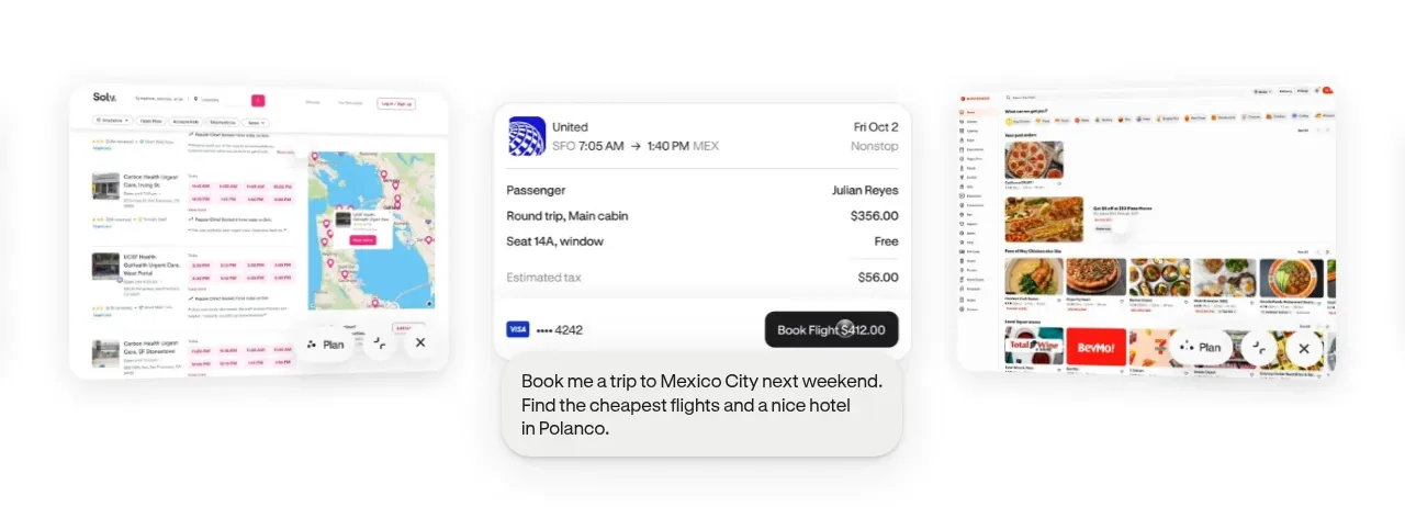
 Product-in-context showcase
Hark · Gallery
Product-in-context showcase
Hark · Gallery