 kage
kage
storyshort.ai

Design analysis
A centered showcase section uses a short heading and supporting line above an asymmetrical collage of vertical and wide video examples, making the output feel varied and tangible.
Prompt preview
## Reference images

Study these alongside the description below: hierarchy, rhythm, spacing, colour. Build for the product you are asked about, using this design language.

- Component: https://kage-design-assets.t3.tigrisfiles.io/components/storyshort-ai/c734da75-ded5-4c81-9b78-0aa9ae185a47-1791551951-2.webp
- Full page it was cut from: https://kage-design-assets.t3.tigrisfiles.io/screenshots/storyshort-ai/c734da75-ded5-4c81-9b78-0aa9ae185a47-1791551915904-full.webp
- Component on Kage: https://kage.design/component/storyshort-gallery

## Before you start
Ask what kinds of artifacts the user's product creates and which examples best prove its value. Ask about brand colors and whether the examples should feel editorial, playful, or technical.

Build a dark gallery section with a centered heading around 32–40px and a restrained supporting sentence in muted gray. Below it, create an editorial collage rather than a regular card grid: mix wide landscape tiles with narrow portrait tiles, use varied spans, and preserve consistent 10–14px rounded corners. Let media touch or nearly touch in a carefully aligned mosaic, with captions overlaid in small high-contrast labels where useful. Use black negative space around the gallery, thin subtle borders (#242424), and gentle hover scale or playback affordances. The section should feel like proof of breadth, not a stock-photo gallery.

Never: use the reference's logo, product name, copy, illustrations, imagery, or exact gallery arrangement.
More components
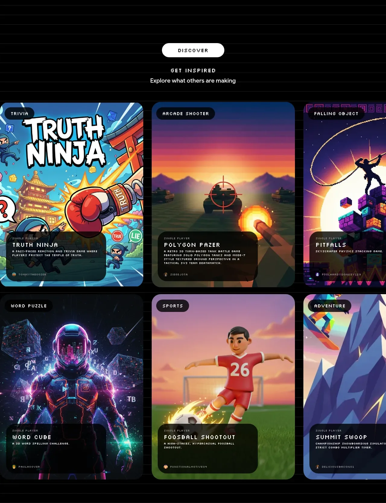
 Discover inspiration gallery
Playground by Google Labs · Gallery
Discover inspiration gallery
Playground by Google Labs · Gallery
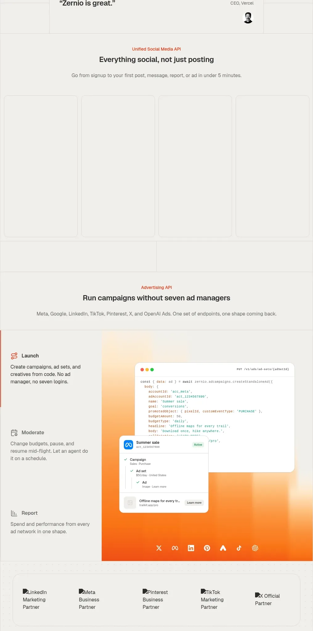
 Social media campaign API showcase
Zernio · Gallery
Social media campaign API showcase
Zernio · Gallery
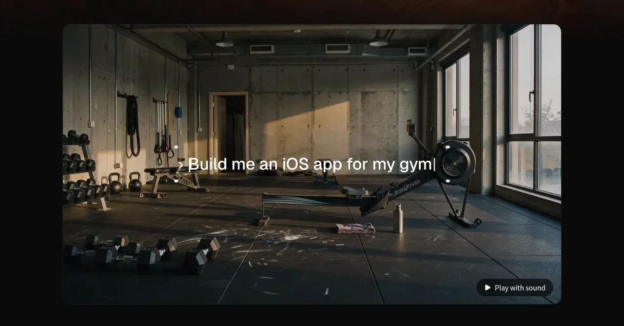
 Product demonstration media
capacity.so · Gallery
Product demonstration media
capacity.so · Gallery
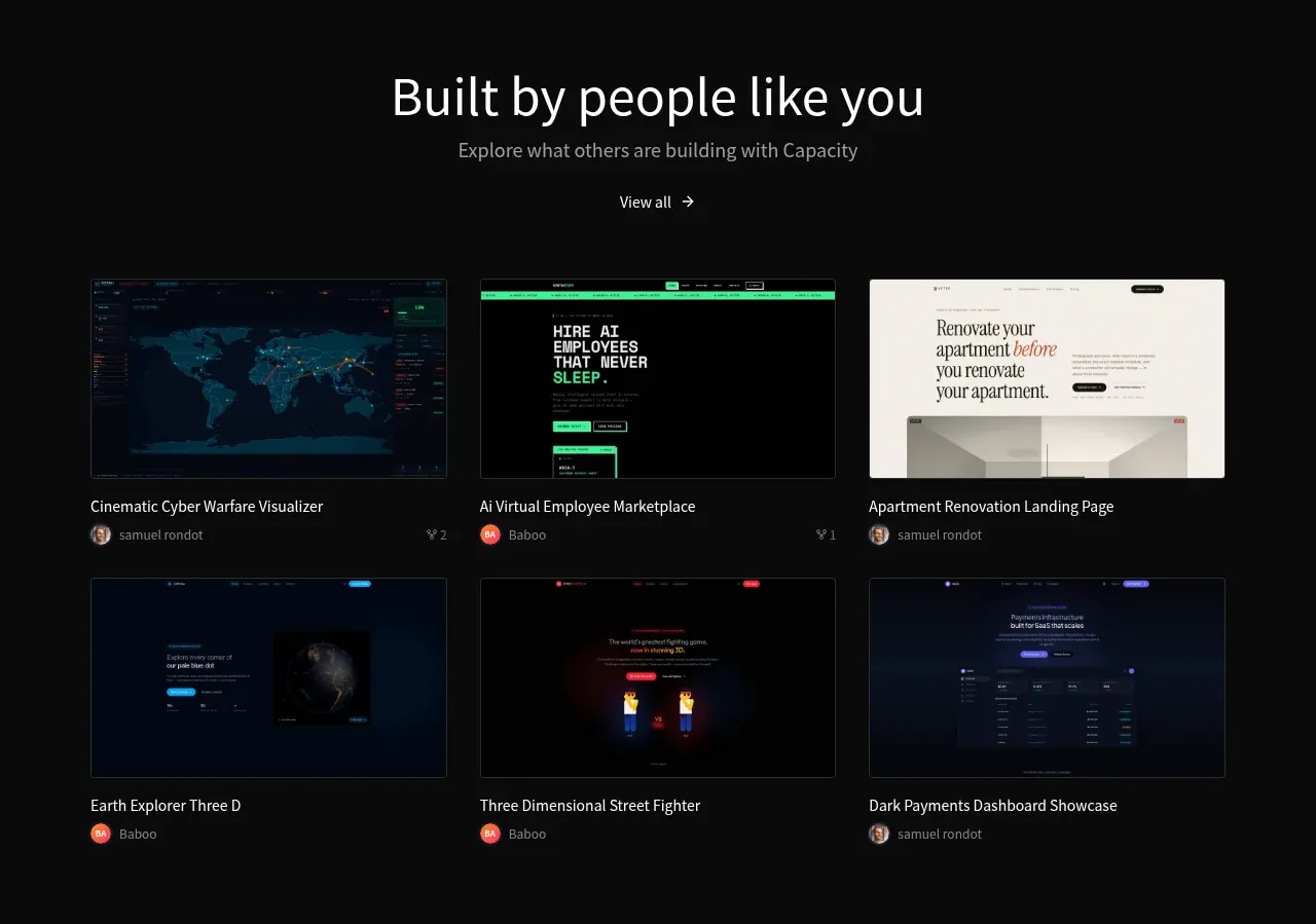 Community project gallery
capacity.so · Gallery
Community project gallery
capacity.so · Gallery

 Short-film examples
storyshort.ai · Gallery
Short-film examples
storyshort.ai · Gallery
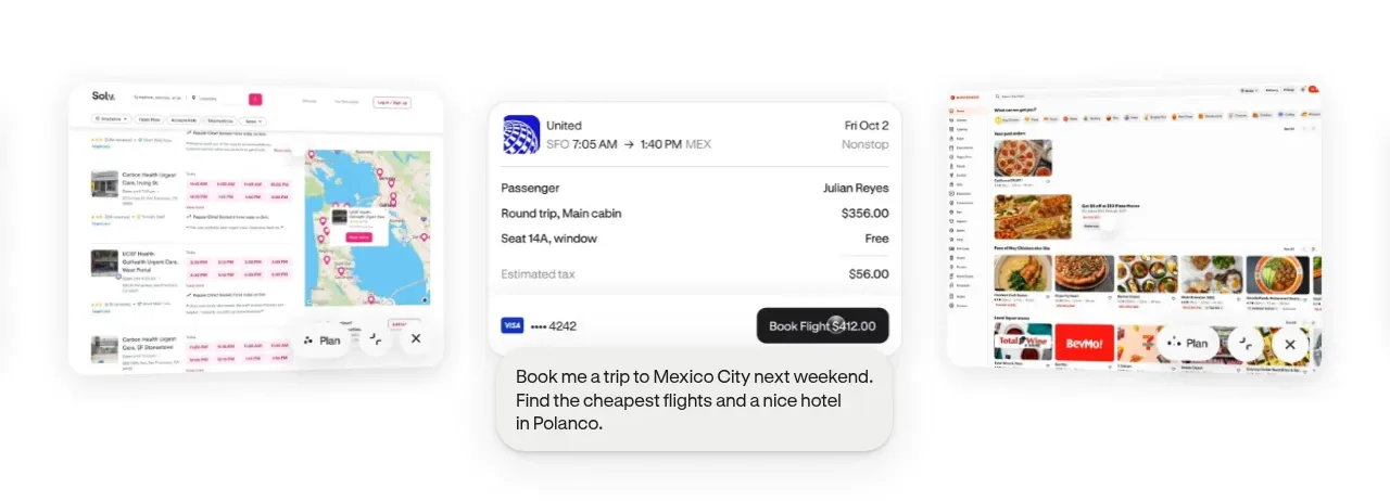
 Product-in-context showcase
Hark · Gallery
Product-in-context showcase
Hark · Gallery