kage
kage
labs.google
Design analysis
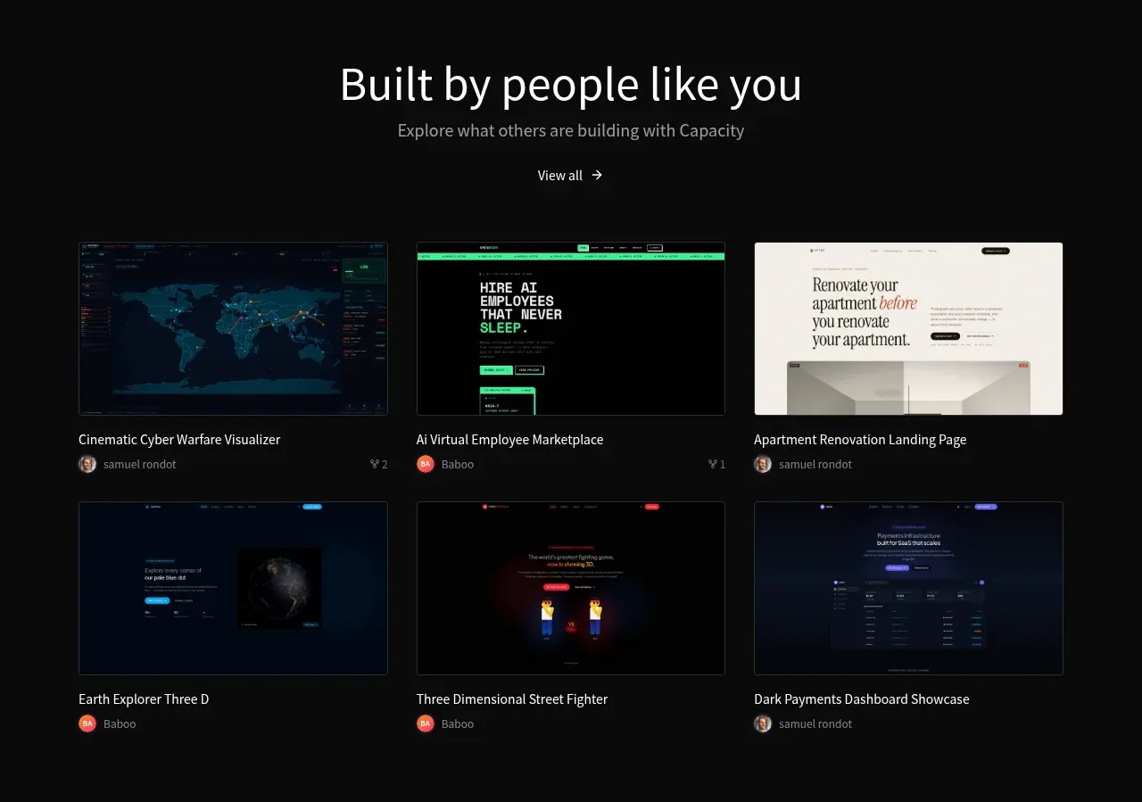
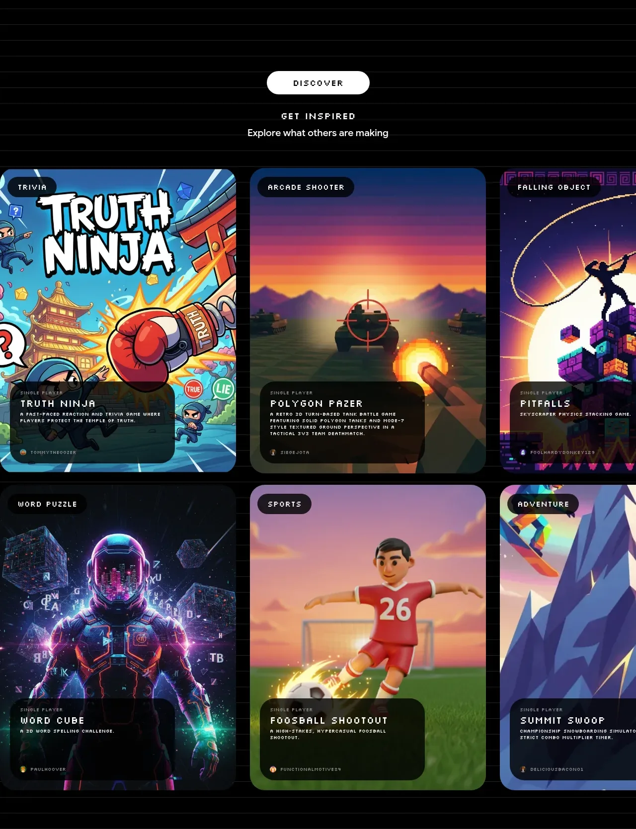
A centered discovery heading introduces a dense two-row gallery of large, rounded game cards with category chips and dark information overlays.
Prompt preview
## Reference images

Study these alongside the description below: hierarchy, rhythm, spacing, colour. Build for the product you are asked about, using this design language.

- Component: https://kage-design-assets.t3.tigrisfiles.io/components/playground-by-google-labs/93d2afab-1def-4986-9178-dd9a071e412b-1791612310-5.webp
- Full page it was cut from: https://kage-design-assets.t3.tigrisfiles.io/screenshots/playground-by-google-labs/93d2afab-1def-4986-9178-dd9a071e412b-1791612198337-full.webp
- Component on Kage: https://kage.design/component/playground-by-google-labs-gallery

## Before you start
Ask what users should discover in the product and what metadata each gallery item needs. Apply the principles below to that product rather than copying the reference.

Create a discovery gallery with a centered pill CTA or section label, an eyebrow/title, and a short subtitle above a responsive card grid. Use three columns on desktop, two on tablet, and one on mobile. Cards should be tall visual tiles with large rounded corners around 24–32px, a category chip near the top, and a bottom-aligned translucent dark information panel. Preserve image focal points with object-fit cover and add a modest hover lift or image zoom without obscuring content. Use near-black #050505, white text, gray metadata, and a restrained border around #282828. Keep gutters around 18–24px and ensure cards have accessible names, focus states, and graceful loading placeholders.

Never: use logos, product names, copy, illustrations, or imagery from the reference.