 kage
kage
capacity.so
Design analysis
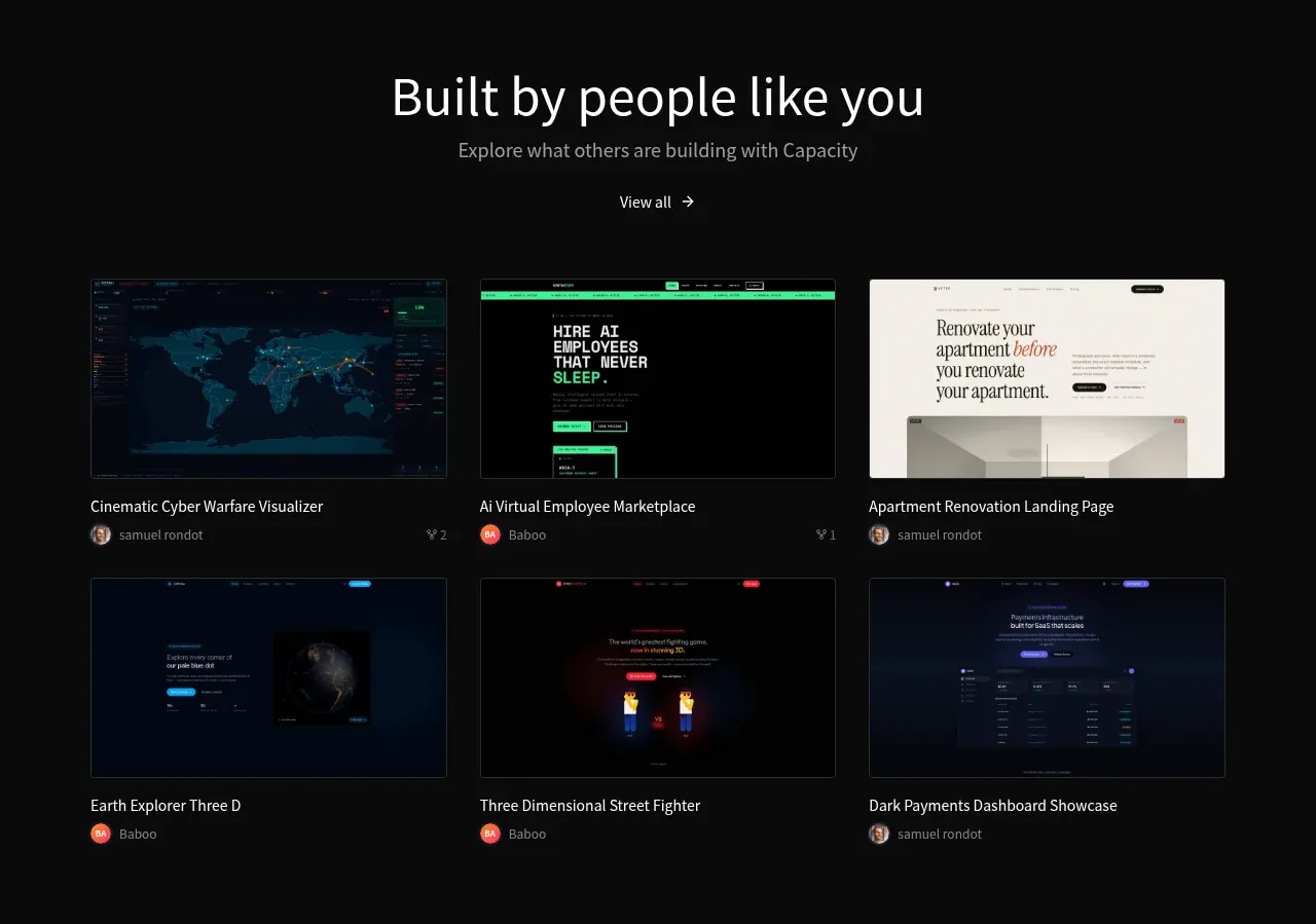
A centered showcase section presents a heading and view-all link above a six-item, three-column grid of project thumbnails with titles and creator metadata.
Prompt preview
## Reference images

Study these alongside the description below: hierarchy, rhythm, spacing, colour. Build for the product you are asked about, using this design language.

- Component: https://kage-design-assets.t3.tigrisfiles.io/components/capacity-so/08f2bf80-ea5b-4604-8f5e-193c94acfc56-1791551995-5.webp
- Full page it was cut from: https://kage-design-assets.t3.tigrisfiles.io/screenshots/capacity-so/08f2bf80-ea5b-4604-8f5e-193c94acfc56-1791551914192-full.webp
- Component on Kage: https://kage.design/component/capacity-gallery-2

## Before you start
Ask what work, templates, case studies, or community creations the user's product should showcase, and what brand system should style them. Then use this pattern with original content.

Create a dark community showcase with a centered heading, a muted subtitle, and a small view-all action. Below it, use a three-column responsive grid of six visual cards. Each card should contain a consistent aspect-ratio thumbnail, project title, and compact creator row with avatar and metadata. Use thin dark borders, 8–12px radii, modest gutters, and strong image cropping. Keep titles readable and let cards lift slightly on hover with a border/color transition. Provide keyboard-accessible links and a mobile one-column or two-column layout.

**Never:** use logos, product names, copy, illustrations, or imagery from the reference.
More components
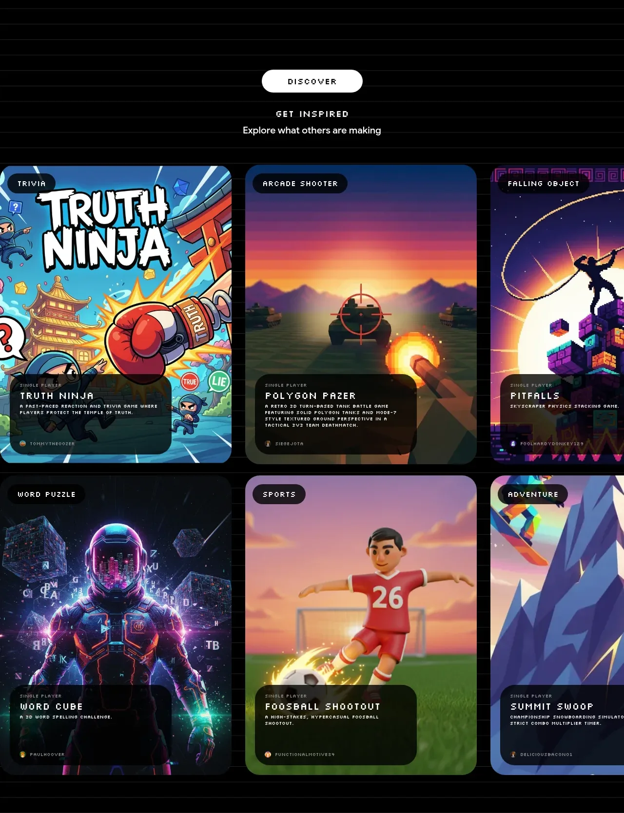
 Discover inspiration gallery
Playground by Google Labs · Gallery
Discover inspiration gallery
Playground by Google Labs · Gallery
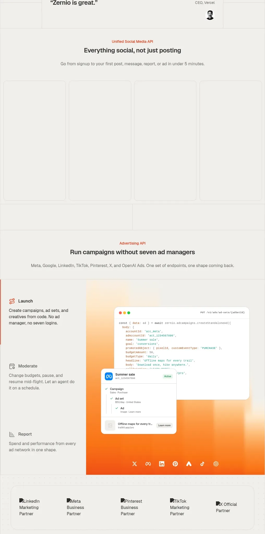
 Social media campaign API showcase
Zernio · Gallery
Social media campaign API showcase
Zernio · Gallery
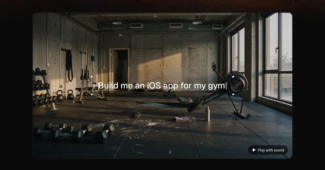
 Product demonstration media
capacity.so · Gallery
Product demonstration media
capacity.so · Gallery
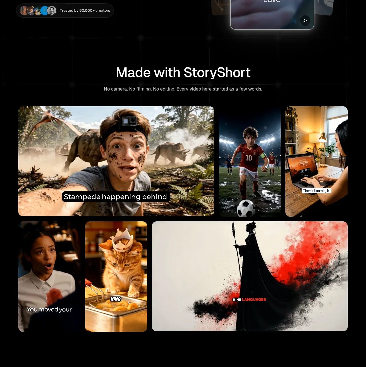
 Made-with showcase gallery
storyshort.ai · Gallery
Made-with showcase gallery
storyshort.ai · Gallery
 Short-film examples
storyshort.ai · Gallery
Short-film examples
storyshort.ai · Gallery
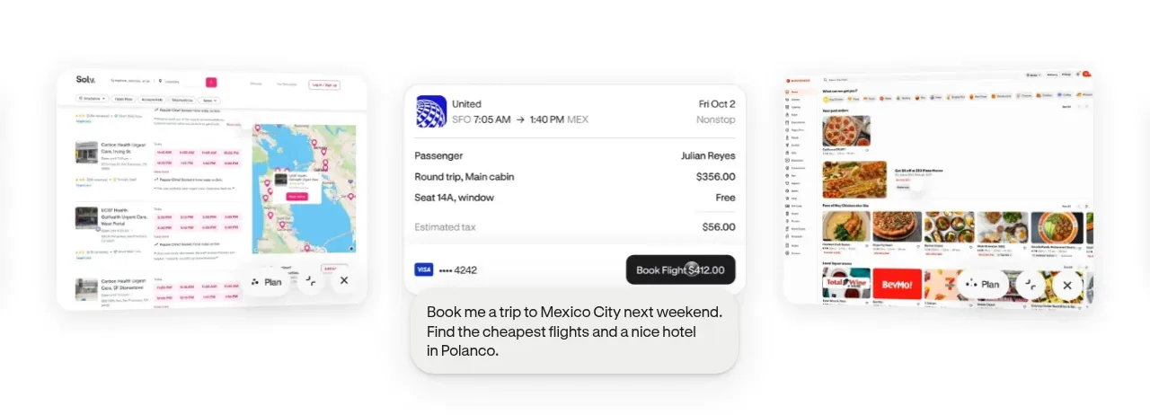
 Product-in-context showcase
Hark · Gallery
Product-in-context showcase
Hark · Gallery