 kage
kage
zernio.link
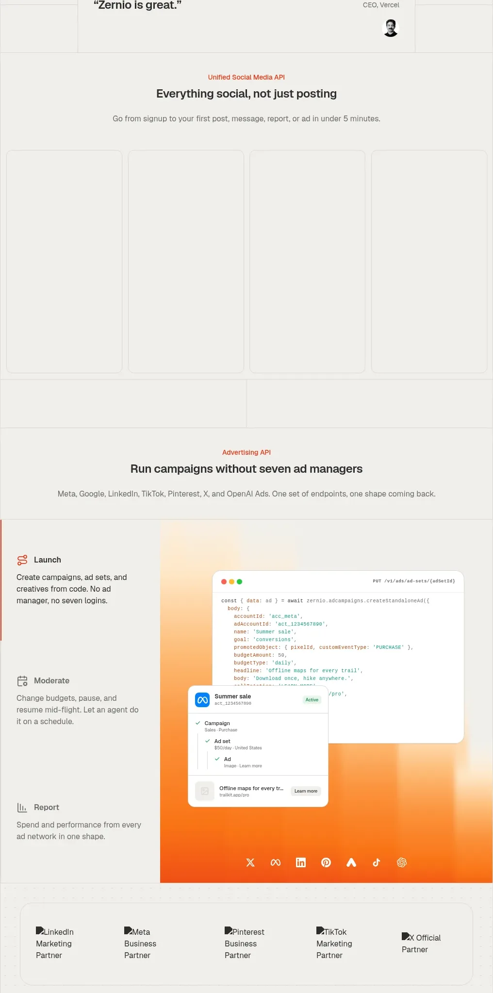
Design analysis
This section introduces an advertising API and presents a tall split layout: a left-side list of capabilities, a large warm product composition, and a row of channel partnerships.
Prompt preview
## Reference images

Study these alongside the description below: hierarchy, rhythm, spacing, colour. Build for the product you are asked about, using this design language.

- Component: https://kage-design-assets.t3.tigrisfiles.io/components/zernio/c501b537-d018-43e7-982b-563c0d4d1135-1791612291-5.webp
- Full page it was cut from: https://kage-design-assets.t3.tigrisfiles.io/screenshots/zernio/c501b537-d018-43e7-982b-563c0d4d1135-1791612175252-full.webp
- Component on Kage: https://kage.design/component/zernio-gallery

## Before you start
Ask what the user's product, audience, and brand are, then apply the following principles to that product rather than copying the reference.

Design a tall product showcase for an automation or campaign API. Use a centered eyebrow, heading, and short description at the top. Below, create a split composition: a narrow left rail with three vertically stacked capabilities, each with a small icon, title, and concise description; and a larger right area containing an original UI mockup over a glowing orange-to-red gradient backdrop. Add a bottom row of partner/channel cards inside a lightly rounded bordered container. Use an off-white #f5f4f1 canvas, thin #e0ded9 rules, dark #282725 text, muted #77746f copy, and orange-red #ef4525 accents. Let the visual area be dominant but preserve a clear reading order and stack the split layout on mobile.

Never: use logos, product names, copy, illustrations, or imagery from the reference.
More components
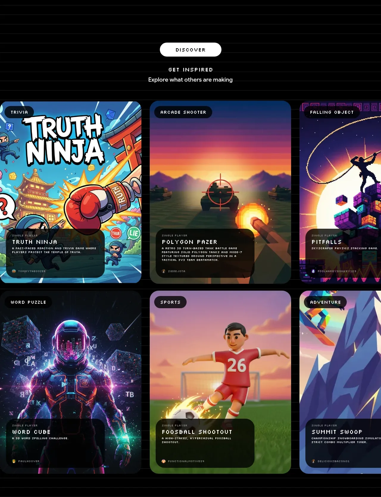
 Discover inspiration gallery
Playground by Google Labs · Gallery
Discover inspiration gallery
Playground by Google Labs · Gallery
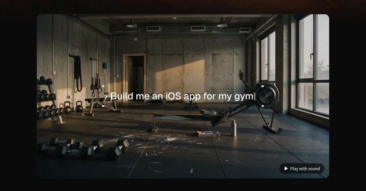
 Product demonstration media
capacity.so · Gallery
Product demonstration media
capacity.so · Gallery
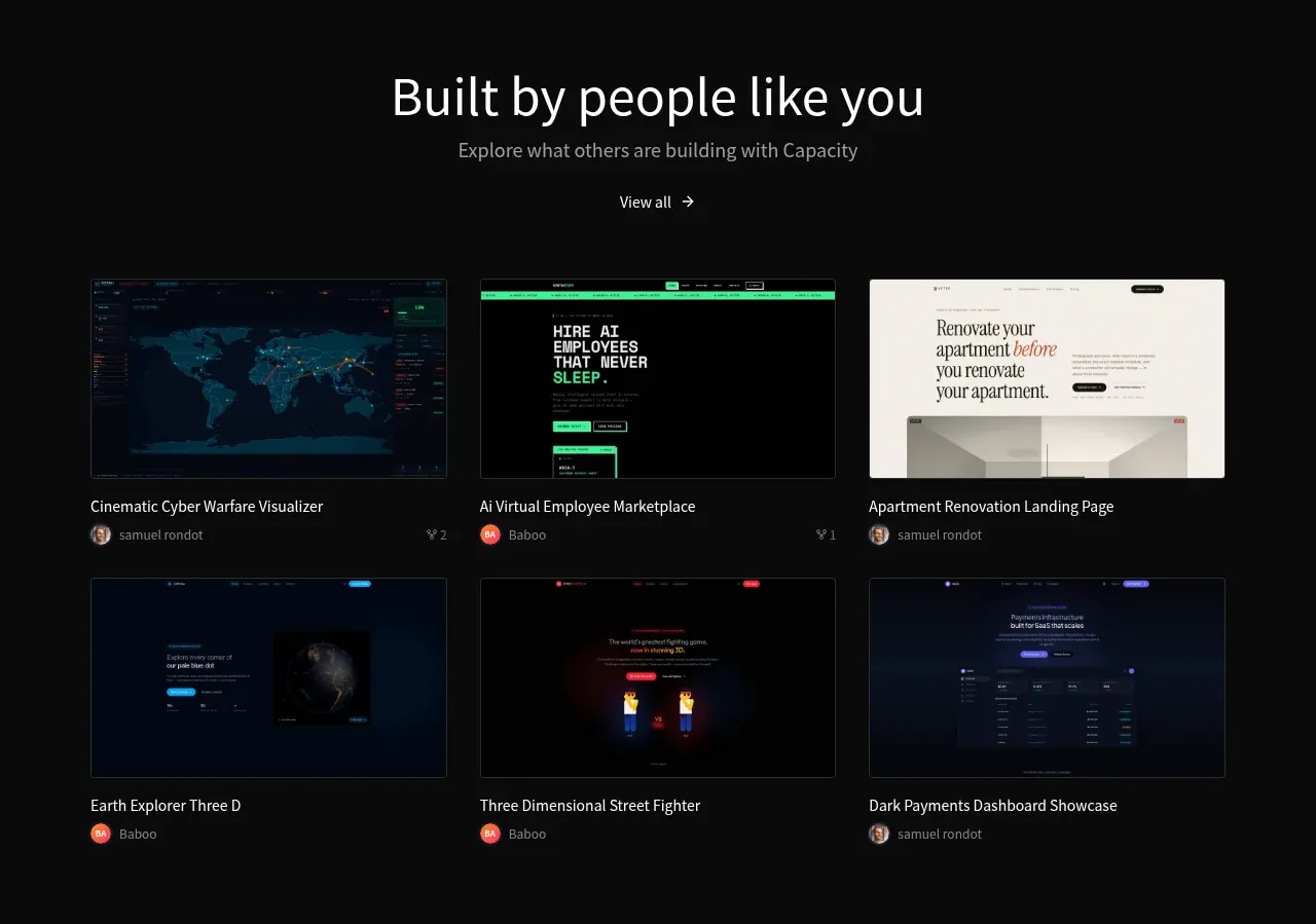 Community project gallery
capacity.so · Gallery
Community project gallery
capacity.so · Gallery
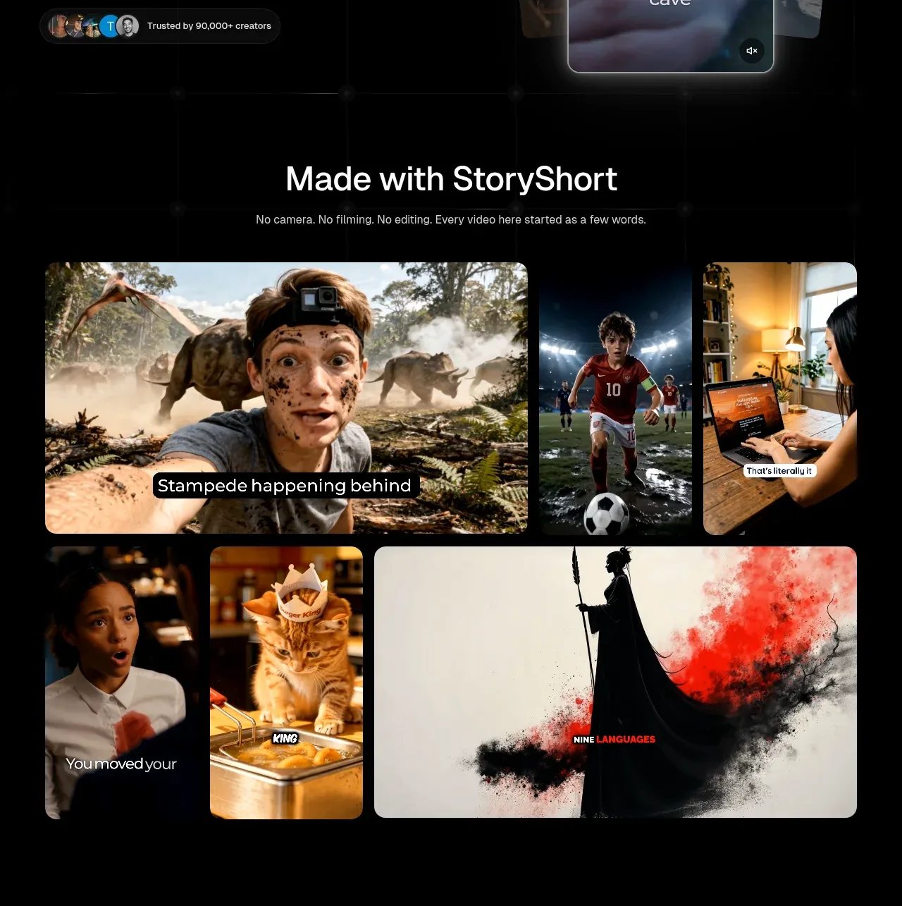
 Made-with showcase gallery
storyshort.ai · Gallery
Made-with showcase gallery
storyshort.ai · Gallery
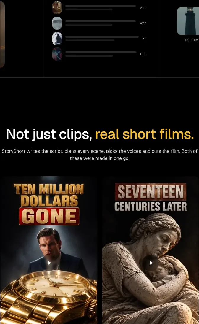 Short-film examples
storyshort.ai · Gallery
Short-film examples
storyshort.ai · Gallery
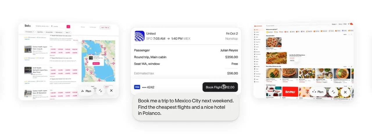
 Product-in-context showcase
Hark · Gallery
Product-in-context showcase
Hark · Gallery