kage
kage
kugelaudio.com
Design analysis
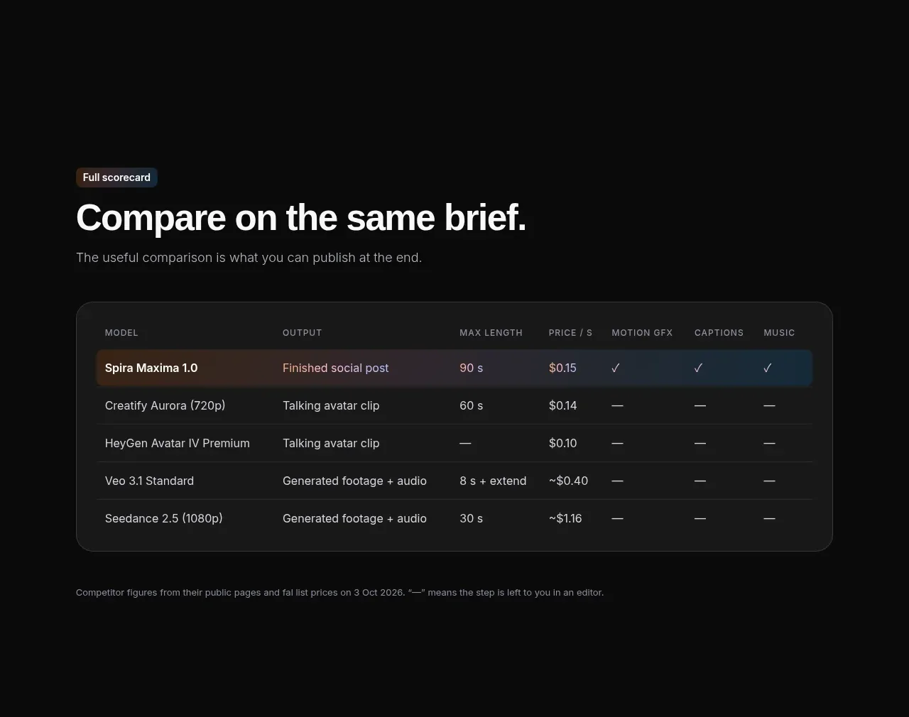
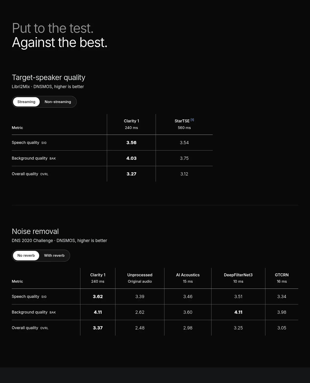
Two dark benchmark blocks present measurable product performance with segmented conditions and strong emphasis on the winning values.
Prompt preview
## Reference images

Study these alongside the description below: hierarchy, rhythm, spacing, colour. Build for the product you are asked about, using this design language.

- Component: https://kage-design-assets.t3.tigrisfiles.io/components/clarity/18084f24-bf00-4b1e-9761-c33f370871f3-1790921031-6.webp
- Full page it was cut from: https://kage-design-assets.t3.tigrisfiles.io/screenshots/clarity/18084f24-bf00-4b1e-9761-c33f370871f3-1790920906751-full.webp
- Component on Kage: https://kage.design/component/clarity-table

## Before you start
Ask what the user's product is, who it serves, and what their brand personality and primary conversion goal are. Apply the following principles to that product rather than reproducing the reference.

Build a technical comparison section with two vertically separated benchmark tables. Each block begins with a large two-line section heading, a short metric description, and a compact segmented control for test conditions. Use true semantic table markup with a left metric column and several comparison columns; keep headers legible and numeric values aligned. Bold the most important or best-performing values rather than colouring everything. Use thin low-contrast grid rules, generous row height, and horizontal scrolling on narrow screens. Approximate colours: #080909 background, #f0f1f2 headings, #b2b7bc descriptions, #71777d rules, and #dfe3e6 highlighted values. Use 14–16px table type, 12–13px metadata, and 64–100px spacing between the two benchmark groups. Include units, footnotes, and an accessible active-state treatment for segmented controls.

Never: use logos, product names, copy, illustrations or imagery from the reference.