 kage
kage
kugelaudio.com

Design analysis
A tabbed use-case module lets visitors switch between audience scenarios while keeping the media, explanatory overlay, and supporting metric in one focused panel.
Prompt preview
## Reference images

Study these alongside the description below: hierarchy, rhythm, spacing, colour. Build for the product you are asked about, using this design language.

- Component: https://kage-design-assets.t3.tigrisfiles.io/components/clarity/18084f24-bf00-4b1e-9761-c33f370871f3-1790921030-5.webp
- Full page it was cut from: https://kage-design-assets.t3.tigrisfiles.io/screenshots/clarity/18084f24-bf00-4b1e-9761-c33f370871f3-1790920906751-full.webp
- Component on Kage: https://kage.design/component/clarity-tabs

## Before you start
Ask what the user's product is, who it serves, and what their brand personality and primary conversion goal are. Apply the following principles to that product rather than reproducing the reference.

Create a use-case section with a vertical tab rail on the left and a large rounded media panel on the right. Tabs should look like stacked dark controls, with the active tab receiving a brighter border, surface, and text. The media panel should contain an original scenario image/video, a dark gradient for contrast, a lower overlay with a concise benefit headline, a short explanation, and a small pill-shaped performance badge. Use a 28–32% / 68–72% desktop split, 24px gaps, and 18–24px radii. Use #151719 section background, #222529 active tab, #090b0e inactive tab, #f0f1f2 text, #a2a8ae secondary copy, and #3d444d borders. Tabs must be keyboard navigable, expose aria-selected, crossfade or replace content accessibly, and stack above the media on mobile.

Never: use logos, product names, copy, illustrations or imagery from the reference.
More components
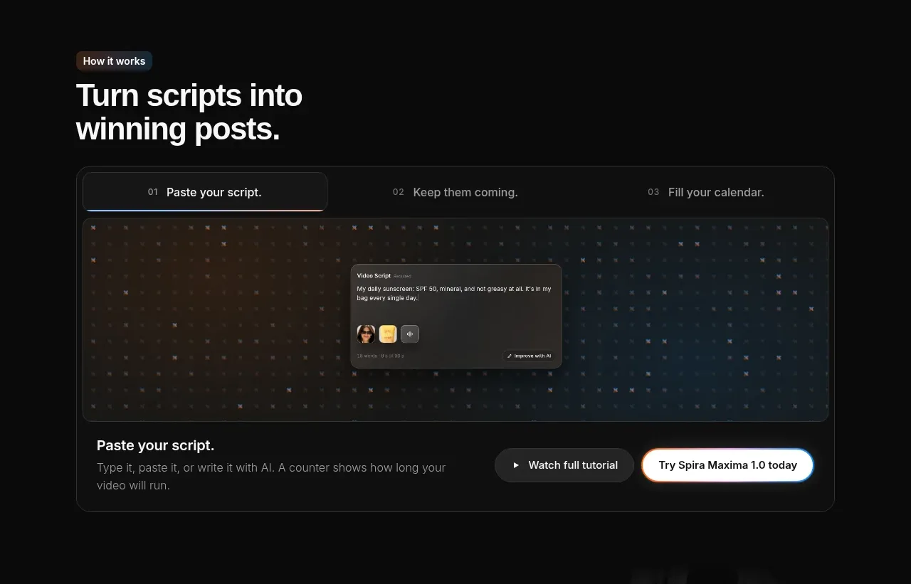
 Script-to-output workflow tabs
Spira Maxima · Tabs & steps
Script-to-output workflow tabs
Spira Maxima · Tabs & steps
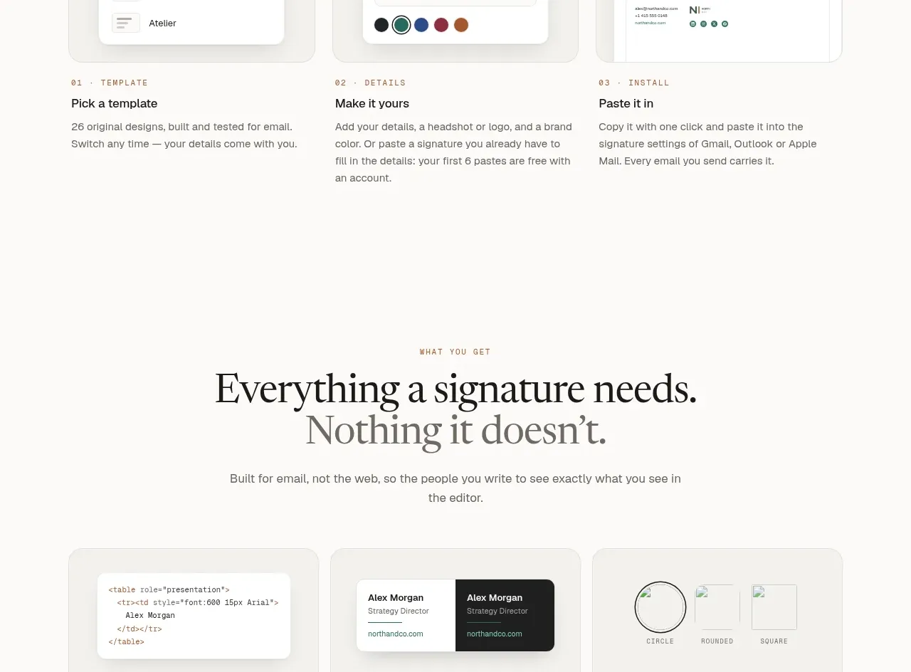
 Inbox preview tabs
esigna · Tabs & steps
Inbox preview tabs
esigna · Tabs & steps
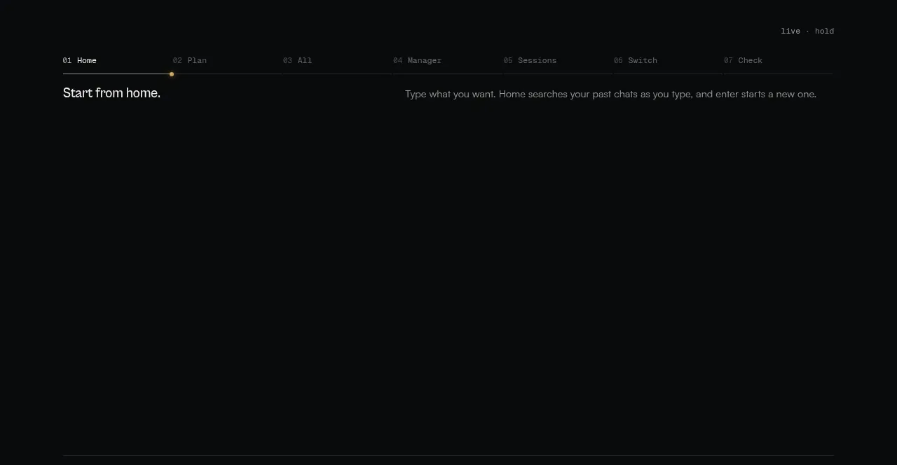
 Workflow stages explainer
CodeAF · Tabs & steps
Workflow stages explainer
CodeAF · Tabs & steps
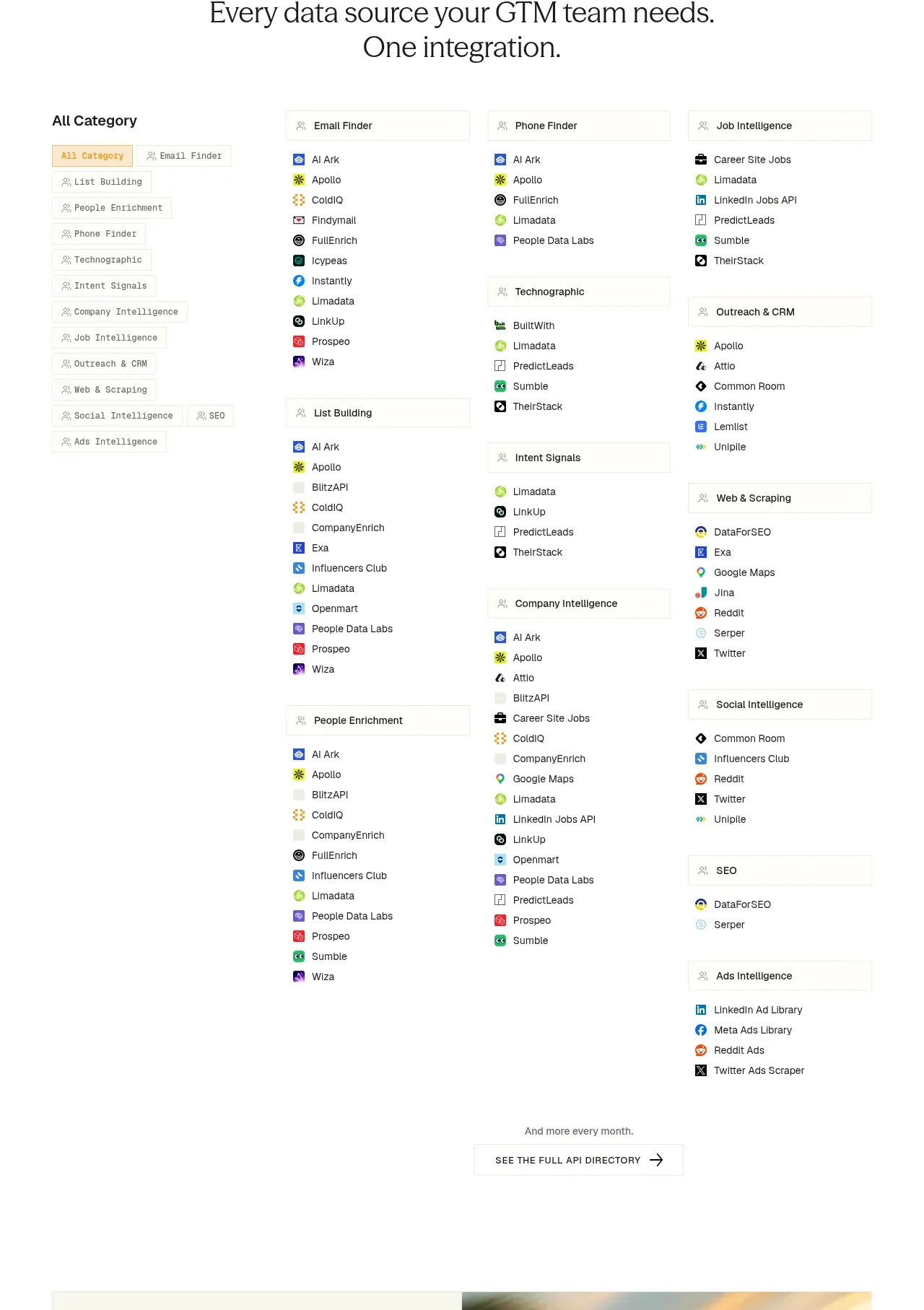
 Integration directory
ColdIQ x Slack · Tabs & steps
Integration directory
ColdIQ x Slack · Tabs & steps
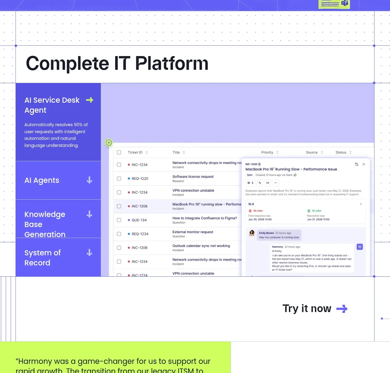
 Complete platform product tour
Harmony · Tabs & steps
Complete platform product tour
Harmony · Tabs & steps
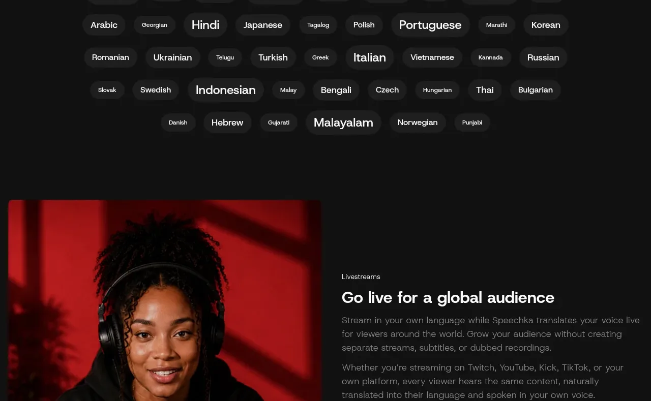
 Language selection cloud
Speechka · Tabs & steps
Language selection cloud
Speechka · Tabs & steps