 kage
kage
cloudflare.com
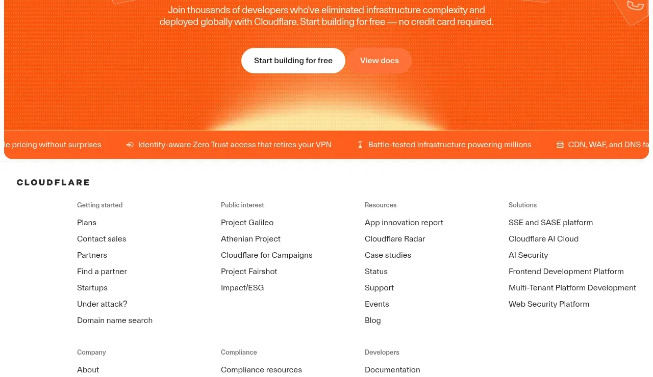
Design analysis
A rounded orange closing CTA repeats the product promise with two actions, subtle floating technical motifs, and a benefit strip along its bottom edge.
Prompt preview
## Reference images

Study these alongside the description below: hierarchy, rhythm, spacing, colour. Build for the product you are asked about, using this design language.

- Component: https://kage-design-assets.t3.tigrisfiles.io/components/cloudflare-com/1ca6ff30-a094-43e2-8124-fd26c9356e55-1789213792-7.webp
- Full page it was cut from: https://kage-design-assets.t3.tigrisfiles.io/screenshots/cloudflare-com/1ca6ff30-a094-43e2-8124-fd26c9356e55-1789213761908-full.webp
- Component on Kage: https://kage.design/component/cloudflare-cta

## Before you start
Ask what action the user should take next, what commitment is required, and which proof or reassurance reduces friction. Apply this conversion pattern to that product.

Create a wide closing CTA with a rounded rectangle, a vivid brand background around `#ff5a1f`, subtle low-contrast abstract motifs, and centered white content. Use a concise heading around 36–48px, one explanatory paragraph, and two actions: a high-contrast filled or light primary button and a lower-emphasis secondary link/button. Add a thin benefit strip at the bottom only if it communicates 3–4 genuine reassurances; separate items with spacing rather than heavy rules. Keep the section visually distinct but consistent with the hero, provide strong focus states, and stack actions on mobile.

### Never
- Never use logos, product names, copy, illustrations, or imagery from the reference.
- Never repeat the exact hero CTA or unsupported promises.
- Never use decorative motifs that resemble proprietary artwork.
More components

 Dark conversion call to action
DockFix 5.0 · Call to action
Dark conversion call to action
DockFix 5.0 · Call to action

 Final conversion banner
Cortex · Call to action
Final conversion banner
Cortex · Call to action
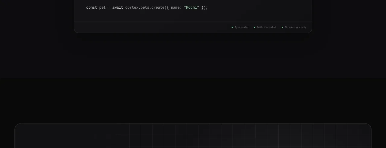 Open-source platform callout
Cortex · Call to action
Open-source platform callout
Cortex · Call to action

 Final conversion banner
Relic · Call to action
Final conversion banner
Relic · Call to action

 Open source repository CTA
Moji · Call to action
Open source repository CTA
Moji · Call to action

 Early-access signup
Jackalope · Call to action
Early-access signup
Jackalope · Call to action