kage
kage
cloudflare.com

Design analysis
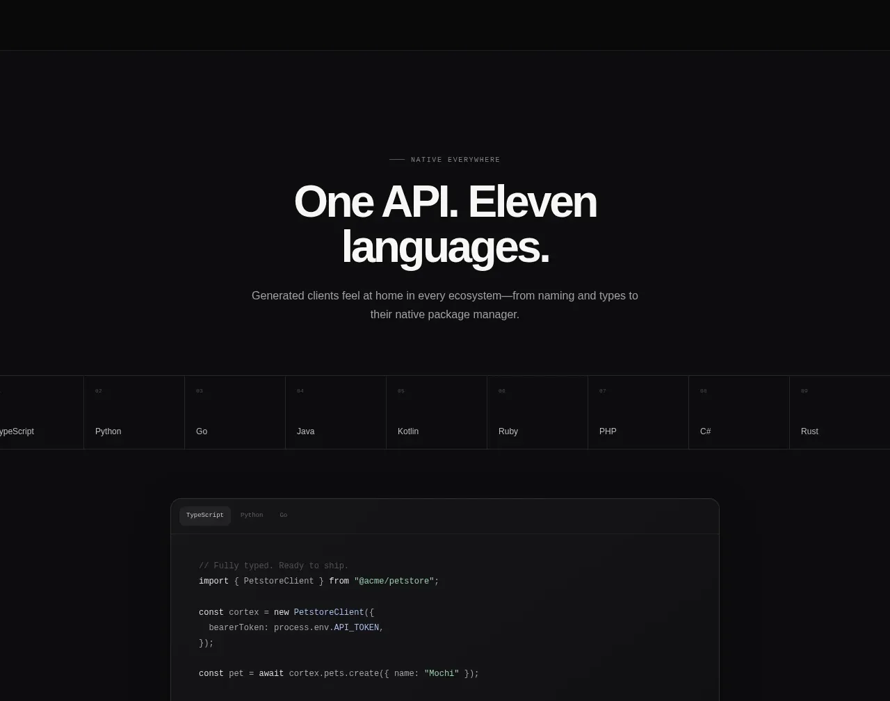
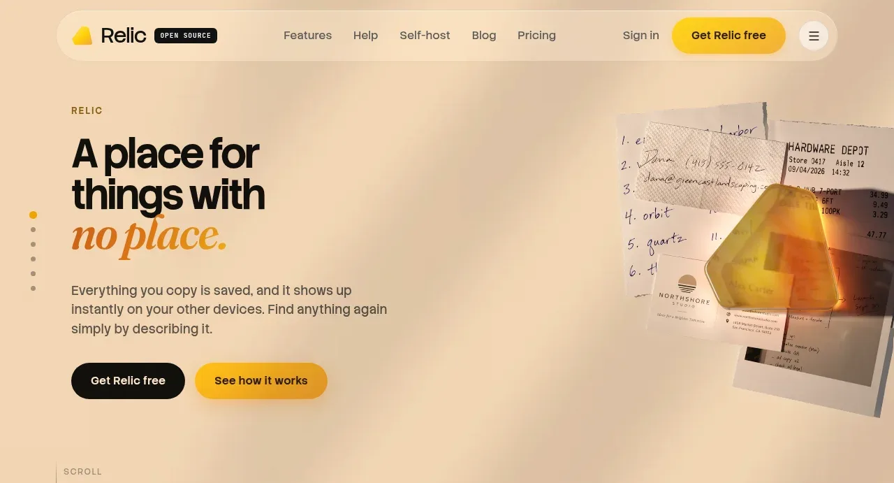
A large rounded orange hero uses a centered announcement pill, oversized value proposition, supporting copy, and one high-contrast CTA over a subtle network-like texture.
Prompt preview
## Reference images

Study these alongside the description below: hierarchy, rhythm, spacing, colour. Build for the product you are asked about, using this design language.

- Component: https://kage-design-assets.t3.tigrisfiles.io/components/cloudflare-com/1ca6ff30-a094-43e2-8124-fd26c9356e55-1789213790-1.webp
- Full page it was cut from: https://kage-design-assets.t3.tigrisfiles.io/screenshots/cloudflare-com/1ca6ff30-a094-43e2-8124-fd26c9356e55-1789213761908-full.webp
- Component on Kage: https://kage.design/component/cloudflare-hero

## Before you start
Ask what the user's product is, what outcome it promises, and what brand colors and proof points are available. Apply the principles below to that product rather than copying the reference.

Create a full-width hero directly below navigation with a deep orange gradient/background around `#ff5a1f` and `#ff6a2a`, a large radius around 12–16px, and generous vertical padding. Center a small announcement or eyebrow pill above a concise two-line headline; use an expressive sans-serif display style around 42–56px on desktop, 32–40px on mobile, with tight line-height and white text. Follow with one or two lines of supporting copy in a softer white, then one prominent pill-shaped light CTA with dark text. Add only a subtle abstract technical texture or glow behind the content, keeping contrast high and respecting reduced-motion preferences. Keep the content column narrow enough to create hierarchy and align all elements to the same center axis.

### Never
- Never use logos, product names, copy, illustrations, or imagery from the reference.
- Never copy the exact headline or announcement.
- Never let decorative texture reduce readability or invent unsupported product claims.