kage
kage
agentfield.ai
Design analysis
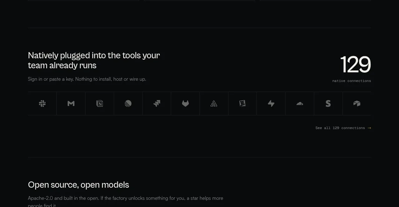
This integration band combines a benefit statement, a large connection count, and a dense row of tool marks to communicate breadth without becoming a conventional logo wall.
Prompt preview
## Reference images

Study these alongside the description below: hierarchy, rhythm, spacing, colour. Build for the product you are asked about, using this design language.

- Component: https://kage-design-assets.t3.tigrisfiles.io/components/codeaf/74fffb9e-aea6-4193-af2d-c8a5b19c270c-1791007529-5.webp
- Full page it was cut from: https://kage-design-assets.t3.tigrisfiles.io/screenshots/codeaf/74fffb9e-aea6-4193-af2d-c8a5b19c270c-1791007420738-full.webp
- Component on Kage: https://kage.design/component/codeaf-logo-cloud

## Before you start
Ask which tools the user's product connects to, whether their marks may be displayed, and what integration metric is meaningful. Use original or properly licensed assets for the user's product.

Build a dark integrations section with a two-column heading row: a benefit-oriented title and supporting sentence on the left, and a large numeric connection count with a tiny label on the right. Below it, create a single bordered strip of evenly sized cells containing simplified tool icons or neutral glyphs, followed by a subtle “see all” link aligned to the right.

Design language: background #08090a, text #d7dad7, muted copy #777b79, borders #202324, and accent #b99543 used sparingly. Use a 24–28px heading, a large 48–56px metric, and 10–12px mono labels. Cells should have 1px borders, no card shadows, consistent 64–72px heights, and centered icons. On hover, brighten the cell border and reveal the tool name; make the row horizontally scrollable on narrow screens.

Never: use logos, product names, copy, illustrations, or imagery from the reference.