kage
kage
coldiq.com
Design analysis
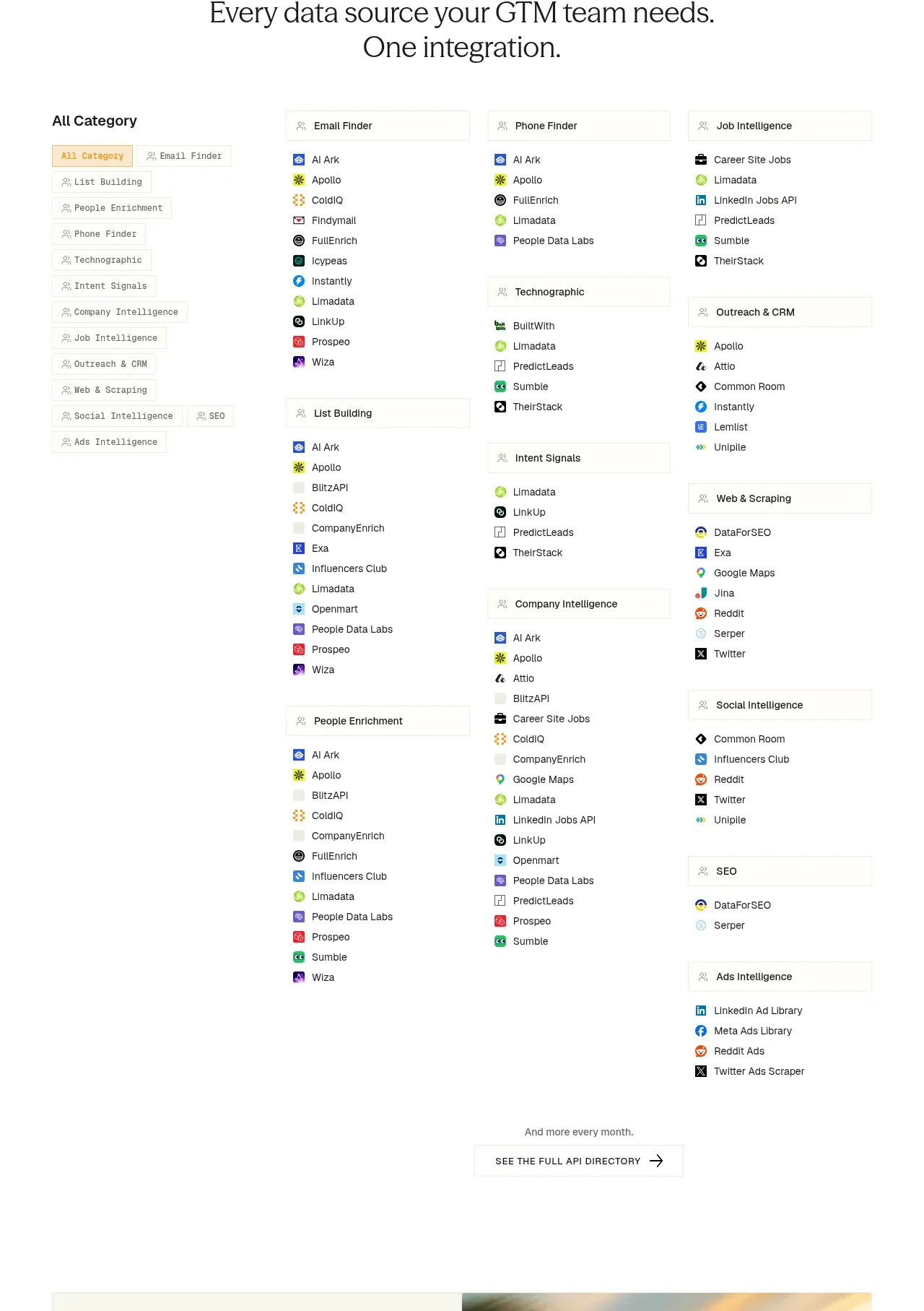
A large light directory organizes many sources through a category sidebar, grouped integration lists, and a clear browse-all action.
Prompt preview
## Reference images

Study these alongside the description below: hierarchy, rhythm, spacing, colour. Build for the product you are asked about, using this design language.

- Component: https://kage-design-assets.t3.tigrisfiles.io/components/coldiq-x-slack/e029c4ff-104d-4249-8c7e-44961fb1d1f9-1790748088-8.webp
- Full page it was cut from: https://kage-design-assets.t3.tigrisfiles.io/screenshots/coldiq-x-slack/e029c4ff-104d-4249-8c7e-44961fb1d1f9-1790748039437-full.webp
- Component on Kage: https://kage.design/component/coldiq-x-slack-tabs

## Before you start
Ask what categories, integrations, filters, and search behavior matter for the user's product. Apply the information architecture to the user's data set rather than copying the reference.

Build a light directory section with a centered eyebrow and two-line heading. Below, use a responsive layout with a left category navigation and a multi-column directory of grouped integration lists. Each group has a light bordered heading row and a compact list of items with small neutral icons or status marks. Give the active category a pale orange background and orange text. Add a small note and browse-all button centered beneath the directory.

Use #f8f7f2 for the page, #20211e for headings, #6d6e68 for secondary text, #e2e1d9 for borders, and #ff8a00 for active accents. Use 14–16px group labels, 12–13px list items, 10–12px category navigation, 8–12px row spacing, and 20–24px column gaps. The sidebar becomes a horizontal scrollable tab row on mobile. Support keyboard navigation, visible focus states, filtering, and optional search without making the dense content feel crowded.

Never: use logos, product names, copy, illustrations, or imagery from the reference.