 kage
kage
cortexdocs.dev
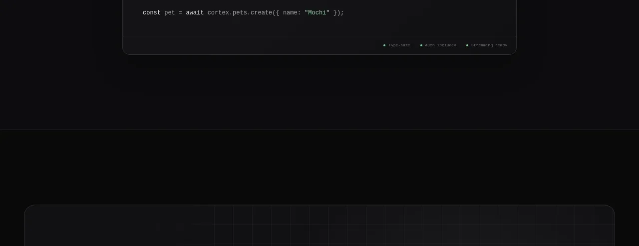
Design analysis
A rounded, softly textured callout combines a strong ownership message and dual actions with a subdued product panel on the right.
Prompt preview
## Reference images

Study these alongside the description below: hierarchy, rhythm, spacing, colour. Build for the product you are asked about, using this design language.

- Component: https://kage-design-assets.t3.tigrisfiles.io/components/cortex/48e48c32-4544-4e71-94d3-849a84be1bb9-1789279411-8.webp
- Full page it was cut from: https://kage-design-assets.t3.tigrisfiles.io/screenshots/cortex/48e48c32-4544-4e71-94d3-849a84be1bb9-1789279340596-full.webp
- Component on Kage: https://kage.design/component/cortex-cta

## Before you start
Ask what action the user's product most wants visitors to take and what trust message supports it. Apply this structure with original brand content.

Build a wide rounded CTA panel inside a dark page section. Use a subtle charcoal gradient (#141516 to #101112), a 1px border (#2c2e30), 14–16px radius, and a faint technical grid or glow in the background. Arrange the panel as a two-column split: on the left, a small uppercase eyebrow, a large 3-line headline, supporting paragraph, and two buttons; on the right, a subdued product/interface preview that supports the message without overpowering it.

Use bright white headings, gray copy, one light primary button and one dark secondary button. Keep the panel padded 48px on desktop and stack it on mobile, moving the visual below the copy. Add hover and focus states while preserving strong contrast.

Never: use the reference's logos, product names, copy, illustrations, imagery, or exact CTA labels.
More components

 Dark conversion call to action
DockFix 5.0 · Call to action
Dark conversion call to action
DockFix 5.0 · Call to action
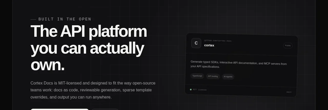
 Final conversion banner
Cortex · Call to action
Final conversion banner
Cortex · Call to action
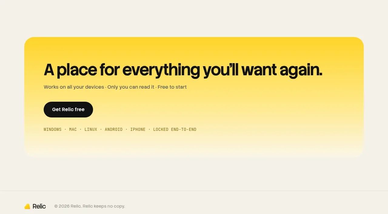
 Final conversion banner
Relic · Call to action
Final conversion banner
Relic · Call to action
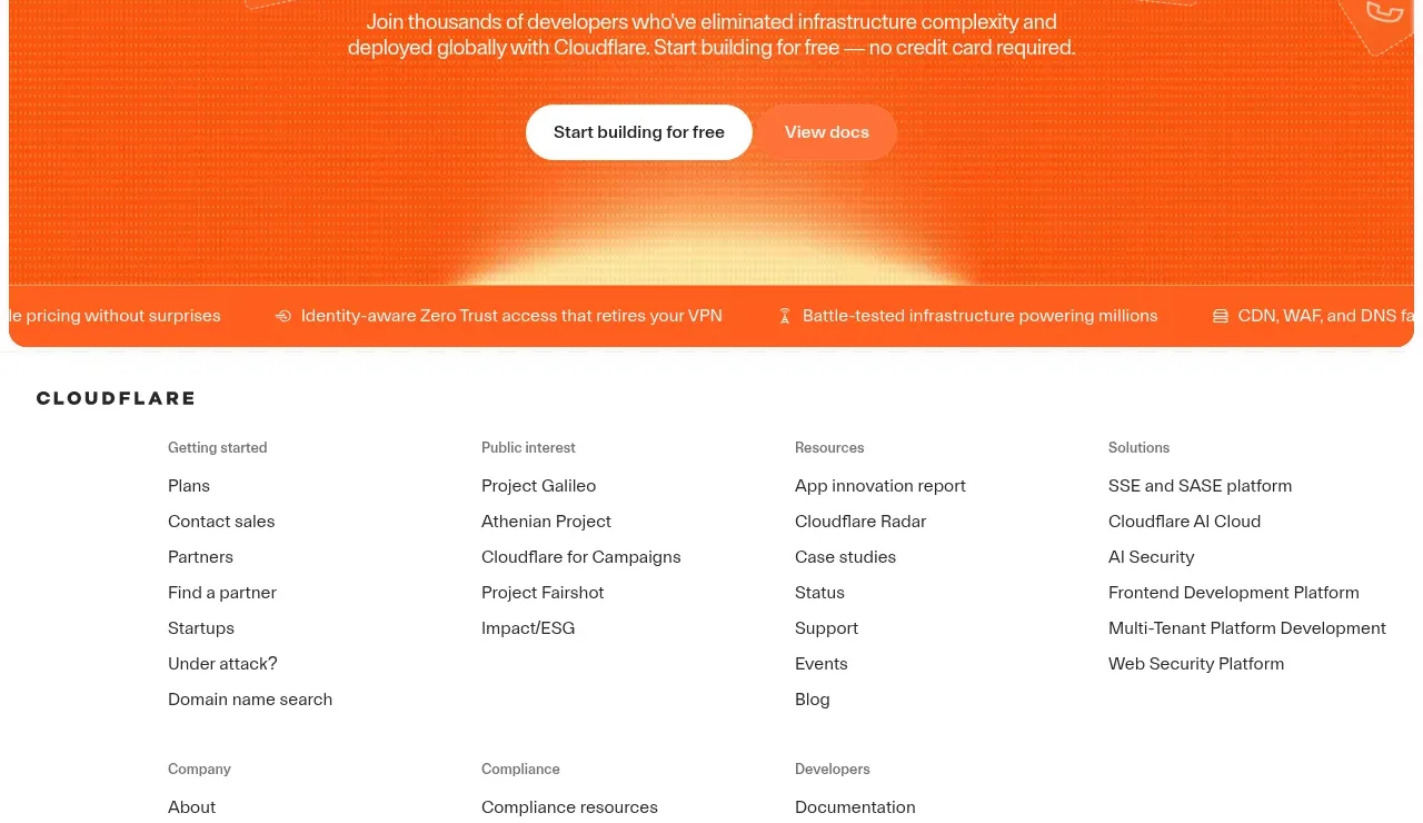
 Conversion banner
cloudflare.com · Call to action
Conversion banner
cloudflare.com · Call to action

 Open source repository CTA
Moji · Call to action
Open source repository CTA
Moji · Call to action

 Early-access signup
Jackalope · Call to action
Early-access signup
Jackalope · Call to action