 kage
kage
cortexdocs.dev

Design analysis
A final centered conversion message uses a short eyebrow, oversized headline, supporting copy, and two prominent buttons before the footer.
Prompt preview
## Reference images

Study these alongside the description below: hierarchy, rhythm, spacing, colour. Build for the product you are asked about, using this design language.

- Component: https://kage-design-assets.t3.tigrisfiles.io/components/cortex/48e48c32-4544-4e71-94d3-849a84be1bb9-1789279411-9.webp
- Full page it was cut from: https://kage-design-assets.t3.tigrisfiles.io/screenshots/cortex/48e48c32-4544-4e71-94d3-849a84be1bb9-1789279340596-full.webp
- Component on Kage: https://kage.design/component/cortex-cta-2

## Before you start
Ask what the user's primary conversion goal is and what concise promise should motivate it. Then write original content for this pattern.

Create a spacious final CTA band on a black background with a faint centered grid or radial glow. Center a small uppercase eyebrow, a very large single-line or two-line headline, a concise muted paragraph, and two horizontally aligned action buttons. Keep the composition calm and high contrast, with no extra cards or imagery.

Use a 240–280px desktop height, 58–72px headline sizing, 14px body copy, 8px button radii, and a bright primary surface (#f2f2ef) against a dark secondary button (#171819). Provide responsive wrapping and stack the actions on narrow screens.

Never: use the reference's logos, product names, copy, illustrations, imagery, or exact CTA labels.
More components

 Dark conversion call to action
DockFix 5.0 · Call to action
Dark conversion call to action
DockFix 5.0 · Call to action
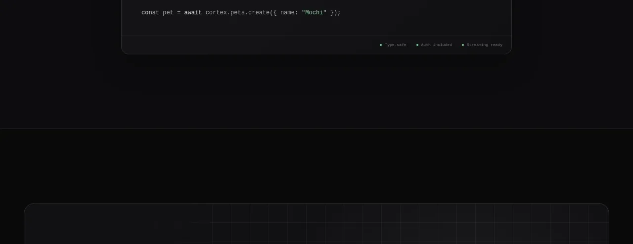
 Open-source platform callout
Cortex · Call to action
Open-source platform callout
Cortex · Call to action
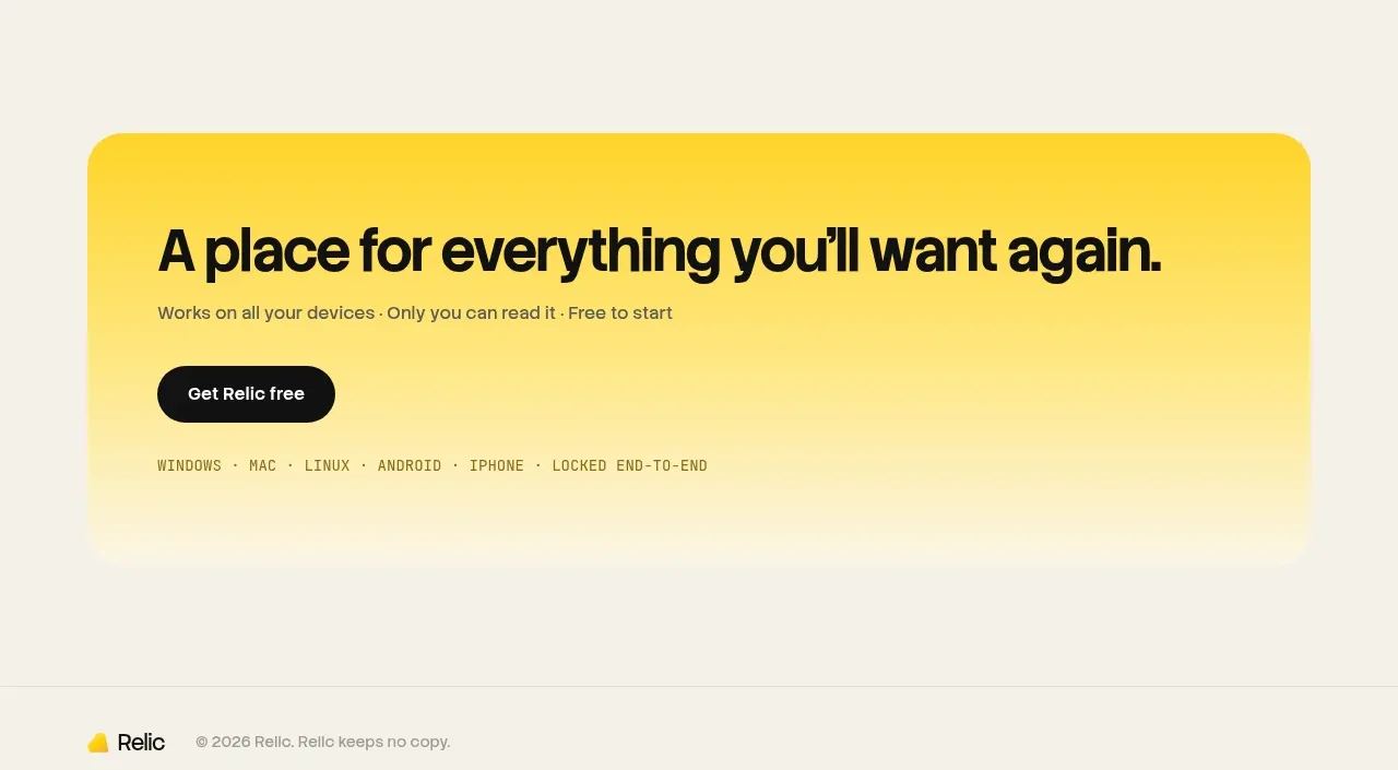
 Final conversion banner
Relic · Call to action
Final conversion banner
Relic · Call to action
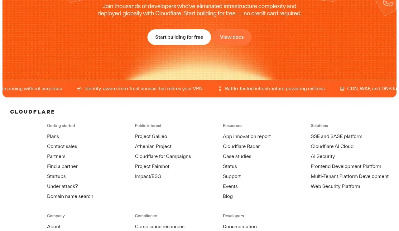
 Conversion banner
cloudflare.com · Call to action
Conversion banner
cloudflare.com · Call to action

 Open source repository CTA
Moji · Call to action
Open source repository CTA
Moji · Call to action

 Early-access signup
Jackalope · Call to action
Early-access signup
Jackalope · Call to action