kage
kage
cortexdocs.dev
Design analysis
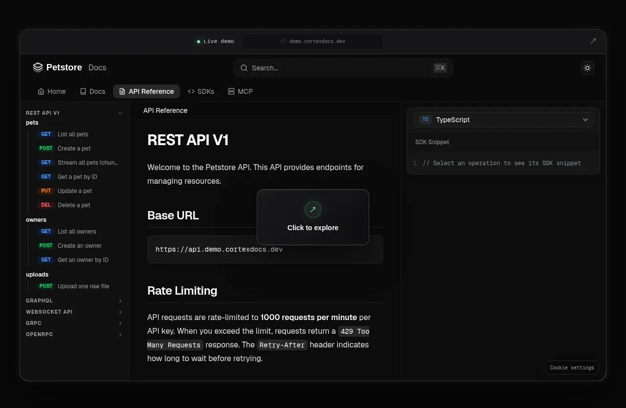
A large framed browser-like product visualization demonstrates the product through dense documentation UI, navigation, content, and an SDK panel.
Prompt preview
## Reference images

Study these alongside the description below: hierarchy, rhythm, spacing, colour. Build for the product you are asked about, using this design language.

- Component: https://kage-design-assets.t3.tigrisfiles.io/components/cortex/48e48c32-4544-4e71-94d3-849a84be1bb9-1789279409-2.webp
- Full page it was cut from: https://kage-design-assets.t3.tigrisfiles.io/screenshots/cortex/48e48c32-4544-4e71-94d3-849a84be1bb9-1789279340596-full.webp
- Component on Kage: https://kage.design/component/cortex-gallery

## Before you start
Ask what the user's product is and what primary workflow should be demonstrated. Use the following composition as inspiration, not as a literal reproduction.

Build a large centered product-preview frame below the hero. Give it a dark translucent surface (#111213), 1px gray border (#36383a), 12px rounded corners, and a subtle shadow. Add a slim browser chrome row with a live/demo indicator, centered address field, and small external-link icon. Inside, create a three-column application layout: narrow left navigation, central content/documentation area, and a right contextual panel or code/SDK area. Include realistic but original placeholder content, tabs, search, section headings, and a floating “explore” affordance.

Keep the preview legible but visually subordinate to the marketing copy. Use 11–14px UI text, low-contrast separators, small status colors, and responsive behavior that hides or stacks the side panels on mobile. This is a visual demonstration, not a functional full application.

Never: use the reference's logos, product names, copy, illustrations, imagery, or exact interface labels.