kage
kage
cortexdocs.dev

Design analysis
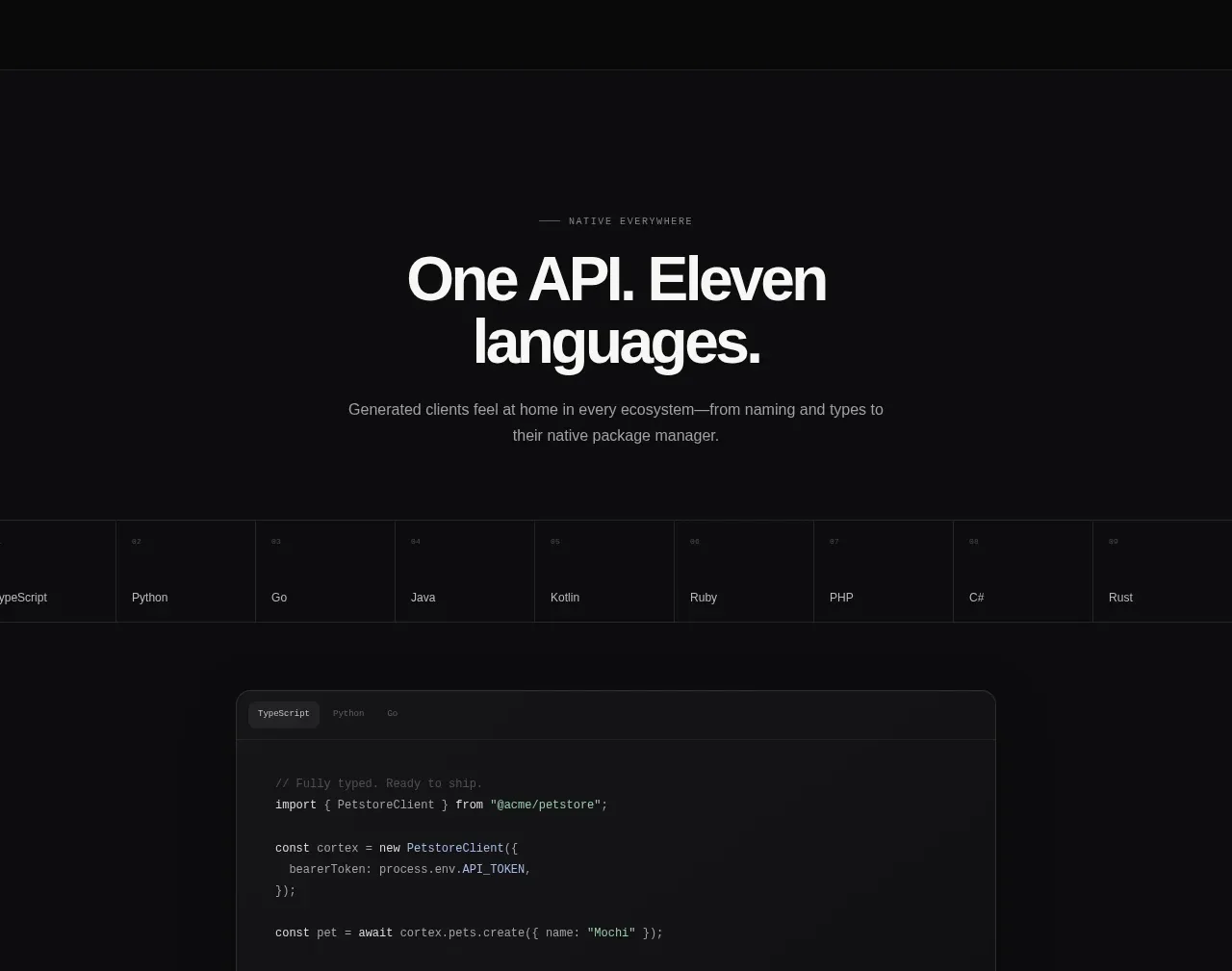
The hero uses oversized two-line typography, a small eyebrow, concise explanatory copy, and paired calls to action before transitioning into the product preview.
Prompt preview
## Reference images

Study these alongside the description below: hierarchy, rhythm, spacing, colour. Build for the product you are asked about, using this design language.

- Component: https://kage-design-assets.t3.tigrisfiles.io/components/cortex/48e48c32-4544-4e71-94d3-849a84be1bb9-1789279408-1.webp
- Full page it was cut from: https://kage-design-assets.t3.tigrisfiles.io/screenshots/cortex/48e48c32-4544-4e71-94d3-849a84be1bb9-1789279340596-full.webp
- Component on Kage: https://kage.design/component/cortex-hero

## Before you start
Ask what the user's product does, who the audience is, and what brand direction to follow. Then apply these layout principles with original content.

Create a dark, centered hero directly below the navigation. Use a tiny mint or brand-accent eyebrow in uppercase monospace lettering, followed by an exceptionally large two-line headline with the first line in bright white (#f4f4f2) and the second line in a dimmer gray (#77797d) to create hierarchy. Center a short two-line description beneath it in muted gray (#a2a3a5), constrain it to roughly 500px, and finish with two horizontally aligned buttons: a light primary button and a dark outlined secondary button.

Give the hero generous vertical breathing room: approximately 340–400px tall on desktop, with headline sizing around 60–68px, tight line-height near 0.95, and responsive scaling below 48px. Use a black background (#090a0a), subtle grid or radial atmospheric texture only if it supports the brand, 8px button corners, and clear hover/focus states.

Never: use the reference's logos, product names, copy, illustrations, imagery, or exact CTA labels.