 kage
kage
crewtower.app
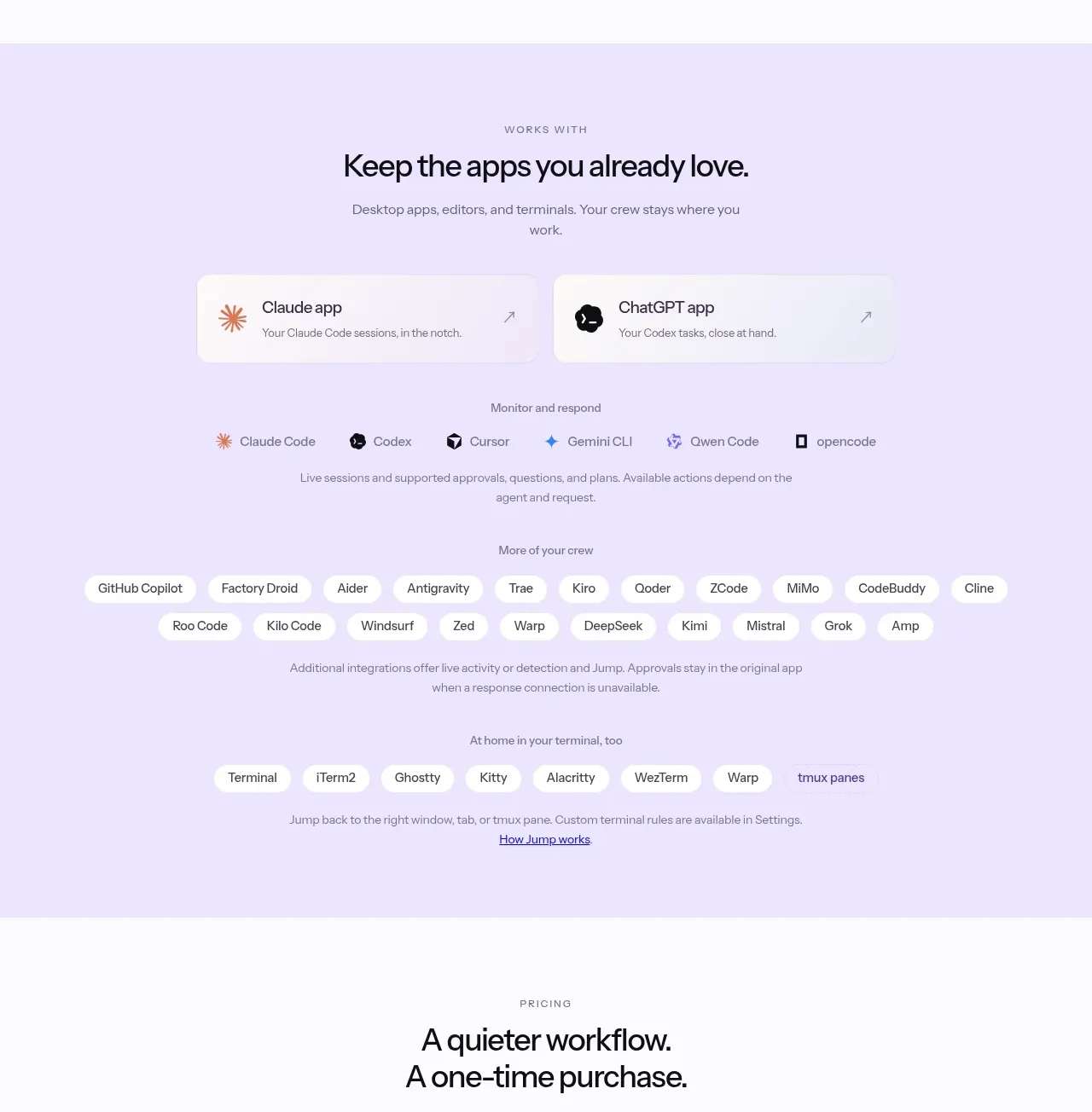
Design analysis
This compatibility band reassures visitors by grouping supported desktop apps, agents, terminals, and a broad set of additional integrations into lightweight pill lists.
Prompt preview
## Reference images

Study these alongside the description below: hierarchy, rhythm, spacing, colour. Build for the product you are asked about, using this design language.

- Component: https://kage-design-assets.t3.tigrisfiles.io/components/crewtower-mod-for-claude-code/6a95b5f4-2bf6-41f9-aa93-70409ededf43-1792303420-3.webp
- Full page it was cut from: https://kage-design-assets.t3.tigrisfiles.io/screenshots/crewtower-mod-for-claude-code/6a95b5f4-2bf6-41f9-aa93-70409ededf43-1792303277739-full.webp
- Component on Kage: https://kage.design/component/crewtower-mod-for-claude-code-logo-cloud

## Before you start
Ask which apps, platforms, and integrations the user's product supports, and which category matters most to conversion. Apply the structure with their real ecosystem.

Create a centered integrations section on a pale lavender background. Start with an uppercase eyebrow, a clear heading, and one sentence of supporting copy. Organize compatibility into labeled groups: primary apps, agents/tools, broader integrations, and terminal environments. Represent each item as a light pill or compact card with a small icon placeholder, 13–14px text, 10–14px horizontal padding, 999px radius, and a subtle #ffffffcc surface. Keep rows centered with natural wrapping and 8–12px gaps. Add concise explanatory copy between groups and preserve a calm, low-contrast visual hierarchy. Make pills accessible and optionally link them to filtered documentation.

Never use logos, product names, copy, illustrations, or imagery from the reference.
More components
 Teams and open-source adoption grid
Ultracite v8 · Logo cloud
Teams and open-source adoption grid
Ultracite v8 · Logo cloud

 Platform compatibility grid
Scalebrowser · Logo cloud
Platform compatibility grid
Scalebrowser · Logo cloud
 Compatible tools grid
Parallax · Logo cloud
Compatible tools grid
Parallax · Logo cloud

 Trusted by teams strip
AI Sandboxes by Buddy · Logo cloud
Trusted by teams strip
AI Sandboxes by Buddy · Logo cloud

 Platform compatibility statement
Navige · Logo cloud
Platform compatibility statement
Navige · Logo cloud
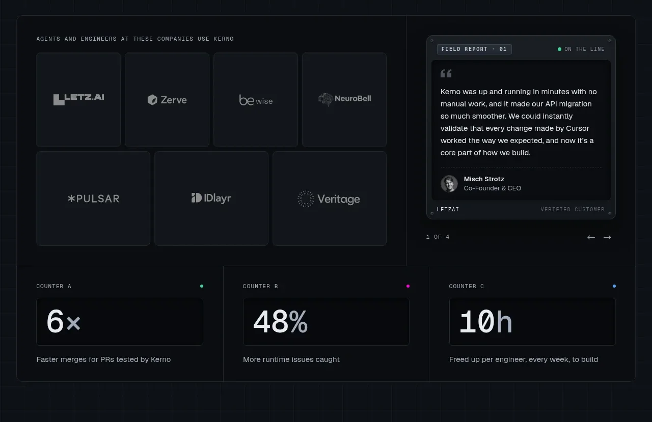
 Customer proof and operating metrics
Kerno 1.0 · Logo cloud
Customer proof and operating metrics
Kerno 1.0 · Logo cloud