 kage
kage
conifer.build
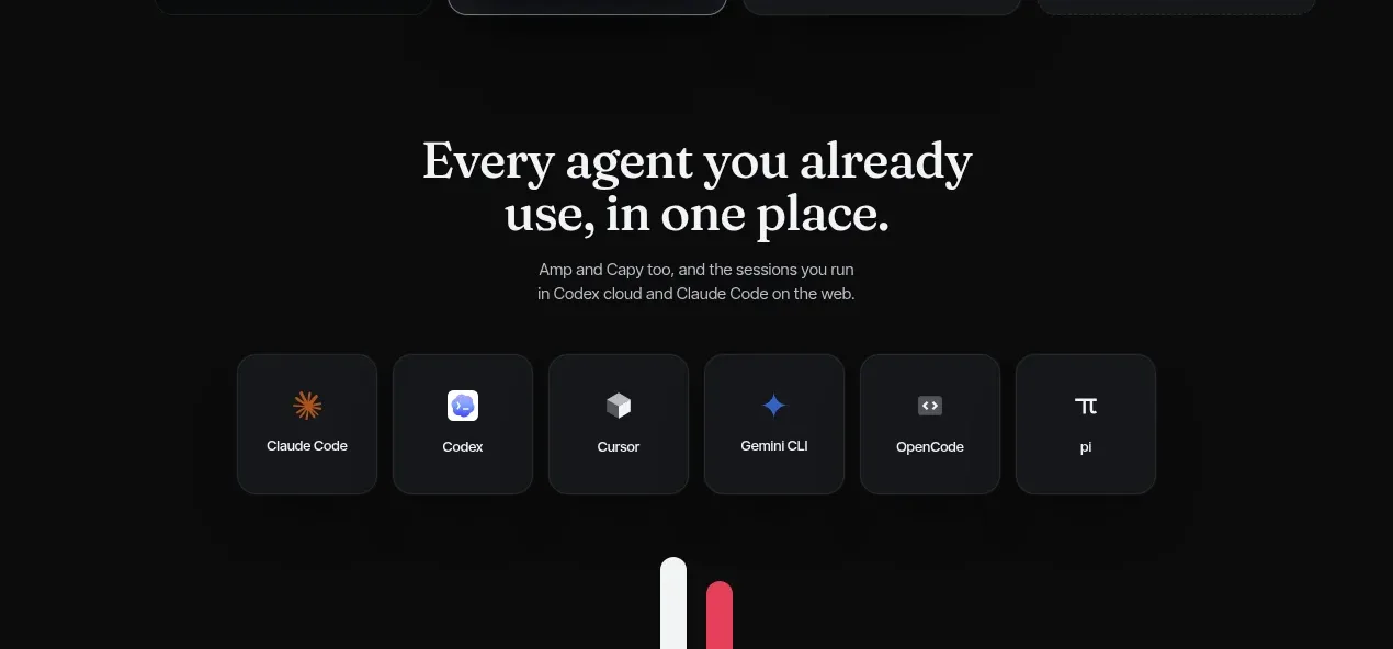
Design analysis
A concise compatibility statement is followed by a calm grid of tool tiles, communicating breadth without overwhelming the CTA that follows.
Prompt preview
## Reference images

Study these alongside the description below: hierarchy, rhythm, spacing, colour. Build for the product you are asked about, using this design language.

- Component: https://kage-design-assets.t3.tigrisfiles.io/components/parallax/9ca98bac-0bc3-4cc4-b310-031492d1188c-1792216894-5.webp
- Full page it was cut from: https://kage-design-assets.t3.tigrisfiles.io/screenshots/parallax/9ca98bac-0bc3-4cc4-b310-031492d1188c-1792216865980-full.webp
- Component on Kage: https://kage.design/component/parallax-logo-cloud

## Before you start
Ask what ecosystems, services, or tools the user's product integrates with and what level of compatibility needs to be communicated. Use those answers to populate an original grid.

Create a dark compatibility section with a centered serif heading, a brief muted explanation, and a single row or responsive grid of six compact integration tiles. Each tile should use a simple abstract glyph or text symbol, a short generic tool label, and a subtle hover lift/border transition. Tiles should be equal height, dark gray with a thin border and 12–16px radius, spaced evenly inside a centered max-width container. Use `#0b0b0b` background, `#17191d` tiles, `#2b2d32` borders, `#eeeae7` text, `#969195` secondary text, and a very restrained accent glow or pink-red focus state around `#df3c62`. Keep the heading and explanation narrow so the section feels intentional rather than like a directory.

Never:
- use logos, product names, or copy from the reference
- reproduce the reference's tool names or glyphs
- use trademarked imagery or illustrations from the reference
More components
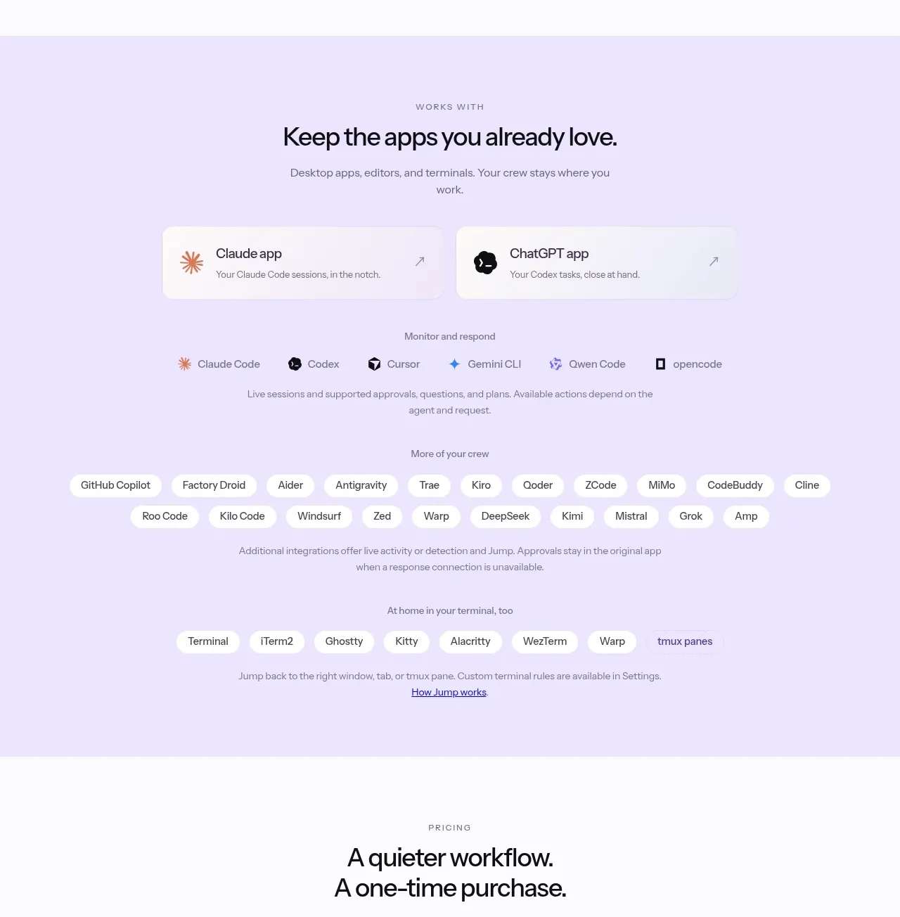
 Supported apps and integrations
CrewTower Mod for Claude Code · Logo cloud
Supported apps and integrations
CrewTower Mod for Claude Code · Logo cloud
 Teams and open-source adoption grid
Ultracite v8 · Logo cloud
Teams and open-source adoption grid
Ultracite v8 · Logo cloud

 Platform compatibility grid
Scalebrowser · Logo cloud
Platform compatibility grid
Scalebrowser · Logo cloud

 Trusted by teams strip
AI Sandboxes by Buddy · Logo cloud
Trusted by teams strip
AI Sandboxes by Buddy · Logo cloud

 Platform compatibility statement
Navige · Logo cloud
Platform compatibility statement
Navige · Logo cloud
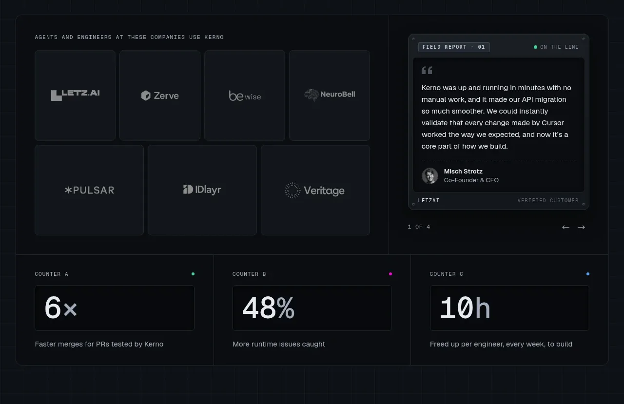
 Customer proof and operating metrics
Kerno 1.0 · Logo cloud
Customer proof and operating metrics
Kerno 1.0 · Logo cloud