 kage
kage
navige.ai

Design analysis
A centered editorial heading introduces a compatibility area with substantial breathing room, creating a calm transition before the proof section.
Prompt preview
## Reference images

Study these alongside the description below: hierarchy, rhythm, spacing, colour. Build for the product you are asked about, using this design language.

- Component: https://kage-design-assets.t3.tigrisfiles.io/components/navige/e3ee1ee4-7855-4062-a956-cf327122240e-1792130699-2.webp
- Full page it was cut from: https://kage-design-assets.t3.tigrisfiles.io/screenshots/navige/e3ee1ee4-7855-4062-a956-cf327122240e-1792130598253-full.webp
- Component on Kage: https://kage.design/component/navige-logo-cloud

## Before you start
Ask what the user's product is, which integrations matter, and what its brand personality is. Apply the principles below to that product rather than reproducing this reference.

Build a platform or integration section on a warm off-white canvas. Place a centered, oversized heading near the top with a subtle typographic contrast such as one italic phrase. Below it, reserve an airy compatibility showcase for platform marks or integration tiles, arranged in a restrained horizontal or responsive grid. Use near-black #111217 type, low-contrast #e8e6df dividers, and generous whitespace. Integration marks should be monochrome or treated consistently, with no visual competition against the heading.

On hover, integration tiles can lift slightly and reveal a tooltip or accessible label. Collapse to two columns on mobile.

Never: use logos, product names, copy, illustrations, or imagery from the reference.
More components
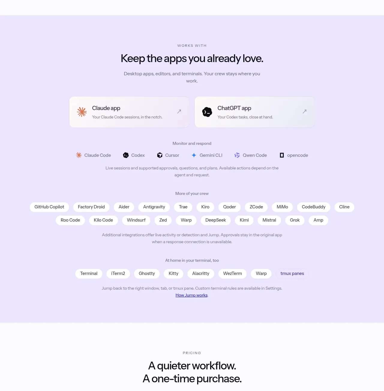
 Supported apps and integrations
CrewTower Mod for Claude Code · Logo cloud
Supported apps and integrations
CrewTower Mod for Claude Code · Logo cloud
 Teams and open-source adoption grid
Ultracite v8 · Logo cloud
Teams and open-source adoption grid
Ultracite v8 · Logo cloud

 Platform compatibility grid
Scalebrowser · Logo cloud
Platform compatibility grid
Scalebrowser · Logo cloud
 Compatible tools grid
Parallax · Logo cloud
Compatible tools grid
Parallax · Logo cloud

 Trusted by teams strip
AI Sandboxes by Buddy · Logo cloud
Trusted by teams strip
AI Sandboxes by Buddy · Logo cloud
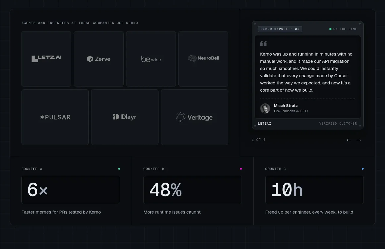
 Customer proof and operating metrics
Kerno 1.0 · Logo cloud
Customer proof and operating metrics
Kerno 1.0 · Logo cloud