 kage
kage
kerno.io
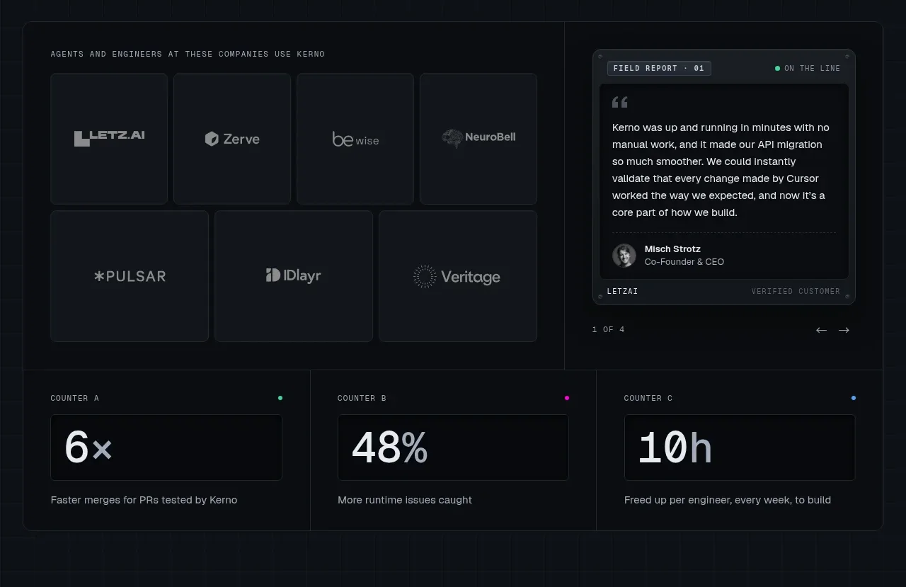
Design analysis
A dense proof band combines customer tiles, a testimonial field report, and three outcome metrics. The modular cards provide social proof while the metrics make the value proposition measurable.
Prompt preview
## Reference images

Study these alongside the description below: hierarchy, rhythm, spacing, colour. Build for the product you are asked about, using this design language.

- Component: https://kage-design-assets.t3.tigrisfiles.io/components/kerno-1-0/454d79dc-d228-4b14-889b-ec4f181556d7-1792130638-2.webp
- Full page it was cut from: https://kage-design-assets.t3.tigrisfiles.io/screenshots/kerno-1-0/454d79dc-d228-4b14-889b-ec4f181556d7-1792130514699-full.webp
- Component on Kage: https://kage.design/component/kerno-1-0-logo-cloud

## Before you start
Ask what evidence the user's product has—customers, quotes, usage data, or outcomes—and what may legally be shown. Adapt the structure to the available proof instead of fabricating claims.

Create a dark social-proof section with two levels. At the top, use a grid of understated customer or ecosystem tiles beside a compact testimonial card styled as a field report; below, add three equal metric cards. Use a 12-column or two-region grid with consistent 8–12px gutters, 1px borders (#252d37), panel backgrounds (#10151c), and 5–8px corner radii. Customer marks should be monochrome and low contrast; do not let them overpower the quote. The testimonial should include a short quote, avatar treatment if permitted, role, and a tiny status label. Metrics should use oversized figures around 30–42px, a small mono label above, and one explanatory line below. Use cool gray copy (#8d98a3) and an accent sparingly for status dots and key numerals. Make cards responsive: customer tiles become a two-column grid and metrics stack on small screens.

Never use reference customer names, logos, testimonial copy, numbers, portraits, or product branding.
More components
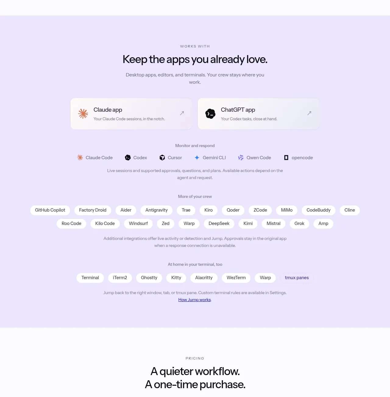
 Supported apps and integrations
CrewTower Mod for Claude Code · Logo cloud
Supported apps and integrations
CrewTower Mod for Claude Code · Logo cloud
 Teams and open-source adoption grid
Ultracite v8 · Logo cloud
Teams and open-source adoption grid
Ultracite v8 · Logo cloud

 Platform compatibility grid
Scalebrowser · Logo cloud
Platform compatibility grid
Scalebrowser · Logo cloud
 Compatible tools grid
Parallax · Logo cloud
Compatible tools grid
Parallax · Logo cloud

 Trusted by teams strip
AI Sandboxes by Buddy · Logo cloud
Trusted by teams strip
AI Sandboxes by Buddy · Logo cloud

 Platform compatibility statement
Navige · Logo cloud
Platform compatibility statement
Navige · Logo cloud