 kage
kage
scalebrowser.net

Design analysis
A quiet explanatory line introduces a dense, evenly bordered matrix of platform marks, communicating broad compatibility without competing with the hero.
Prompt preview
## Reference images

Study these alongside the description below: hierarchy, rhythm, spacing, colour. Build for the product you are asked about, using this design language.

- Component: https://kage-design-assets.t3.tigrisfiles.io/components/scalebrowser/2a4622f4-ebe3-4b20-ac5d-aef2ae1302c9-1792216896-2.webp
- Full page it was cut from: https://kage-design-assets.t3.tigrisfiles.io/screenshots/scalebrowser/2a4622f4-ebe3-4b20-ac5d-aef2ae1302c9-1792216866183-full.webp
- Component on Kage: https://kage.design/component/scalebrowser-logo-cloud

## Before you start
Ask which platforms, channels, or ecosystems the user's product supports and what visual treatment their brand permits. Apply the same information architecture to those options.

Build a centered compatibility section with a one- or two-line muted introduction above a bordered grid of equal cells. Each cell should contain a small monochrome or subdued platform symbol and ample whitespace; use consistent icon sizing and avoid visual noise. Use #fbfcfd cell backgrounds, #edf0f2 1px rules, #8d969e marks, 14px supporting text, and a max width around 780px. Let the grid wrap responsively and provide accessible labels/tooltips for unfamiliar symbols.

Never use logos, product names, copy, illustrations, or imagery from the reference.
More components
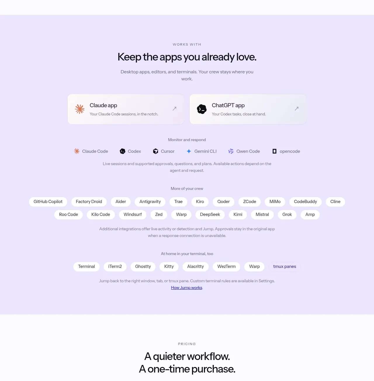
 Supported apps and integrations
CrewTower Mod for Claude Code · Logo cloud
Supported apps and integrations
CrewTower Mod for Claude Code · Logo cloud
 Teams and open-source adoption grid
Ultracite v8 · Logo cloud
Teams and open-source adoption grid
Ultracite v8 · Logo cloud
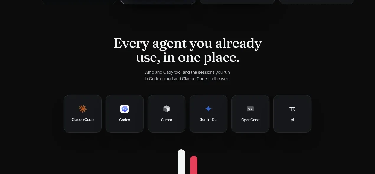
 Compatible tools grid
Parallax · Logo cloud
Compatible tools grid
Parallax · Logo cloud

 Trusted by teams strip
AI Sandboxes by Buddy · Logo cloud
Trusted by teams strip
AI Sandboxes by Buddy · Logo cloud

 Platform compatibility statement
Navige · Logo cloud
Platform compatibility statement
Navige · Logo cloud
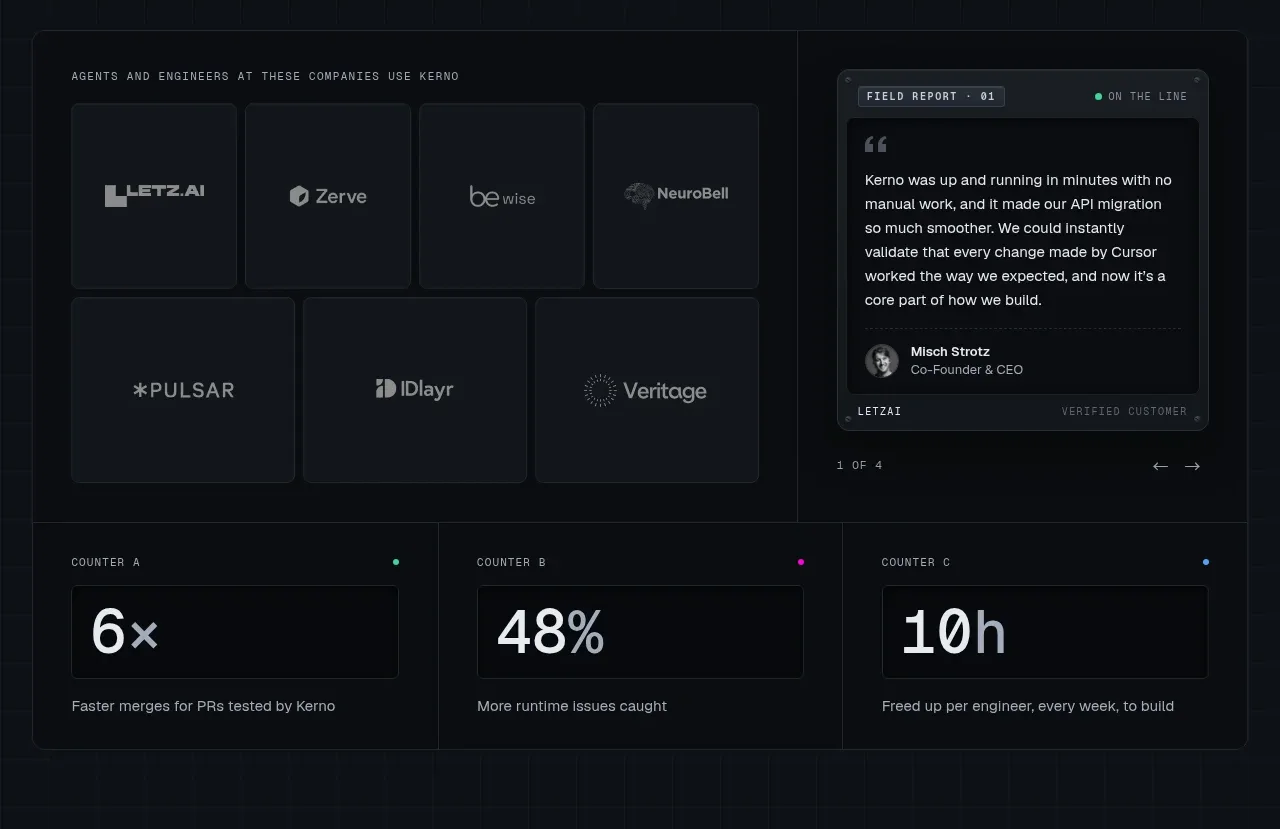
 Customer proof and operating metrics
Kerno 1.0 · Logo cloud
Customer proof and operating metrics
Kerno 1.0 · Logo cloud