 kage
kage
ultracite.ai
Design analysis
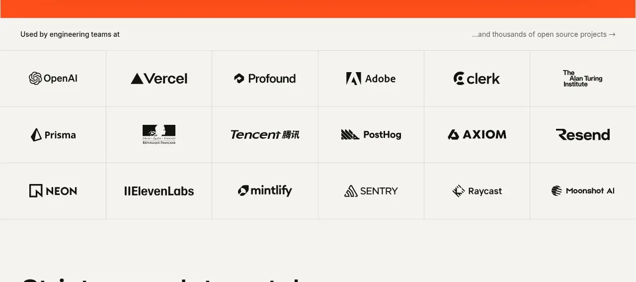
A short trust section introduces the organizations using the product, then presents names in a restrained multi-column grid with hairline separators. The monochrome treatment keeps attention on the product rather than the brands.
Prompt preview
## Reference images

Study these alongside the description below: hierarchy, rhythm, spacing, colour. Build for the product you are asked about, using this design language.

- Component: https://kage-design-assets.t3.tigrisfiles.io/components/ultracite-v8/2cfe6d77-9aac-44fd-bb06-05dad12091d2-1792303305-2.webp
- Full page it was cut from: https://kage-design-assets.t3.tigrisfiles.io/screenshots/ultracite-v8/2cfe6d77-9aac-44fd-bb06-05dad12091d2-1792303236925-full.webp
- Component on Kage: https://kage.design/component/ultracite-v8-logo-cloud

## Before you start
Ask which customer, community, or ecosystem names the user's product can credibly show and whether legal approval exists. Adapt this trust pattern to those inputs.

Build a restrained adoption logo cloud below the hero. Add a small introductory line with a supporting phrase, then place approved customer or ecosystem marks in a consistent six-column desktop grid. Use equal-height cells, centered alignment, subtle vertical and horizontal rules, and generous whitespace so the marks feel editorial rather than like a sales badge wall. Render marks in monochrome or a carefully controlled neutral treatment, preserving each mark's legibility and clear space.

Use the same warm off-white background (#f7f7f4), thin borders around #dfdfda, and black or charcoal marks #20201e. Keep the intro copy at 12–14px and the grid marks visually balanced rather than forcing every logo to the same width. On mobile, reduce to two columns and maintain accessible alt text and links where applicable. Add a restrained hover treatment only if the marks are interactive.

### Never
- Never use logos, product names, copy, illustrations, or imagery from the reference.
- Never invent customer relationships or display unapproved marks.
- Never use colorful logo treatments that overpower the page.
More components
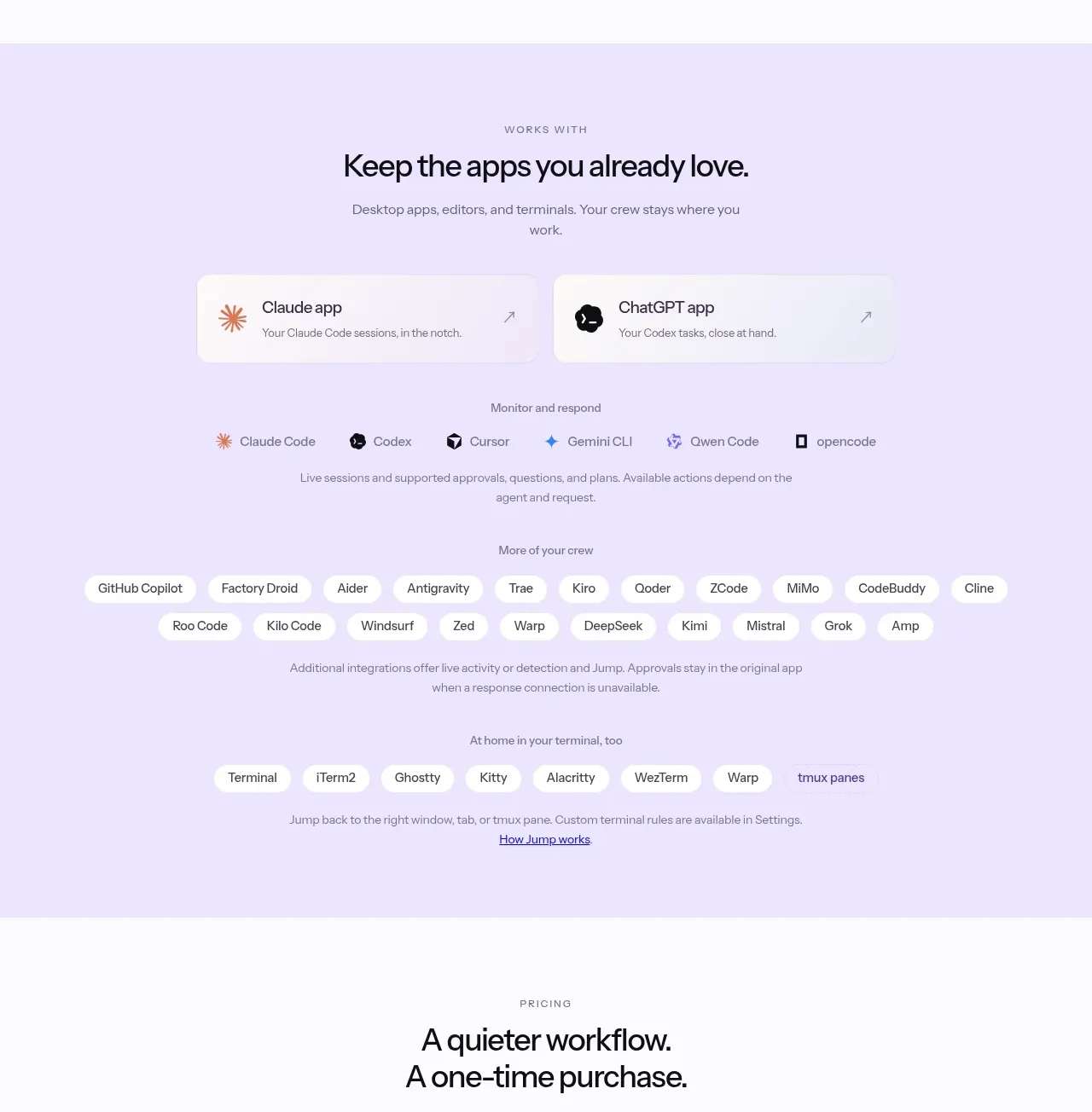
 Supported apps and integrations
CrewTower Mod for Claude Code · Logo cloud
Supported apps and integrations
CrewTower Mod for Claude Code · Logo cloud

 Platform compatibility grid
Scalebrowser · Logo cloud
Platform compatibility grid
Scalebrowser · Logo cloud
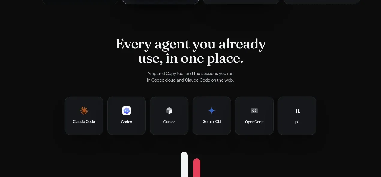
 Compatible tools grid
Parallax · Logo cloud
Compatible tools grid
Parallax · Logo cloud

 Trusted by teams strip
AI Sandboxes by Buddy · Logo cloud
Trusted by teams strip
AI Sandboxes by Buddy · Logo cloud

 Platform compatibility statement
Navige · Logo cloud
Platform compatibility statement
Navige · Logo cloud
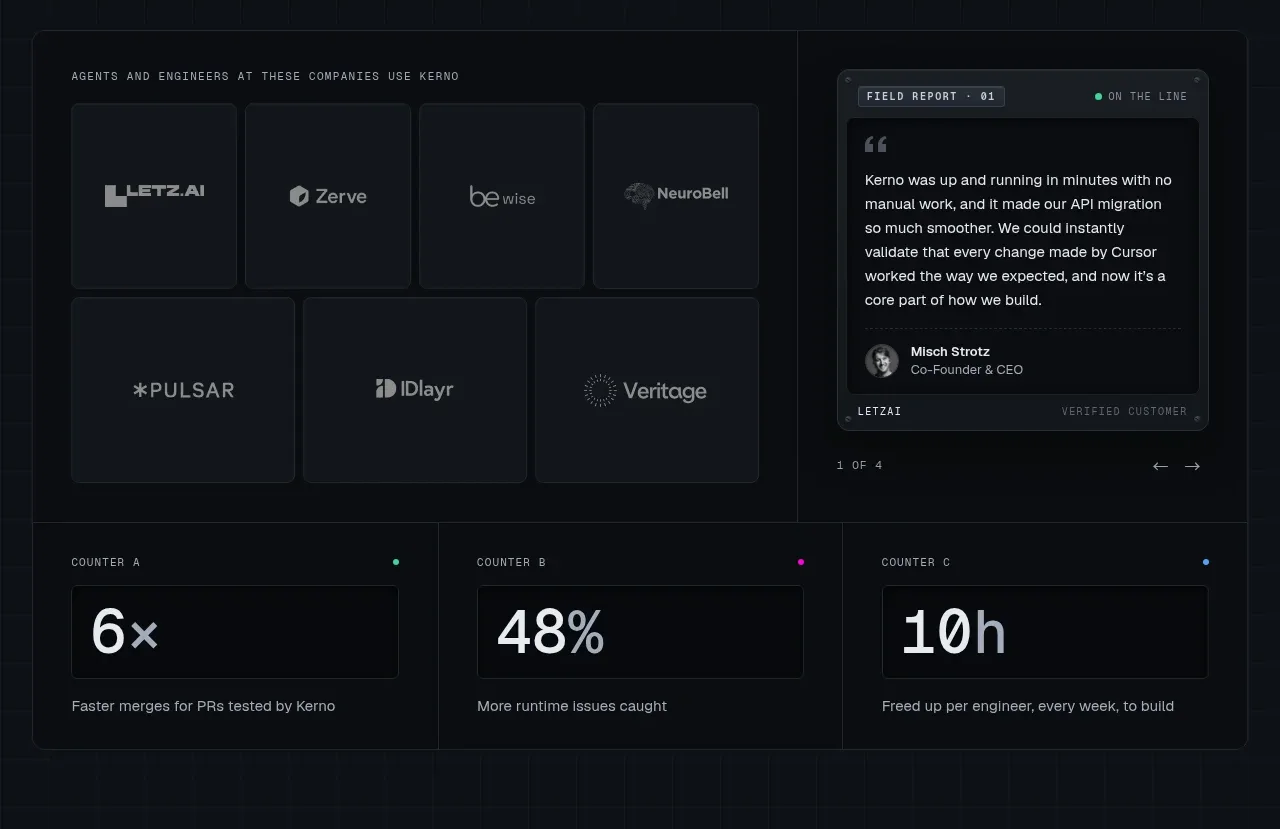
 Customer proof and operating metrics
Kerno 1.0 · Logo cloud
Customer proof and operating metrics
Kerno 1.0 · Logo cloud