kage
kage
dockfix.app
Design analysis
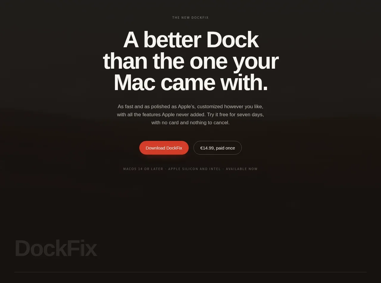
A dark closing CTA centers a strong product promise, short reassurance, two actions, and a tiny compatibility/payment note before the footer begins.
Prompt preview
## Reference images

Study these alongside the description below: hierarchy, rhythm, spacing, colour. Build for the product you are asked about, using this design language.

- Component: https://kage-design-assets.t3.tigrisfiles.io/components/dockfix-5-0/2c092be4-cae6-431a-8bc7-3fef5352fd95-1789279443-5.webp
- Full page it was cut from: https://kage-design-assets.t3.tigrisfiles.io/screenshots/dockfix-5-0/2c092be4-cae6-431a-8bc7-3fef5352fd95-1789279362906-full.webp
- Component on Kage: https://kage.design/component/dockfix-5-0-cta

## Before you start
Ask what the user's product is, who it is for, and what their brand personality and visual identity are. Apply the principles below to that product rather than reproducing this reference.

Build a centered closing CTA on a near-black background (#151311). Add a tiny uppercase eyebrow in muted gray, then a large high-impact headline in warm white (#f5f1e8), limited to roughly 8–12 words and three or four lines at narrow widths. Follow with a short reassuring paragraph in soft gray, then place a primary coral button (#e85b47) beside a secondary dark button with a subtle border (#49433d). Include a small, low-contrast compatibility, pricing, or guarantee note below. Use generous vertical padding—around 80–120px—strong typographic contrast, and a max-width of 500px. Buttons should have 9999px radius, clear hover states, and full-width stacking on mobile.

Never: use logos, product names, copy, illustrations or imagery from the reference.