kage
kage
dockfix.app
Design analysis
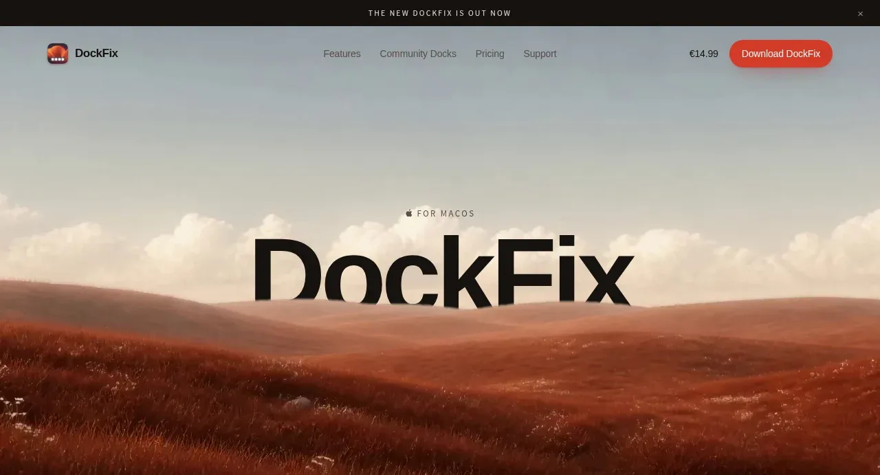
The hero uses an oversized centered product title over a cinematic landscape, with a small platform label and a subtle scroll cue. Its strong type/image contrast makes the product immediately legible without a crowded interface.
Prompt preview
## Reference images

Study these alongside the description below: hierarchy, rhythm, spacing, colour. Build for the product you are asked about, using this design language.

- Component: https://kage-design-assets.t3.tigrisfiles.io/components/dockfix-5-0/2c092be4-cae6-431a-8bc7-3fef5352fd95-1789279441-1.webp
- Full page it was cut from: https://kage-design-assets.t3.tigrisfiles.io/screenshots/dockfix-5-0/2c092be4-cae6-431a-8bc7-3fef5352fd95-1789279362906-full.webp
- Component on Kage: https://kage.design/component/dockfix-5-0-hero

## Before you start
Ask what the user's product is, who it is for, and what their brand personality and visual identity are. Apply the principles below to that product rather than reproducing this reference.

Create a full-width first hero directly below the navigation, sized to fill the first viewport on desktop. Place a short uppercase platform/category eyebrow above an oversized centered headline, then let a cinematic, edge-to-edge visual occupy the background or lower half. Use near-black display typography (#121110), a pale atmospheric sky palette, and a darkened image treatment behind text when necessary. The title should be extremely large and tight, with minimal supporting copy; use generous empty space above and below and a tiny uppercase scroll indicator at the bottom. Preserve a calm editorial composition, high contrast, and a clear focal point. On mobile, scale the headline fluidly with clamp(), keep the subject centered, and avoid cropping the primary visual.

Never: use logos, product names, copy, illustrations or imagery from the reference.