kage
kage
dreamscalelabs.com
Design analysis
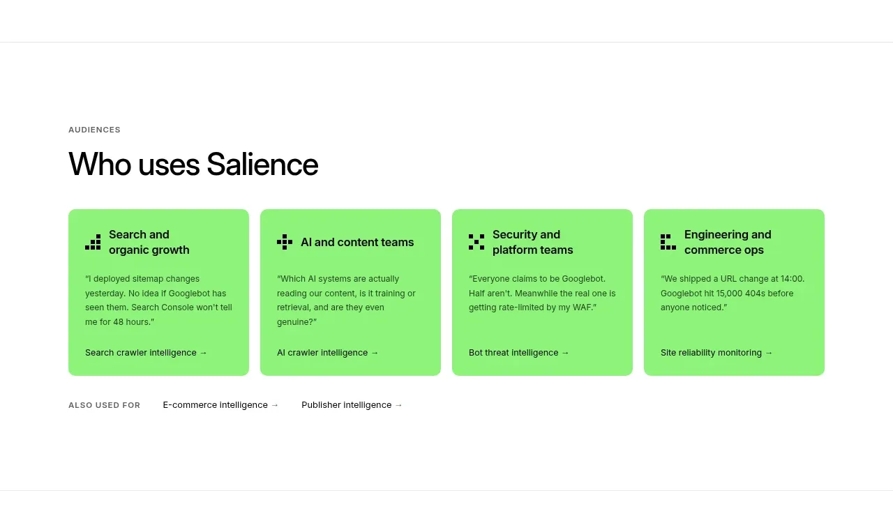
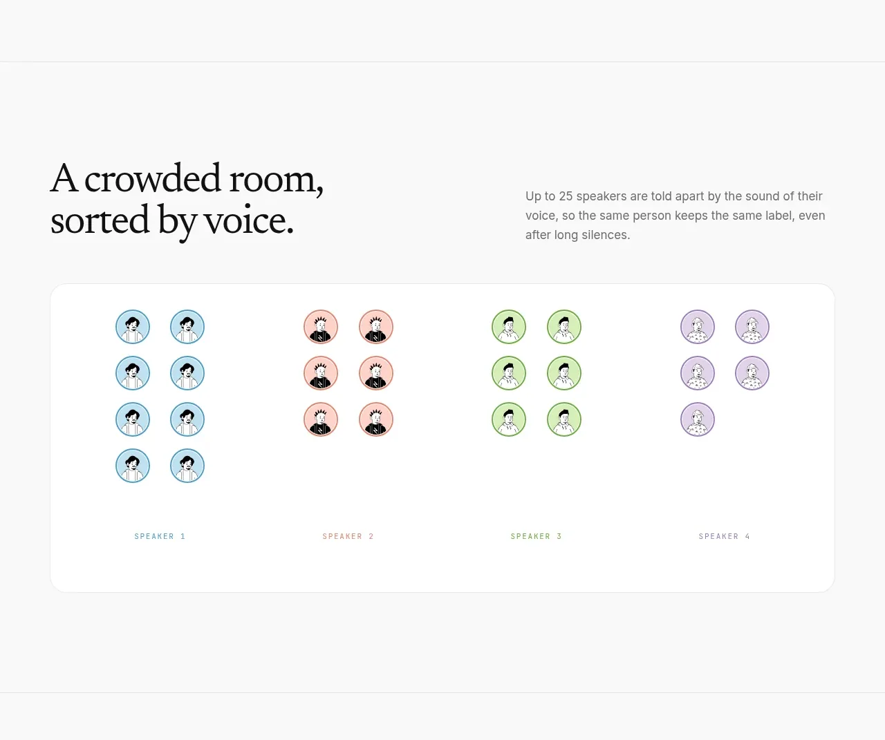
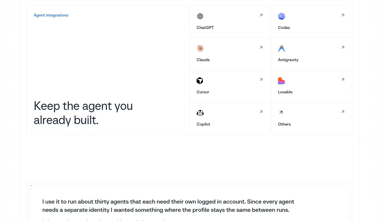
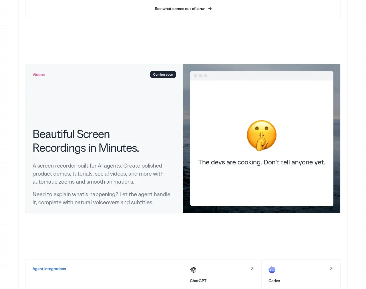
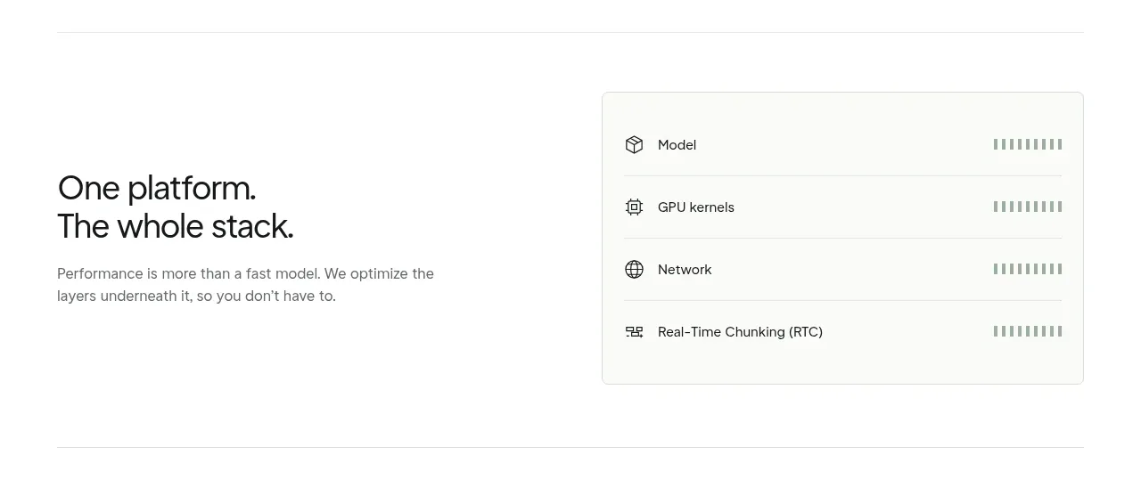
This section explains a platform promise with a heading and short paragraph on the left, while a single restrained system card on the right lists infrastructure layers. The bordered card makes complexity legible without adding visual noise.
Prompt preview
## Reference images

Study these alongside the description below: hierarchy, rhythm, spacing, colour. Build for the product you are asked about, using this design language.

- Component: https://kage-design-assets.t3.tigrisfiles.io/components/dreamscale-labs/1997d92a-7a08-4743-8853-9f94160e0cd8-1792130788-5.webp
- Full page it was cut from: https://kage-design-assets.t3.tigrisfiles.io/screenshots/dreamscale-labs/1997d92a-7a08-4743-8853-9f94160e0cd8-1792130510959-full.webp
- Component on Kage: https://kage.design/component/dreamscale-labs-card

## Before you start
Ask the user which layers, modules, or capabilities make up their platform and what needs to be understood at a glance. Then create an original version for that system.

Build a split platform section with a text column on the left and a compact bordered capability card on the right. Use a 30–34px heading with a short line break, a 13–15px gray paragraph below, and a card approximately 380–420px wide. Style the card with #fbfbfa or white fill, a 1px #e1e4e3 border, 6px radius, and a soft shadow. List four or five layers as horizontal rows separated by very light rules; each row should have a small outline icon, 13px label, and a quiet status/indicator pattern aligned right. Use about 80–100px vertical padding and a thin section divider. Make rows keyboard-focusable if interactive, and stack the card below the copy on mobile.

Never: use logos, product names, copy, illustrations, or imagery from the reference.