kage
kage
scalebrowser.net
Design analysis
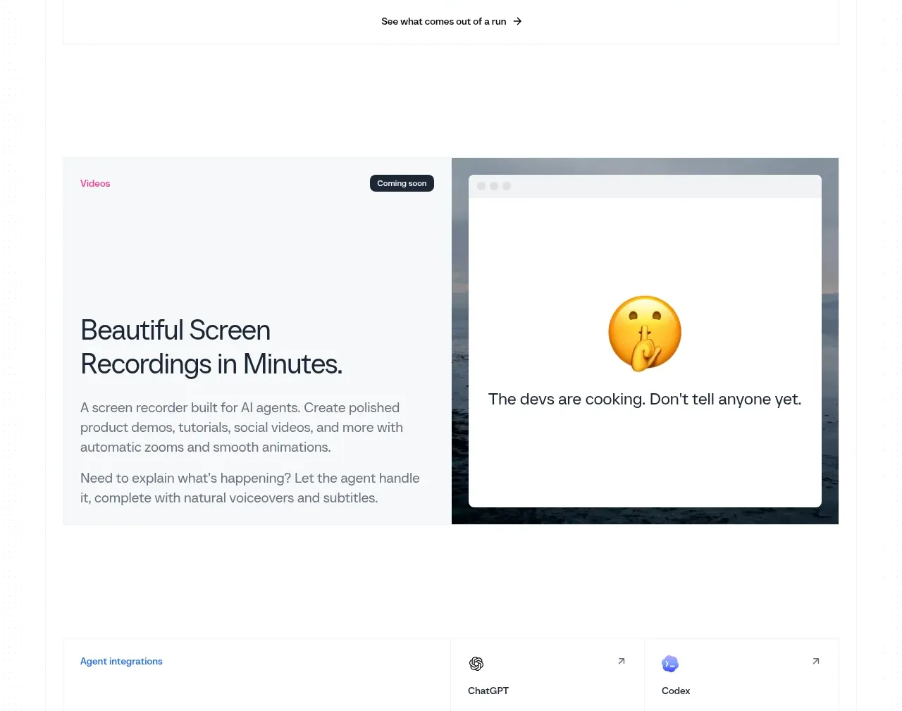
A large editorial card introduces a forthcoming screen-recording feature with a clear title and copy on the left and a playful product-state preview on the right.
Prompt preview
## Reference images

Study these alongside the description below: hierarchy, rhythm, spacing, colour. Build for the product you are asked about, using this design language.

- Component: https://kage-design-assets.t3.tigrisfiles.io/components/scalebrowser/2a4622f4-ebe3-4b20-ac5d-aef2ae1302c9-1792216898-7.webp
- Full page it was cut from: https://kage-design-assets.t3.tigrisfiles.io/screenshots/scalebrowser/2a4622f4-ebe3-4b20-ac5d-aef2ae1302c9-1792216866183-full.webp
- Component on Kage: https://kage.design/component/scalebrowser-card

## Before you start
Ask what future or supporting feature deserves a visual teaser, whether it is available now, and what tone fits the user's brand. Design the teaser around that answer.

Build a wide two-column teaser card with a pale #f7f9fa background, a small coloured category label and compact status badge, a large two-line title, and two short explanatory paragraphs on the left. On the right, place a framed application preview with subtle browser chrome and a simple placeholder state. Use 28–34px heading typography, 15px body text, #606b75 copy, 12–16px corners, and 48–64px padding. The status badge should communicate availability without being visually loud; make the card collapse to one column on mobile.

Never use logos, product names, copy, illustrations, or imagery from the reference.