kage
kage
polylane.com
Design analysis
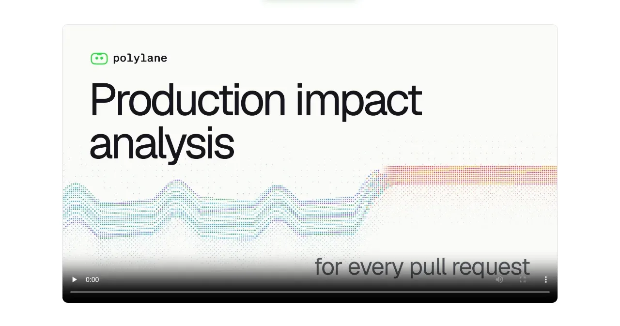
A large bordered media card introduces the product workflow with a branded title treatment and a visible video control bar.
Prompt preview
## Reference images

Study these alongside the description below: hierarchy, rhythm, spacing, colour. Build for the product you are asked about, using this design language.

- Component: https://kage-design-assets.t3.tigrisfiles.io/components/polylane-impact-analysis/878f0a8a-6be5-46ae-8786-d3cb31a469c0-1792130546-2.webp
- Full page it was cut from: https://kage-design-assets.t3.tigrisfiles.io/screenshots/polylane-impact-analysis/878f0a8a-6be5-46ae-8786-d3cb31a469c0-1792130477581-full.webp
- Component on Kage: https://kage.design/component/polylane-impact-analysis-card

## Before you start
Ask what the user's product, brand, and most persuasive workflow are, then build an original demonstration card around that.

Create a centered media card at roughly 80% of the content width with a very light warm-white surface (#fafaf8), a 1px border (#e5e5df), and a 7–10px corner radius. Add a small brand/context label, an oversized concise title in near-black, and a product-demo visual or video area that fills the lower portion. Keep the title left-aligned with 38–44px inset padding, use a 62–72px display heading with tight line-height, and fade the media gently toward the bottom if controls overlay it. Include native-looking playback controls only if a real video is available; otherwise use a polished static product preview with a play button. Maintain responsive aspect ratio and avoid cropping important UI.

Never: use logos, product names, copy, illustrations, or imagery from the reference.