kage
kage
mermaidonline.live
Design analysis
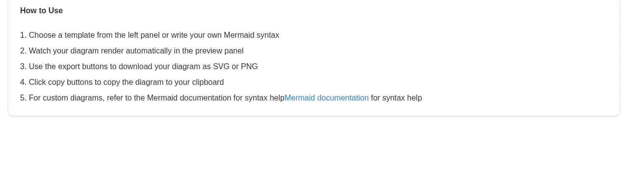
A bordered instructional card gives the editor demo a low-friction sequence of use. Numbered lines and a documentation link make the next steps scannable without competing with the workspace.
Prompt preview
## Reference images

Study these alongside the description below: hierarchy, rhythm, spacing, colour. Build for the product you are asked about, using this design language.

- Component: https://kage-design-assets.t3.tigrisfiles.io/components/mermaidonline-live/7b9ecc63-d7b9-4b92-a5d2-b69508fba7f2-1792152743-3.webp
- Full page it was cut from: https://kage-design-assets.t3.tigrisfiles.io/screenshots/mermaidonline-live/7b9ecc63-d7b9-4b92-a5d2-b69508fba7f2-1792152710959-full.webp
- Component on Kage: https://kage.design/component/mermaidonline-live-card

## Before you start
Ask what the user's product workflow is and what users most often need help accomplishing. Apply these content and layout principles to that workflow.

Build a full-width, low-emphasis instruction card below a product demo. Use a bold small heading, a numbered list of three to five concise steps, and one contextual documentation link. Give it a white background, #e5e5e5 border, 8px radius, 16–20px padding, dark gray text, and a blue link accent. Keep the list left aligned with comfortable line height and enough whitespace to scan quickly. Make the documentation link keyboard accessible and visually distinct.

Never: use logos, product names, copy, illustrations, or imagery from the reference.