kage
kage
maybloc.com
Design analysis
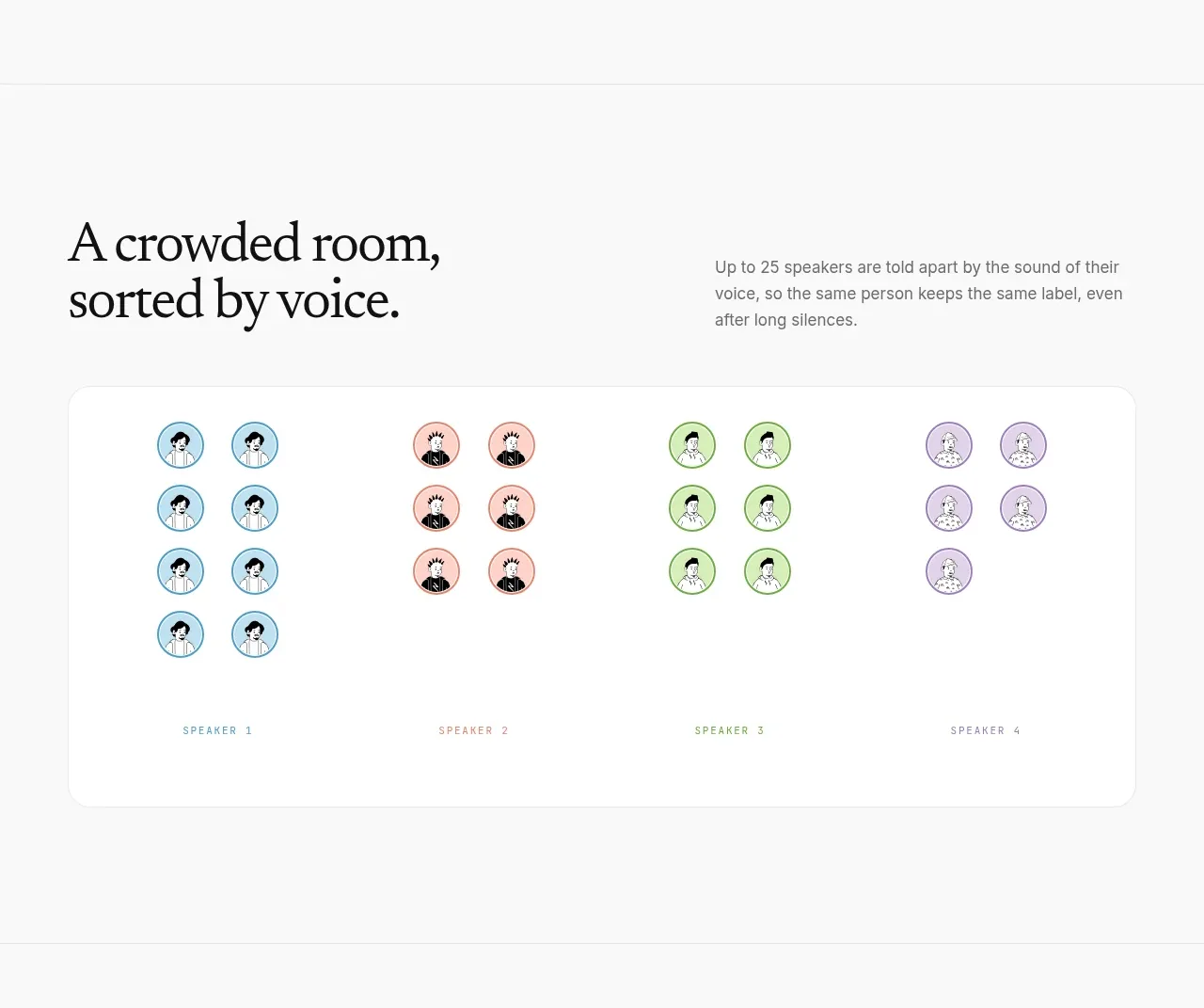
A concise explanatory header sits above a large rounded card that visually groups multiple voices into distinct speaker clusters.
Prompt preview
## Reference images

Study these alongside the description below: hierarchy, rhythm, spacing, colour. Build for the product you are asked about, using this design language.

- Component: https://kage-design-assets.t3.tigrisfiles.io/components/maybloc/1877ee03-3cf3-49f7-b006-226ca2ea42de-1792217041-4.webp
- Full page it was cut from: https://kage-design-assets.t3.tigrisfiles.io/screenshots/maybloc/1877ee03-3cf3-49f7-b006-226ca2ea42de-1792216974687-full.webp
- Component on Kage: https://kage.design/component/maybloc-card

## Before you start
Ask what the user's product is, who it serves, and what brand voice and visual identity it should use. Apply the principles below to that product rather than reproducing the reference.

Build a feature card with a two-column introductory row: a large editorial serif heading on the left and a compact supporting paragraph on the right. Beneath it, place a wide white rounded panel with a subtle #e7e7e7 border and very soft shadow. Inside, show several clearly separated groups of small avatar or token circles, each with a distinct but muted accent color, and a small uppercase label beneath each group. The visual should communicate categorization at a glance without requiring dense text. Use generous whitespace, 20px radius, and responsive wrapping; on small screens convert the groups into a horizontally scrollable or two-column layout.

Never: use the reference's logo, product name, copy, illustrations, imagery, or exact avatar artwork.