kage
kage
scalebrowser.net
Design analysis
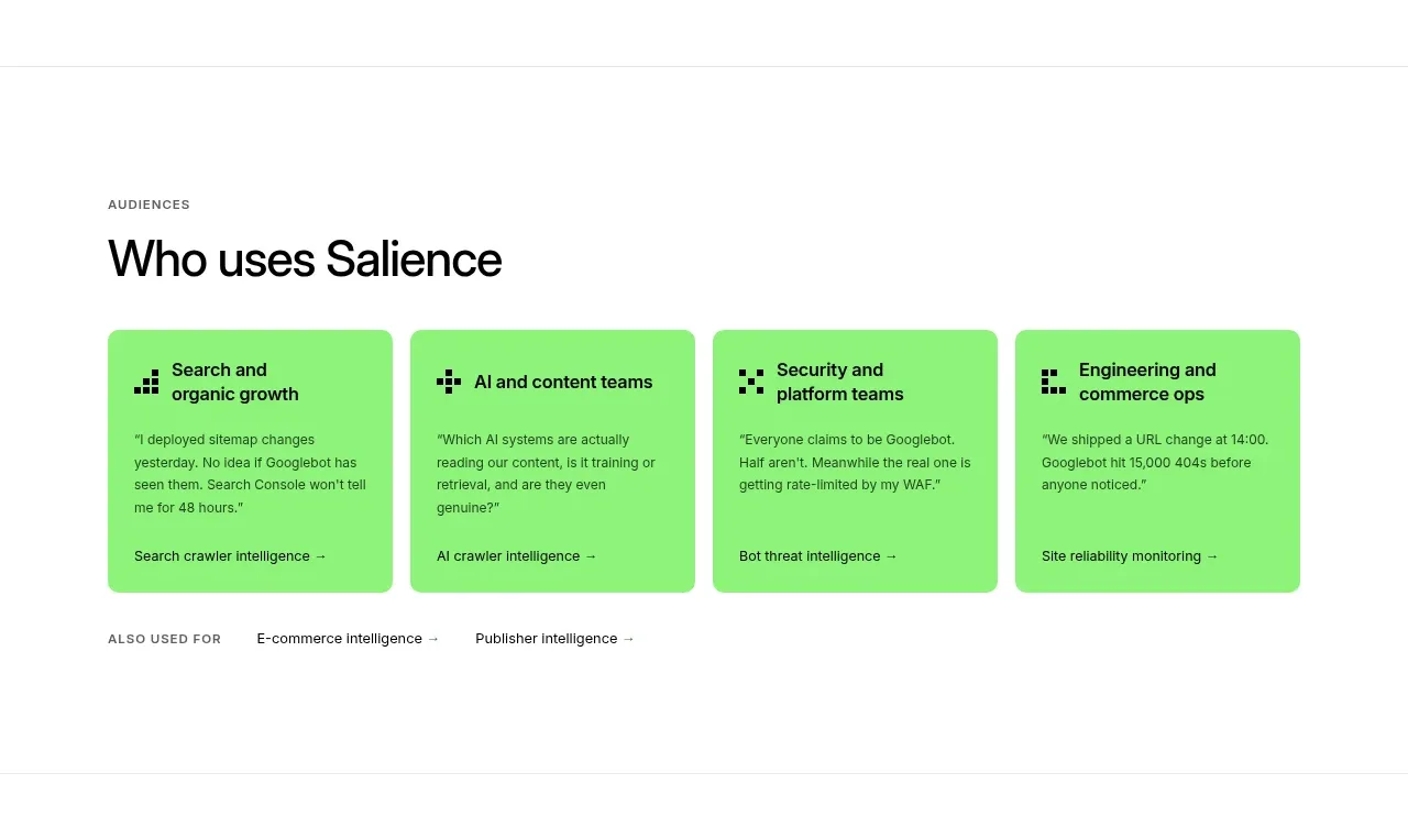
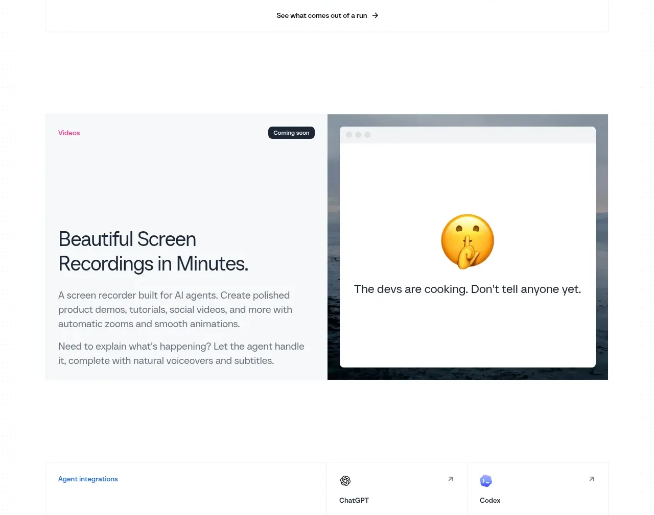
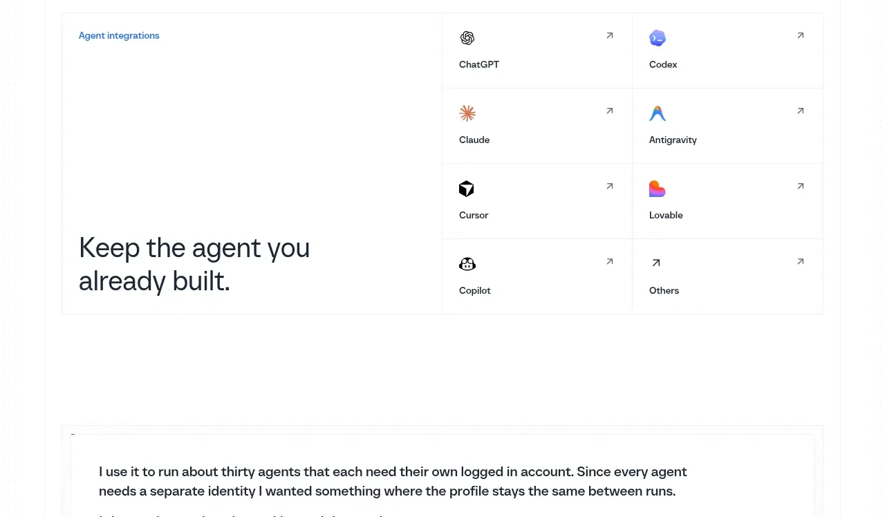
A split directory card combines a large editorial statement with a compact two-column list of integration destinations and directional affordances.
Prompt preview
## Reference images

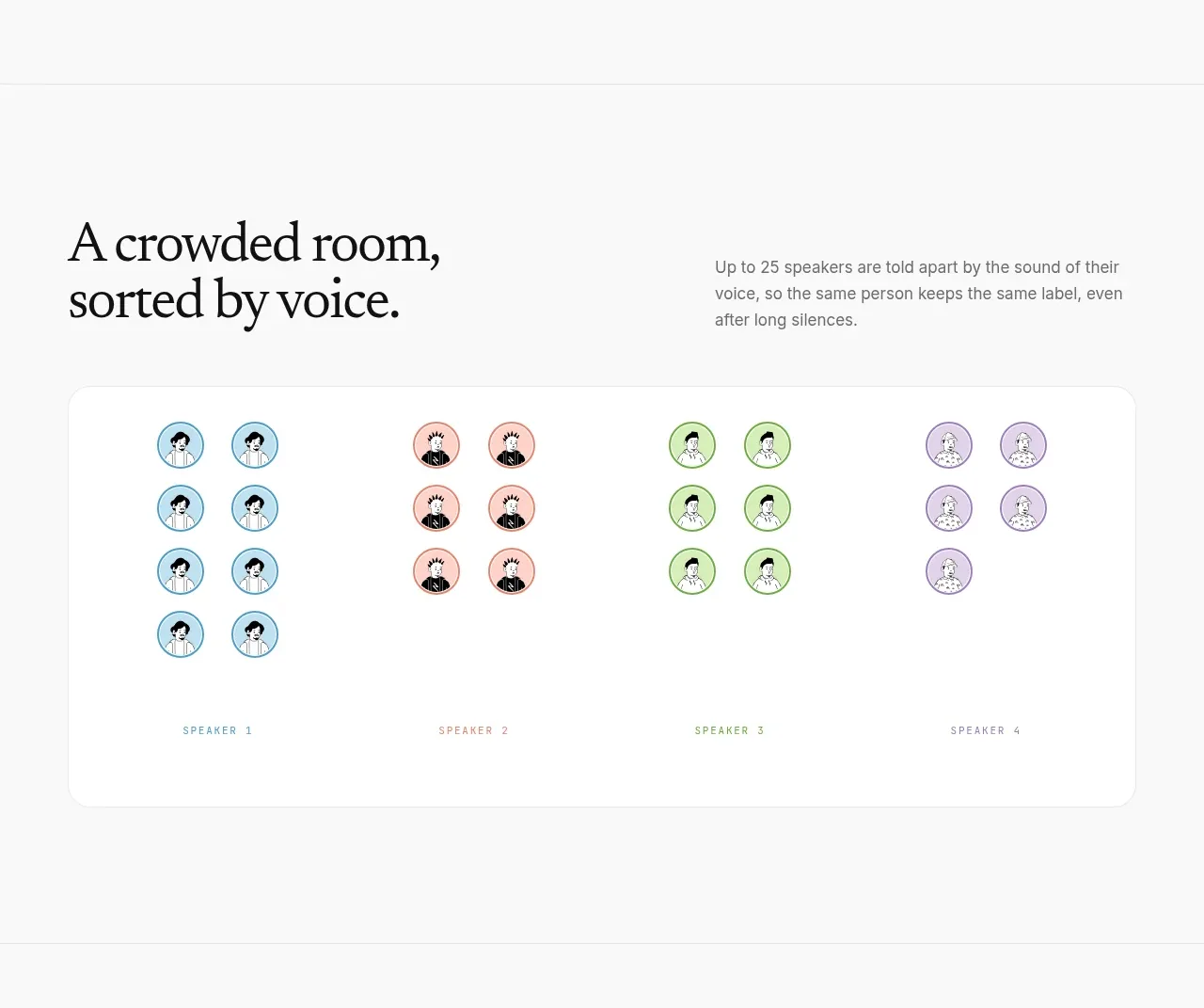
Study these alongside the description below: hierarchy, rhythm, spacing, colour. Build for the product you are asked about, using this design language.

- Component: https://kage-design-assets.t3.tigrisfiles.io/components/scalebrowser/2a4622f4-ebe3-4b20-ac5d-aef2ae1302c9-1792216898-8.webp
- Full page it was cut from: https://kage-design-assets.t3.tigrisfiles.io/screenshots/scalebrowser/2a4622f4-ebe3-4b20-ac5d-aef2ae1302c9-1792216866183-full.webp
- Component on Kage: https://kage.design/component/scalebrowser-card-2

## Before you start
Ask which tools or destinations the user's product integrates with and whether the experience should encourage browsing, connecting, or learning. Use those answers for the directory.

Create a bordered integration directory with a generous left editorial column and a right grid of equal destination cells. The left side gets a small blue eyebrow and a large concise statement; the right cells contain a restrained icon, destination label, and small external-arrow affordance. Use #fff surfaces, #edf0f2 rules, #17202a heading text, #5f6b75 secondary text, 14–16px type, and 48px minimum cell height. Give each cell hover feedback through a light background tint and keyboard focus ring. Collapse to a stacked editorial-plus-grid layout on narrow screens.

Never use logos, product names, copy, illustrations, or imagery from the reference.