kage
kage
duvi.ai

Design analysis
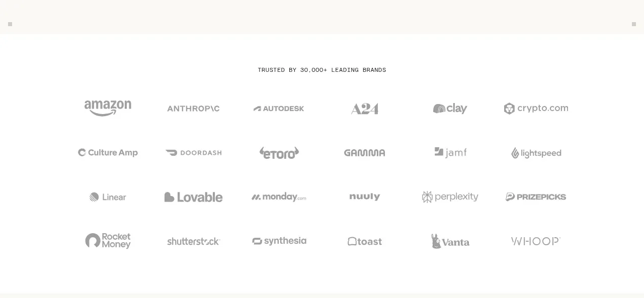
A centered eyebrow introduces two loose rows of monochrome customer marks. The large gap around the marks keeps this proof point understated rather than turning it into a dense partner grid.
Prompt preview
## Reference images

Study these alongside the description below: hierarchy, rhythm, spacing, colour. Build for the product you are asked about, using this design language.

- Component: https://kage-design-assets.t3.tigrisfiles.io/components/duvi/fdecc34f-2fb4-47cd-8615-09e917d211ca-1789884152-3.webp
- Full page it was cut from: https://kage-design-assets.t3.tigrisfiles.io/screenshots/duvi/fdecc34f-2fb4-47cd-8615-09e917d211ca-1789884106277-full.webp
- Component on Kage: https://kage.design/component/duvi-logo-cloud

## Before you start
Ask what the user's product, audience, and brand are, then apply these principles to that product rather than reproducing the reference.

Create a restrained customer-logo band on a near-black background. Center a tiny uppercase, widely tracked label above two flexible rows of partner marks. Render marks as monochrome light gray with varying widths and generous horizontal gaps; do not put them in cards. Use approximately 11px uppercase label text, 24–32px row gaps, and 48–72px vertical padding. On hover, allow a small opacity increase, but keep the default treatment quiet and cohesive. Use a responsive flex or grid that wraps naturally.

Never use logos, product names, copy, illustrations, or imagery from the reference.