kage
kage
duvi.ai
Design analysis
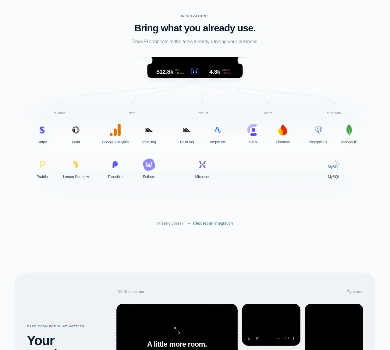
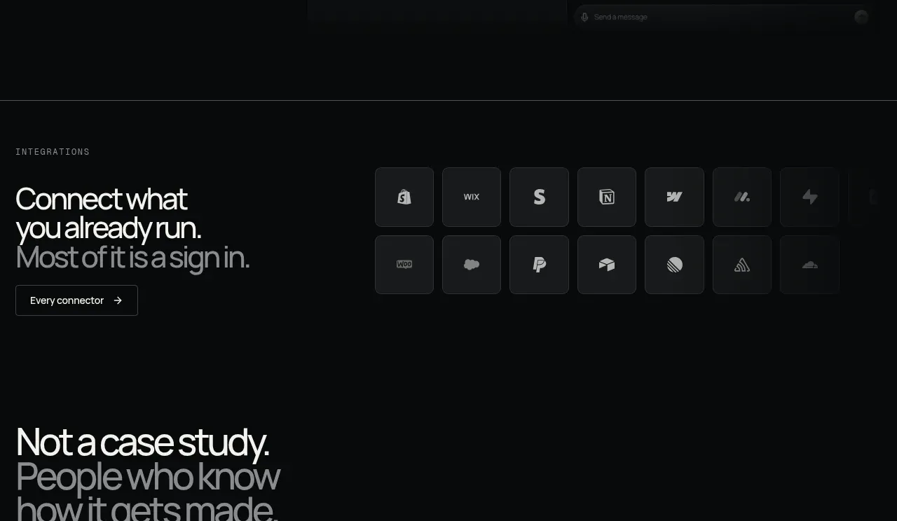
A concise integration statement and CTA sit beside a dense grid of connector tiles. The tiles are uniform, low-contrast, and recognizable through simple abstract marks without overwhelming the headline.
Prompt preview
## Reference images

Study these alongside the description below: hierarchy, rhythm, spacing, colour. Build for the product you are asked about, using this design language.

- Component: https://kage-design-assets.t3.tigrisfiles.io/components/duvi/fdecc34f-2fb4-47cd-8615-09e917d211ca-1789884153-8.webp
- Full page it was cut from: https://kage-design-assets.t3.tigrisfiles.io/screenshots/duvi/fdecc34f-2fb4-47cd-8615-09e917d211ca-1789884106277-full.webp
- Component on Kage: https://kage.design/component/duvi-logo-cloud-2

## Before you start
Ask what the user's product, audience, and brand are, then apply these principles to that product rather than reproducing the reference.

Create an integrations section with a left text column and right connector grid. Use a small eyebrow, a large two- or three-line headline, a muted supporting line, and an outlined secondary button. The right side should be a 4–6 column grid of equal dark tiles with subtle gradients, 1px borders, 8px radii, and centered abstract connector symbols. Base colors: #080a0b background, #f0f1ed headline, #92989a muted copy, #171a1c tiles, #2b3032 borders. Keep tile spacing tight but breathable and use opacity/transform on hover. Make the grid wrap and move below the copy on mobile.

Never use logos, product names, copy, illustrations, or imagery from the reference.