kage
kage
elyx.design
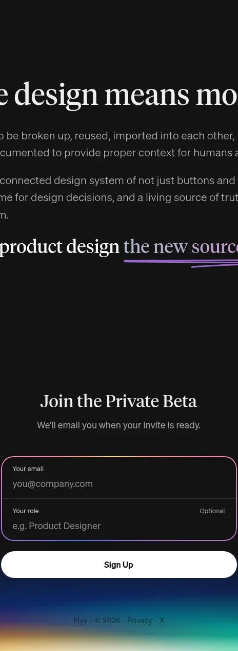
Design analysis
A centered invitation closes the page with a compact two-field form, a high-contrast submit button, and a subtle multicolor glow at the bottom edge.
Prompt preview
## Reference images

Study these alongside the description below: hierarchy, rhythm, spacing, colour. Build for the product you are asked about, using this design language.

- Component: https://kage-design-assets.t3.tigrisfiles.io/components/elyx-design/634f2ca9-e930-42fa-918f-46bd7d94fb82-1789563435-6.webp
- Full page it was cut from: https://kage-design-assets.t3.tigrisfiles.io/screenshots/elyx-design/634f2ca9-e930-42fa-918f-46bd7d94fb82-1789563404568-full.webp
- Component on Kage: https://kage.design/component/elyx-form

## Before you start
Ask what the user's conversion goal is, what information is truly necessary, and what tone the brand should use for the invitation. Then build this signup section for that product.

Create a centered closing signup section on a near-black background (`#111111`). Use a serif heading around 28–34px in off-white, a short muted-gray supporting line, and a compact form around 325px wide. Stack two fields inside one rounded bordered panel: a primary email field and a secondary optional role/context field. Use a fine gradient border transitioning violet, pink, and blue; radius around 18px; dark translucent fill; small labels above quiet placeholders. Place a full-width white or warm-white submit button below with black text, medium weight, 999px radius, and a clear hover state. Add tiny muted footer metadata beneath. Finish the bottom edge with a low, blurred horizontal aurora glow in blue, violet, pink, and teal, keeping it decorative and subtle. Include labels, validation, error messaging, and keyboard focus states.

Never: use logos, product names, copy, illustrations, or imagery from the reference.