 kage
kage
epilude.com

Design analysis
A centered conversion block restates the main promise, adds a brief reassurance line, and ends with a prominent trial button.
Prompt preview
## Reference images

Study these alongside the description below: hierarchy, rhythm, spacing, colour. Build for the product you are asked about, using this design language.

- Component: https://kage-design-assets.t3.tigrisfiles.io/components/epilude-notetaker/4c1f6c09-8367-4067-b5eb-19bb83b45625-1789365731-5.webp
- Full page it was cut from: https://kage-design-assets.t3.tigrisfiles.io/screenshots/epilude-notetaker/4c1f6c09-8367-4067-b5eb-19bb83b45625-1789365700735-full.webp
- Component on Kage: https://kage.design/component/epilude-notetaker-cta

## Before you start
Ask what conversion action the user's product should drive, what promise is most compelling, and what reassurance removes friction. Then write the CTA for that product.

Create a spacious centered CTA band with a slightly lighter charcoal surface than the rest of the page. Use a large two-line serif headline, a small muted reassurance sentence beneath it, and a light pill-shaped primary button. Keep the content vertically centered with generous top and bottom padding and no competing elements. Use #1a1a1a for the band, #f1f0eb for the headline, #a4a49f for supporting text, and #f2f2ee for the button with dark text. The button should have a subtle hover lift and a clear focus ring. Maintain a restrained, premium editorial feel rather than adding decorative graphics.

Never: use logos, product names, copy, illustrations, or imagery from the reference.
More components
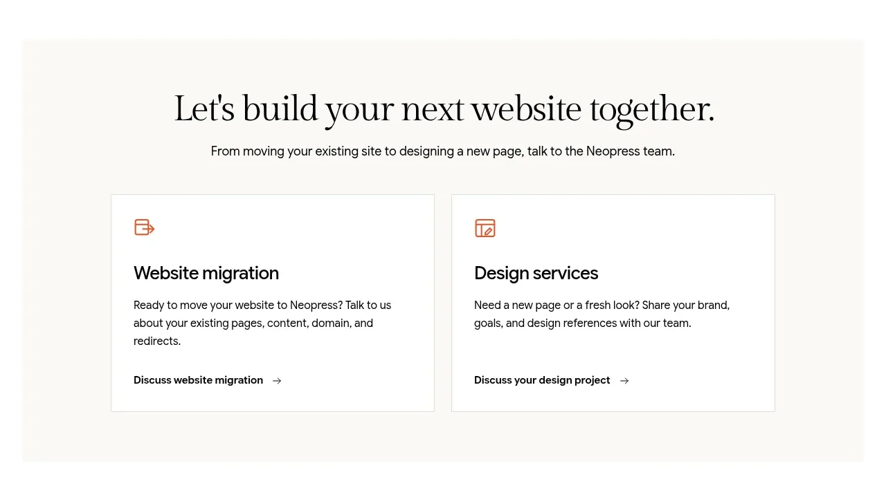
 Build or migrate services CTA
Neopress · Call to action
Build or migrate services CTA
Neopress · Call to action
 Website migration CTA
Neopress · Call to action
Website migration CTA
Neopress · Call to action

 Download conversion prompt
Resurf · Call to action
Download conversion prompt
Resurf · Call to action

 Dark conversion call to action
DockFix 5.0 · Call to action
Dark conversion call to action
DockFix 5.0 · Call to action
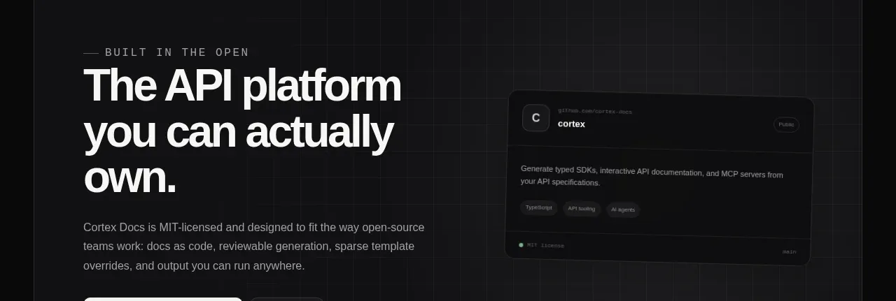
 Final conversion banner
Cortex · Call to action
Final conversion banner
Cortex · Call to action
 Open-source platform callout
Cortex · Call to action
Open-source platform callout
Cortex · Call to action