 kage
kage
epilude.com
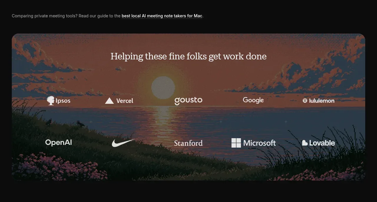
Design analysis
A short credibility transition introduces a guide link and places multiple customer marks over a single rounded atmospheric panel.
Prompt preview
## Reference images

Study these alongside the description below: hierarchy, rhythm, spacing, colour. Build for the product you are asked about, using this design language.

- Component: https://kage-design-assets.t3.tigrisfiles.io/components/epilude-notetaker/4c1f6c09-8367-4067-b5eb-19bb83b45625-1789365730-2.webp
- Full page it was cut from: https://kage-design-assets.t3.tigrisfiles.io/screenshots/epilude-notetaker/4c1f6c09-8367-4067-b5eb-19bb83b45625-1789365700735-full.webp
- Component on Kage: https://kage.design/component/epilude-notetaker-logo-cloud

## Before you start
Ask what the user's product is, which customers or partners may be shown, and what trust signal matters most. Apply the following structure with the user's own assets and brand.

Build a compact social-proof section on a dark page. Start with a small muted editorial sentence and an inline underlined link, then place a wide rounded media panel below. Overlay a centered serif heading near the top of the panel and arrange two balanced rows of monochrome customer or partner marks with generous spacing. Add a dark gradient over the image so marks remain legible. Use charcoal backgrounds (#090909), warm white heading text (#f0eee8), muted copy (#92928e), low-contrast panel borders (#282828), and an atmospheric image treatment that is darkened and desaturated. Keep logos optically balanced rather than mechanically equal in size.

Never: use logos, product names, copy, illustrations, or imagery from the reference.
More components

 Backed-by credibility strip
Neopress · Logo cloud
Backed-by credibility strip
Neopress · Logo cloud
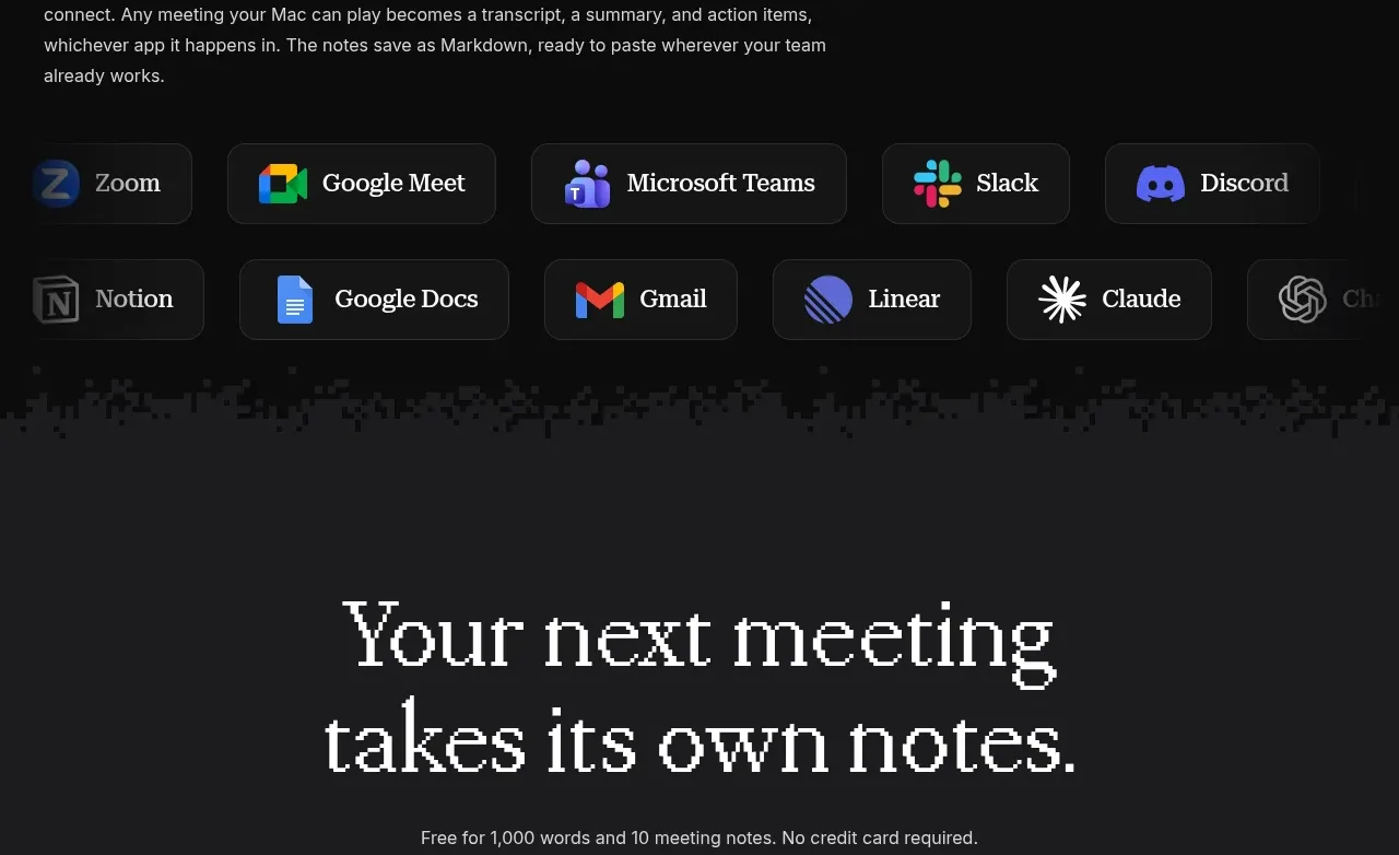
 Compatible apps strip
Epilude Notetaker · Logo cloud
Compatible apps strip
Epilude Notetaker · Logo cloud

 Supported API surface strip
Cortex · Logo cloud
Supported API surface strip
Cortex · Logo cloud

 Trust logos and customer quotes
descript.com · Logo cloud
Trust logos and customer quotes
descript.com · Logo cloud

 Supported assets and services
ledger.com · Logo cloud
Supported assets and services
ledger.com · Logo cloud

 Press coverage logos
bunq.com · Logo cloud
Press coverage logos
bunq.com · Logo cloud