 kage
kage
epilude.com
Design analysis
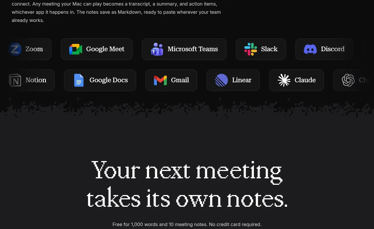
A compatibility section introduces the broad workflow and presents connected apps as a dense set of dark bordered chips across two rows.
Prompt preview
## Reference images

Study these alongside the description below: hierarchy, rhythm, spacing, colour. Build for the product you are asked about, using this design language.

- Component: https://kage-design-assets.t3.tigrisfiles.io/components/epilude-notetaker/4c1f6c09-8367-4067-b5eb-19bb83b45625-1789365730-4.webp
- Full page it was cut from: https://kage-design-assets.t3.tigrisfiles.io/screenshots/epilude-notetaker/4c1f6c09-8367-4067-b5eb-19bb83b45625-1789365700735-full.webp
- Component on Kage: https://kage.design/component/epilude-notetaker-logo-cloud-2

## Before you start
Ask what integrations the user's product supports and which workflows the audience values. Use those answers to determine the app categories and hierarchy.

Build an integrations section on a dark background. Use a left-aligned serif heading and a short explanatory paragraph, followed by a responsive wrapping list of app chips. Each chip should be a dark rounded rectangle with a subtle border, an icon area, and a short app label; use consistent height and padding while allowing labels to vary naturally. Arrange chips in visually balanced rows with 12–20px gaps, and fade or crop the final edge only if the design needs a continuation cue. Use #090909 for the page, #161616 for chips, #2d2d2d borders, #f1f0ec for labels, and #9b9b96 for body copy. Add hover states with a slightly lighter surface and brighter border.

Never: use logos, product names, copy, illustrations, or imagery from the reference.
More components

 Backed-by credibility strip
Neopress · Logo cloud
Backed-by credibility strip
Neopress · Logo cloud
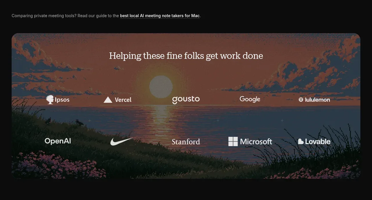
 Customer trust banner
Epilude Notetaker · Logo cloud
Customer trust banner
Epilude Notetaker · Logo cloud

 Supported API surface strip
Cortex · Logo cloud
Supported API surface strip
Cortex · Logo cloud

 Trust logos and customer quotes
descript.com · Logo cloud
Trust logos and customer quotes
descript.com · Logo cloud

 Supported assets and services
ledger.com · Logo cloud
Supported assets and services
ledger.com · Logo cloud

 Press coverage logos
bunq.com · Logo cloud
Press coverage logos
bunq.com · Logo cloud